Brand Identity · Illustration · Concept Project · Boulder, COSolace Studio
Built for a studio that believes real healing starts with self-awareness, not performance.
This was for a brand design challenge hosted on Discord for Curated Collective by Megan Weeks.
The client: Solace Studio, a boutique mind-body wellness studio in Boulder, Colorado serving burned-out professionals aged 28 to 45. Services include breathwork, guided meditation, and nervous system reset workshops.
Brand direction: warm not woo-woo, grounded not clinical, modern not trendy. Soft earthy tones, organic but refined shapes, lots of whitespace. Deliverables included a color palette, typography pairing, primary logo and submark, illustration elements, and one sentence describing the brand feeling.
The Brand Idea
Most wellness brands tell you to relax. Solace asks you to look.
The entire identity is built around one belief — real healing starts with self-awareness. Not another routine. Not perfection. Just the willingness to stop long enough to finally see where you are. That's where everything changes.
For when you're ready to stop running and start seeing.
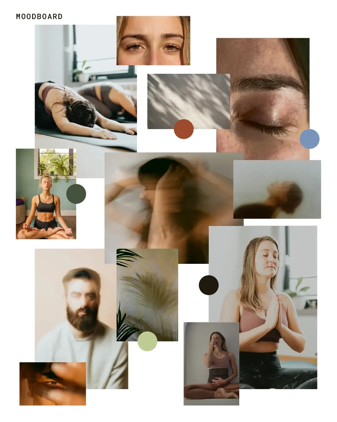
The Moodboard
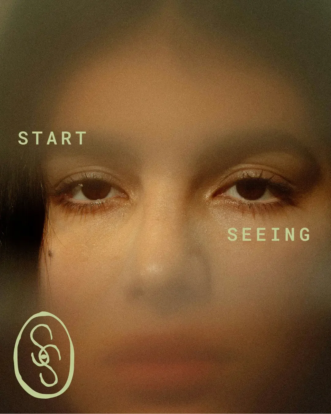
The direction pulled from close-up portraiture, natural light, blurred motion, and earthy organic textures. The reference points were deliberate — eyes, stillness, bodies in practice, plant shadows, soft interiors. Not aspirational wellness imagery. More honest than that. The kind of visual language that says this work is real and it starts with you.
Brand Identity
Every decision in this system connects back to one idea — self-awareness as the foundation of healing. The mark, the palette, the illustrations, the copy all carry meaning. Each element was chosen because it says something about what Solace actually does, not just how it looks.
The Mark
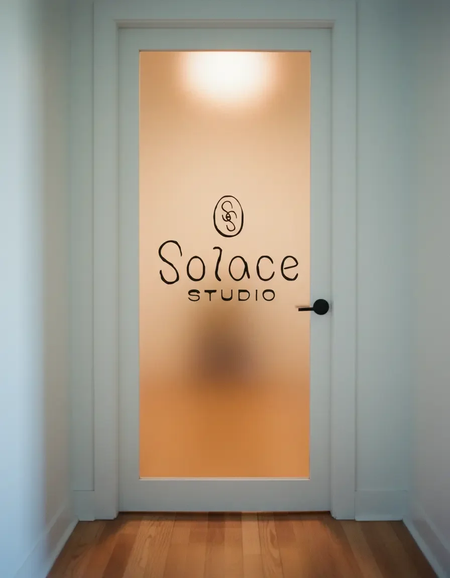
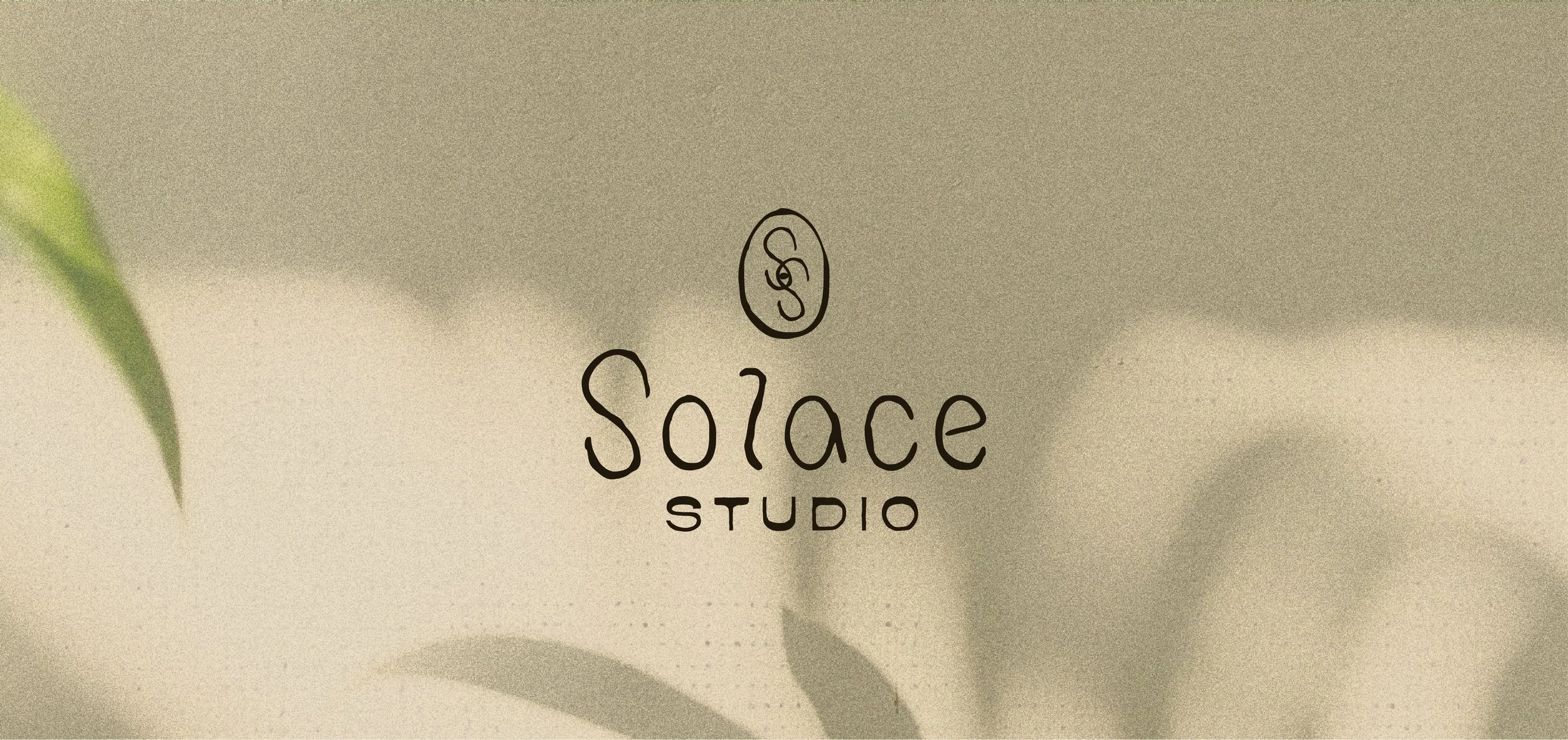
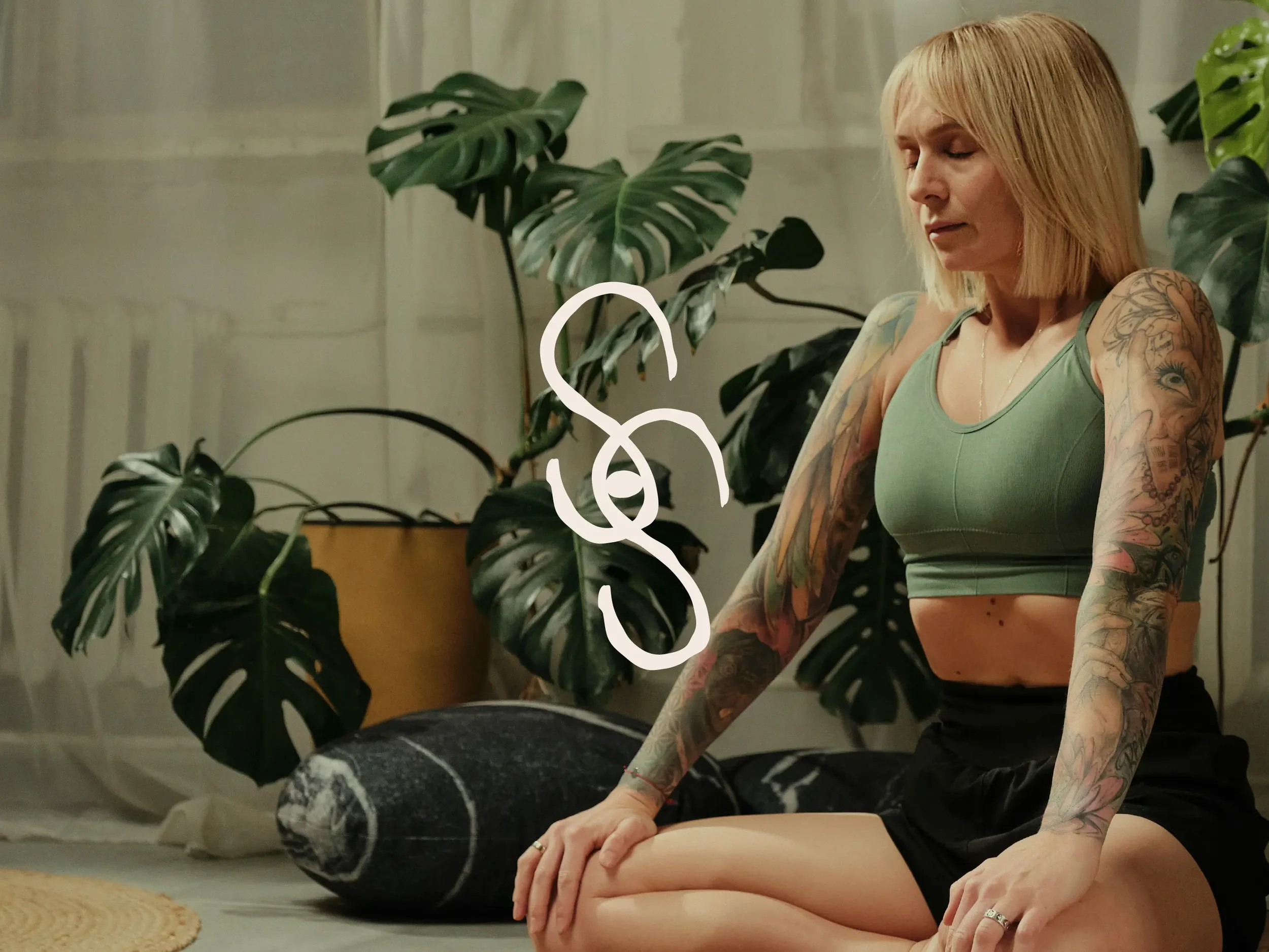
The primary mark is an SS monogram — two S's drawn together by hand. Where the letterforms cross, the negative space naturally forms the shape of an eye. The O from the Solace wordmark was taken, filled in, and dropped into that center — completing it.
The eye wasn't planned. It emerged from the letterforms. That's what made it worth keeping.
It represents self-awareness — the moment you stop running long enough to actually look at yourself. You discover it in the mark rather than being hit over the head with it.
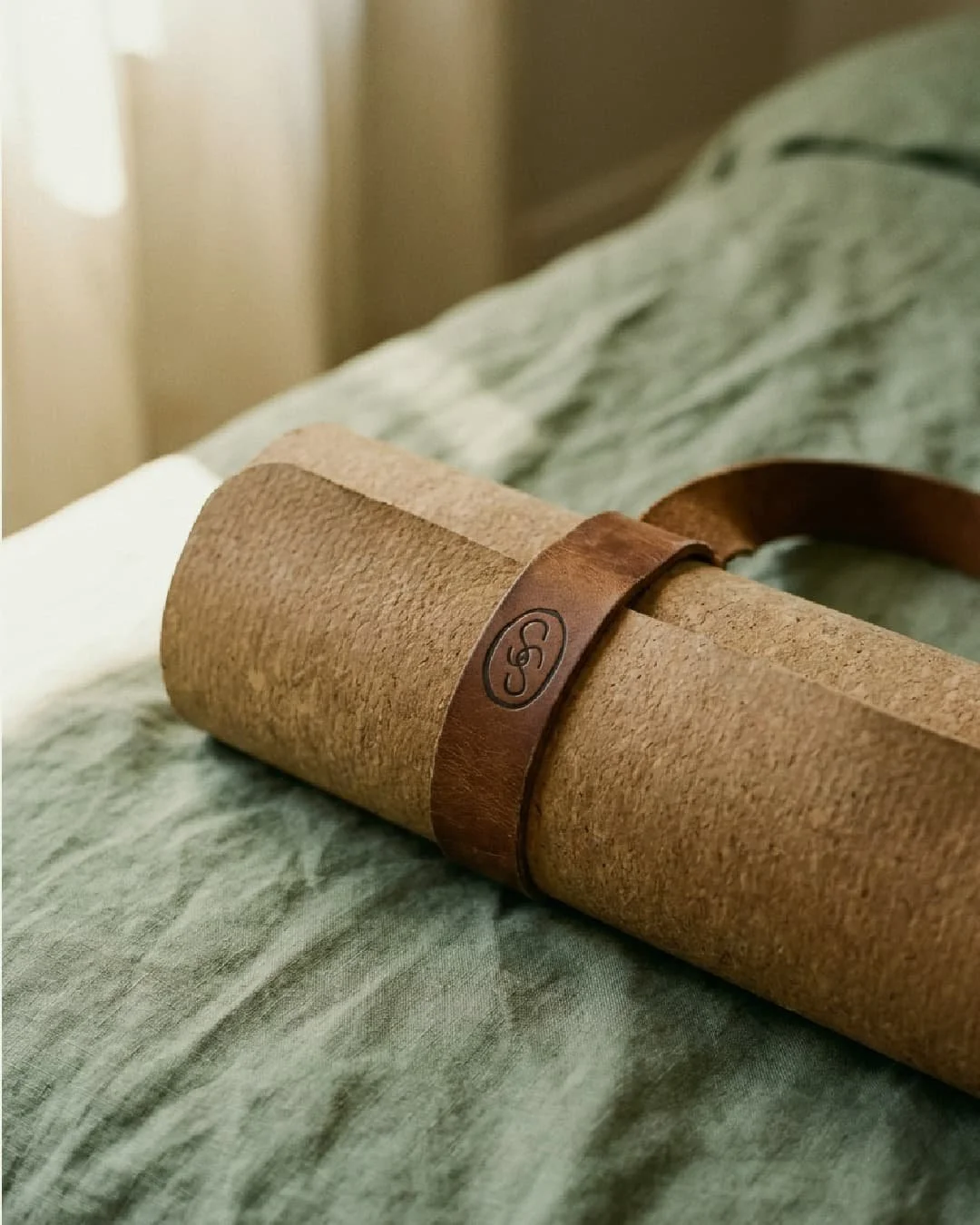
Three versions: the standalone SS monogram, the monogram contained within the O as a submark, and the full stacked wordmark.
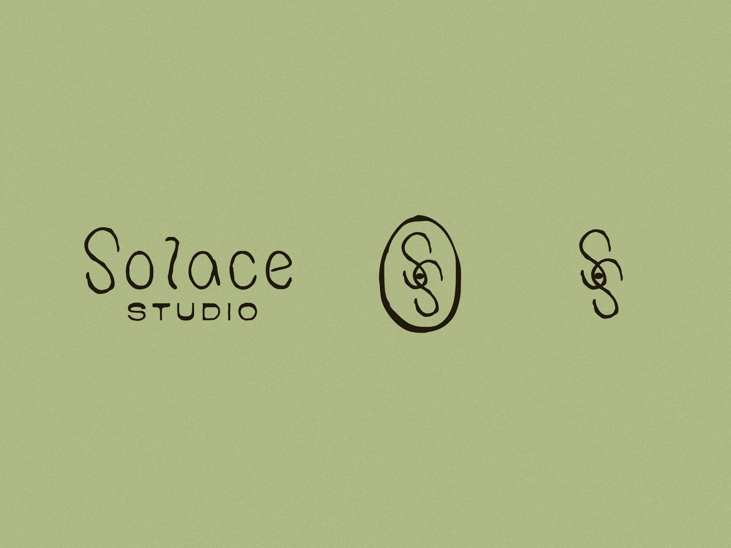
The Logotype
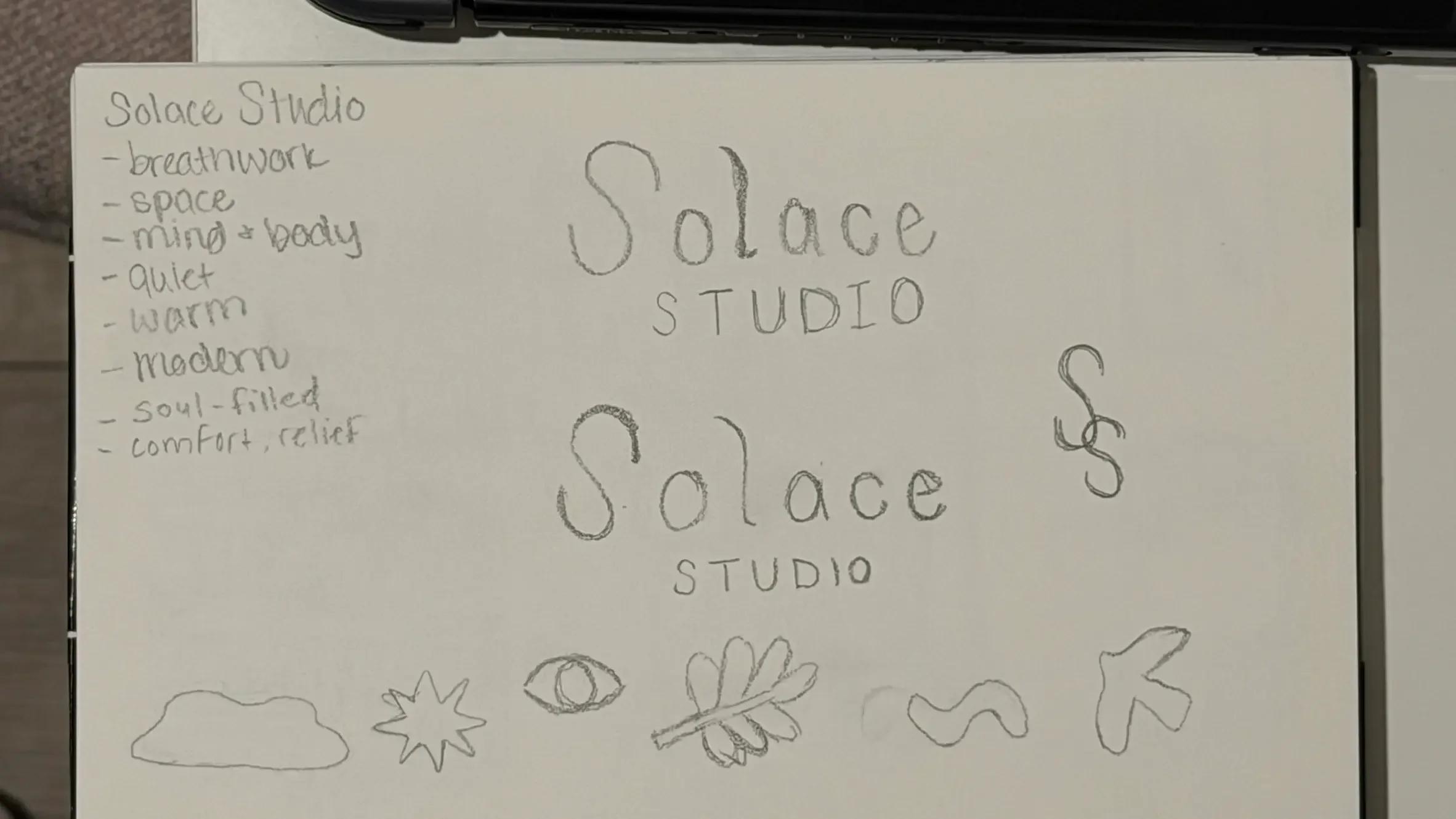
Fully hand-lettered. The letterforms were sketched by hand, built into a custom typeface pipeline — sketchbook to Procreate to Calligraphr to Illustrator — then roughed slightly to keep them feeling organic and alive.
STUDIO sits beneath in tight spaced caps, grounding the hand-drawn warmth with structure.
Nothing in the wordmark is cookie cutter. Everything was made by hand with intention — which is exactly what the brand is about.
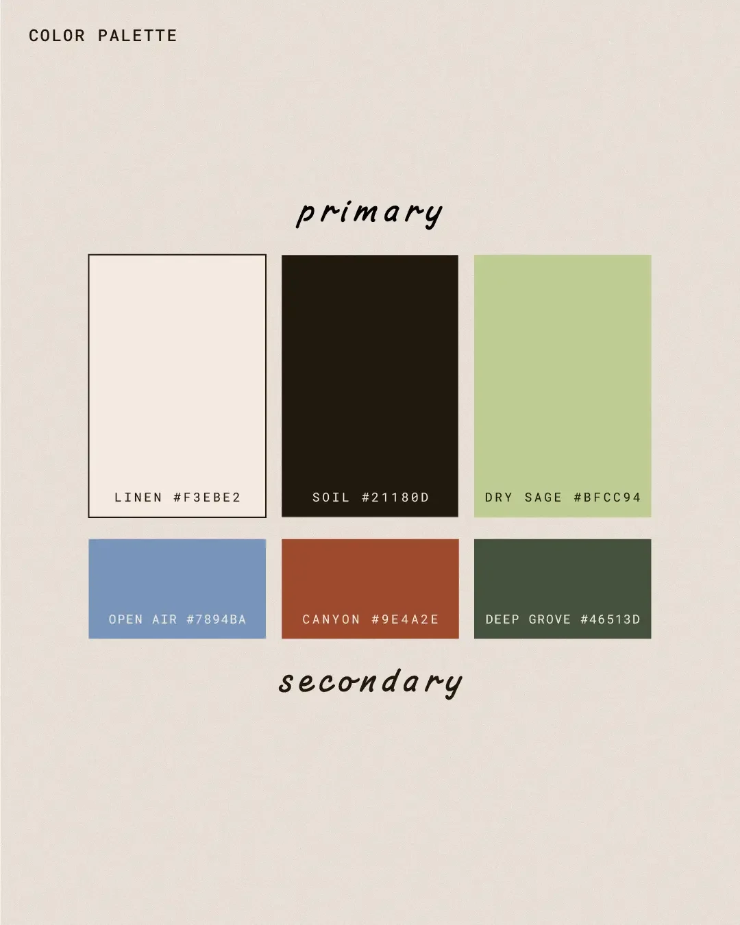
The Color Palette
The palette has more grit than a typical wellness moodboard. Linen and Soil anchor the system — warm cream and deep near-black, breathing room and weight. Dry Sage brings the earthy green without going muted. The secondary palette pushes further: Open Air is coastal denim blue, Canyon is weathered rust, Deep Grove is dark forest. Together they feel alive and bodily rather than aesthetically performing calm.
The Typography
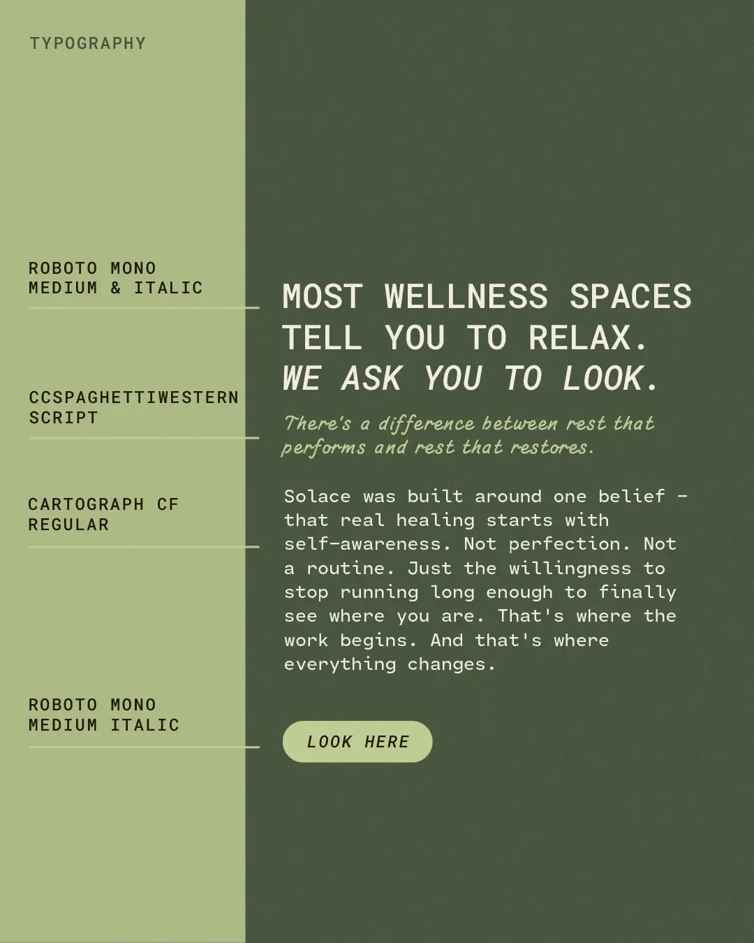
Roboto Mono Medium and Italic for headings — structured, monospaced, grounded. CCSpaghetti Western Script for subheadings — personality and warmth. Cartograph CF Regular for body copy. The pairing creates tension between structure and warmth that mirrors the brand itself. The system was demonstrated through live website copy: "Most wellness spaces tell you to relax. We ask you to look."
The Illustration System
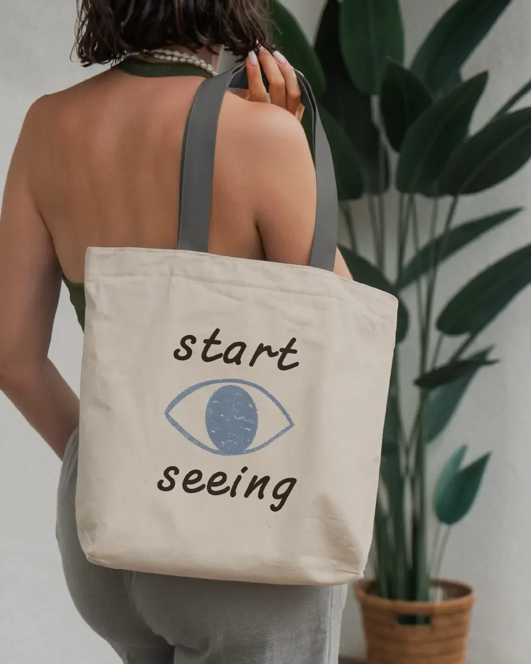
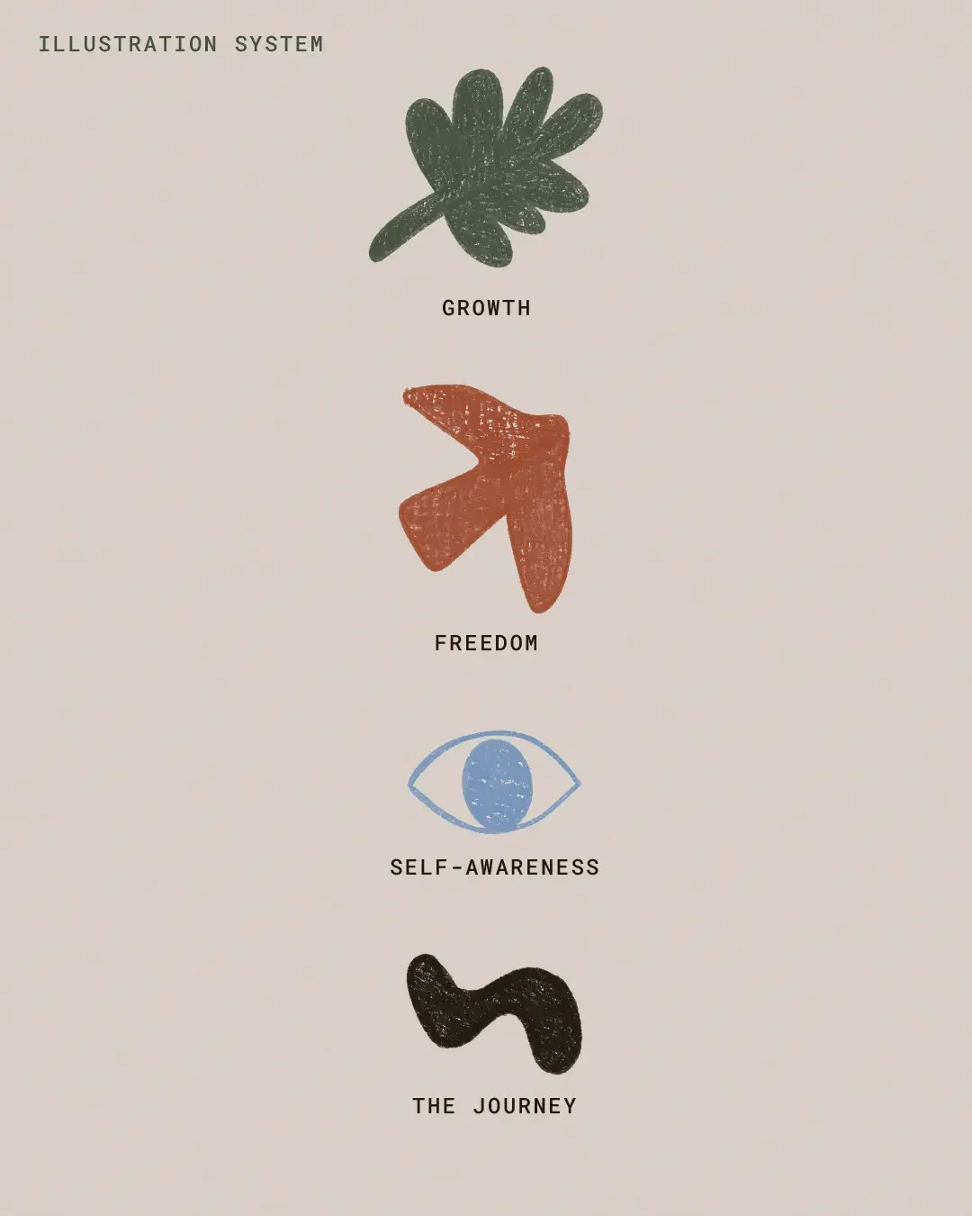
Four hand-drawn illustrations created in Procreate, each connected to a brand value. The leaf for Growth — the kind that happens quietly when conditions are finally right. The bird and arrow for Freedom — what's waiting on the other side of the work. The eye for Self-Awareness — the anchor illustration, the moment you stop and finally look. The S squiggle for The Journey — the non-linear, winding path of healing that also echoes the breath.
None of them are decorative. Each one means something specific to what Solace actually does.
The Mockups
The brand applied to a frosted glass studio door, a natural linen tote with the start seeing illustration, a cork yoga mat with the SS submark stamped on a brown leather strap, and lifestyle photography showing the mark in context. Every touchpoint carries the same feeling — quiet, intentional, and grounded.