LI Hydration
Brand Identity, Website, + Social Media
Role:
Creative Direction, Illustration, Logos, Branding, Guidelines, Website, Social Media
Brand’s Name:
LI Hydration
Location:
Amityville, NY
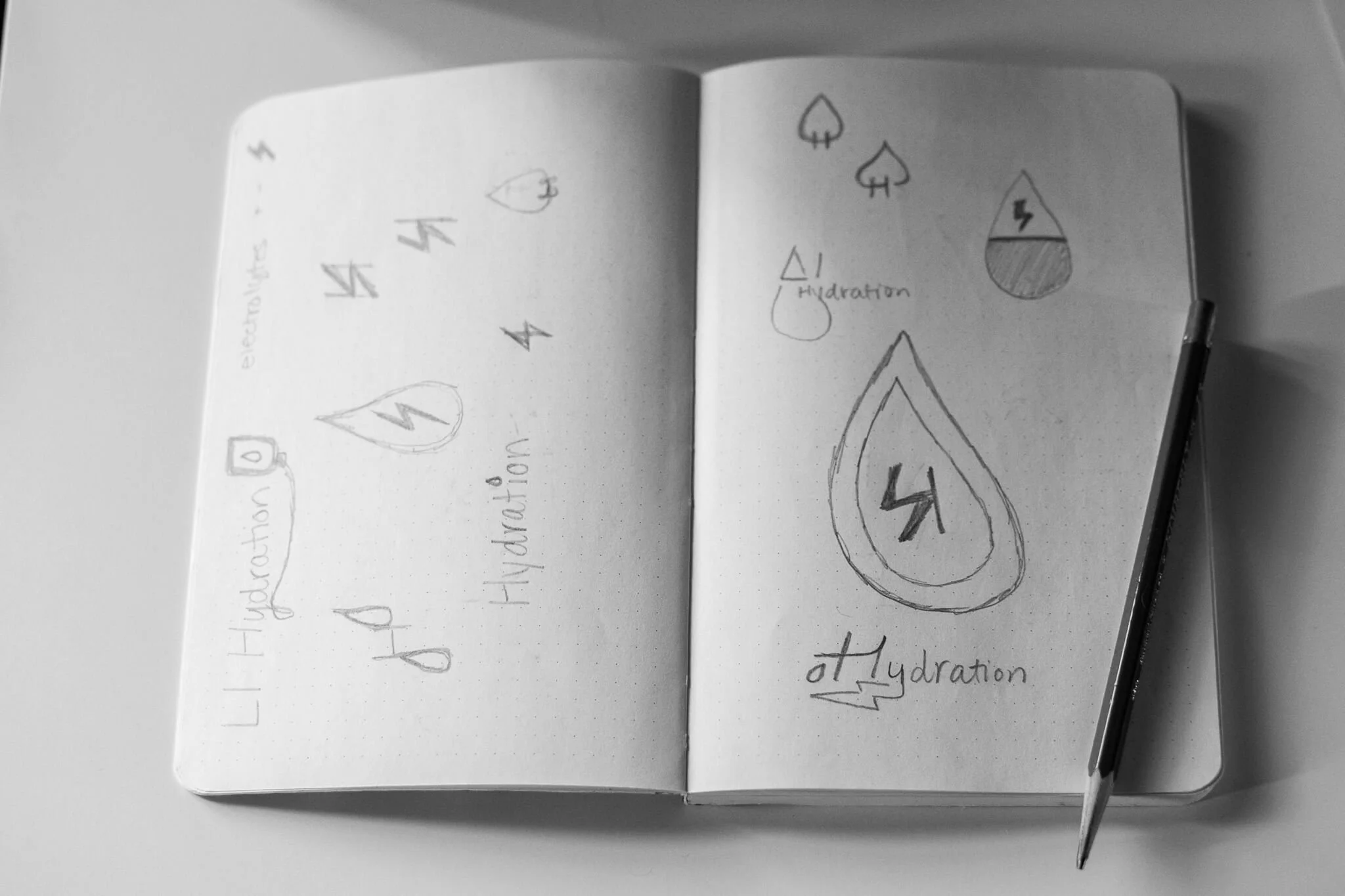
The Before Logo
The Story
When Lyne reached out, she had already started bringing the vision to life, but nothing fully felt aligned. Pieces created through Fiverr, Canva, and DIY efforts lacked the clarity and level of care behind the brand.
The goal was to create something that felt trustworthy, elevated, and approachable from the very first impression, especially for a fast-paced New York audience.
Paxton Creative Co. stepped in to build a cohesive brand and website from the ground up. The result is a visual identity that reflects the heart of the business and supports its growth moving forward.

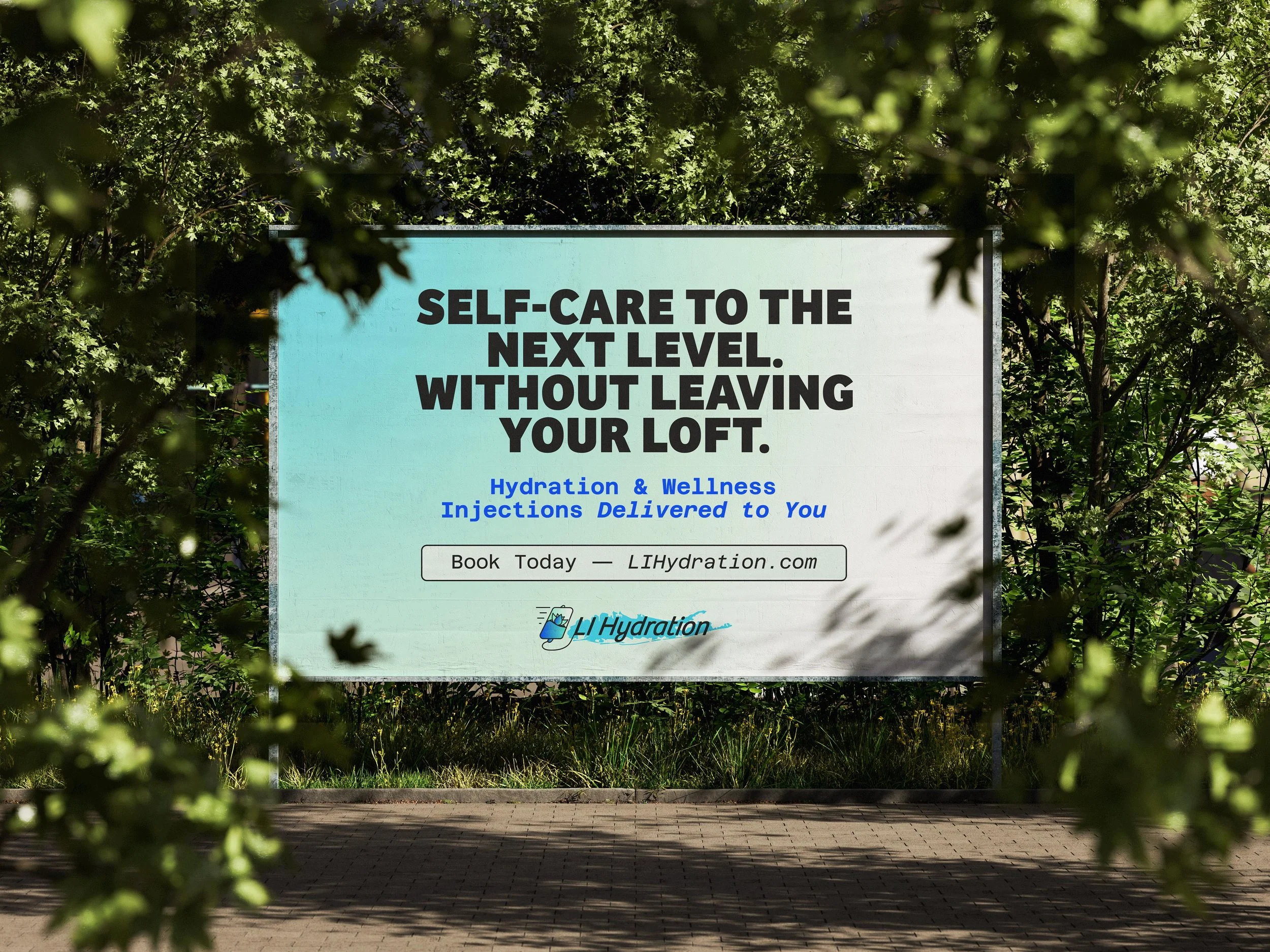
About the Project
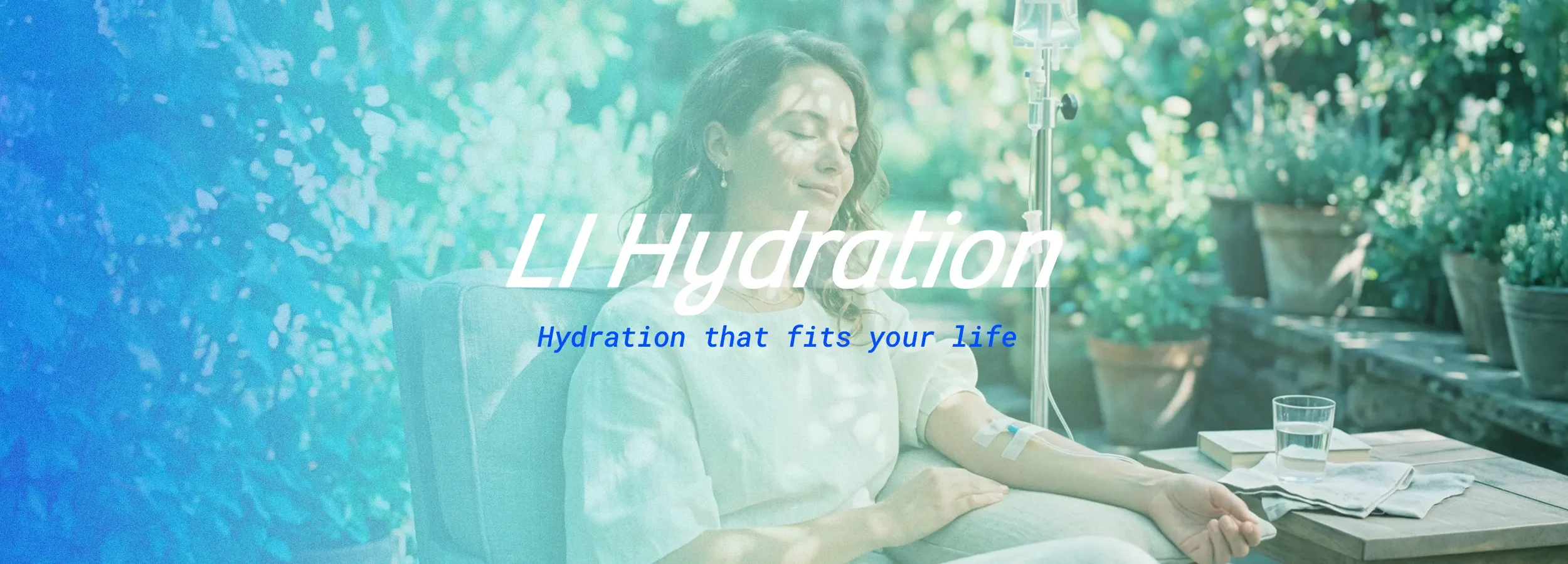
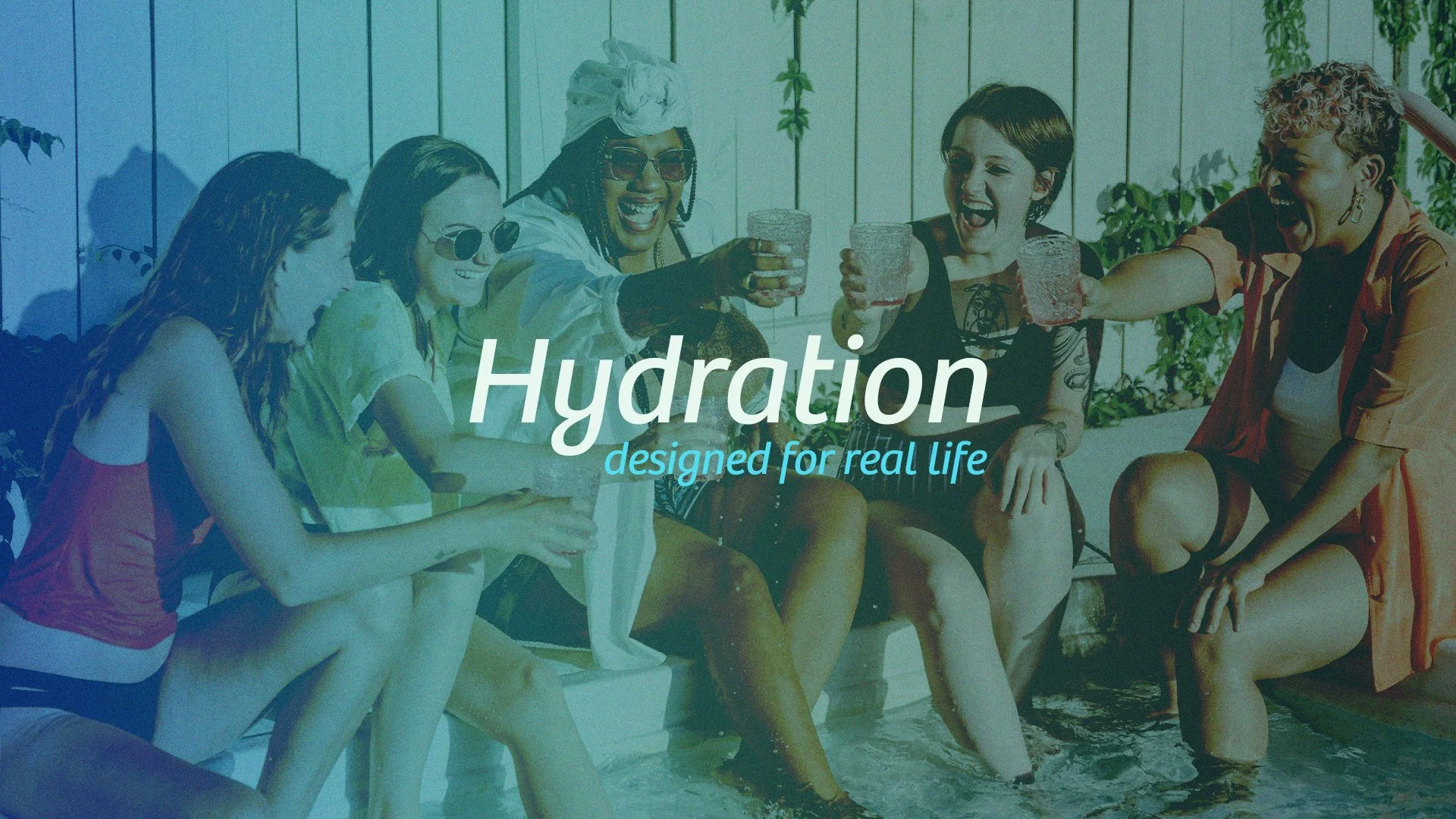
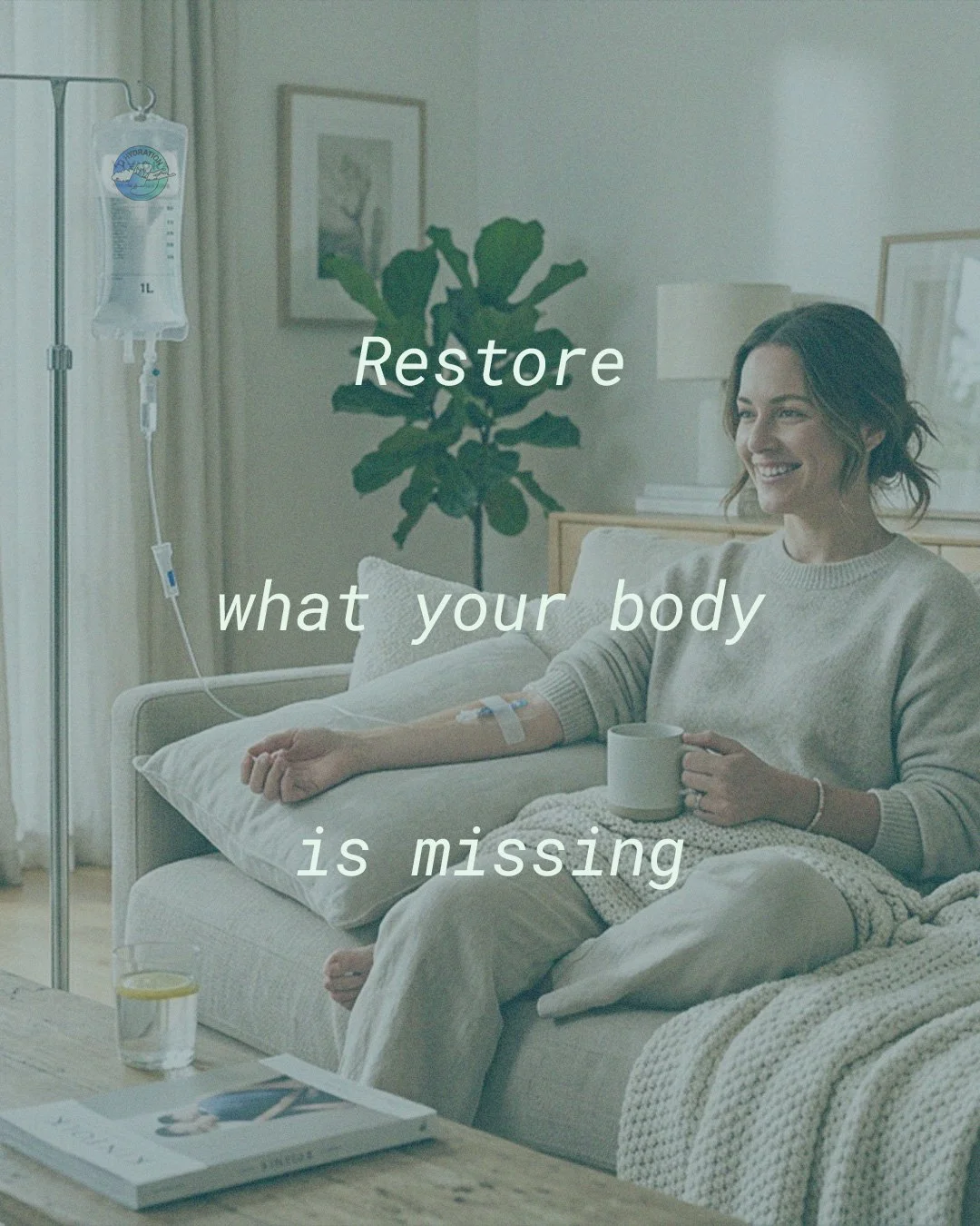
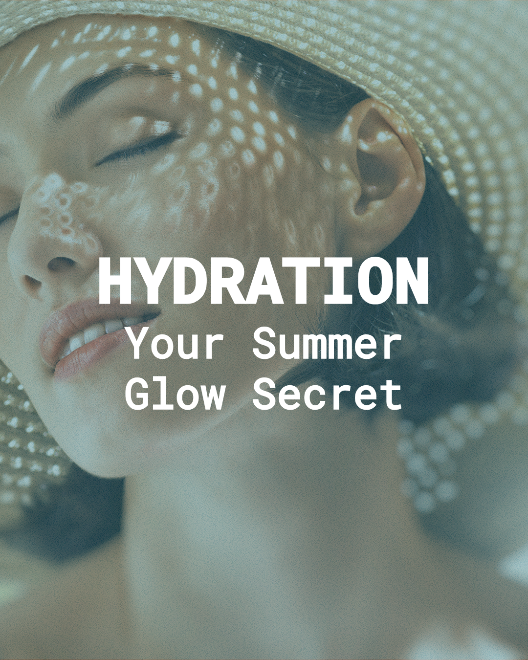
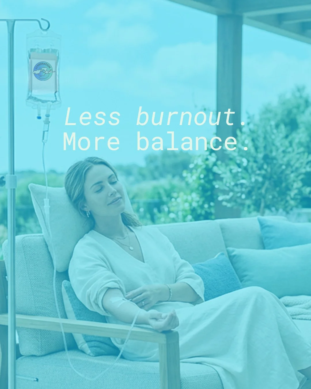
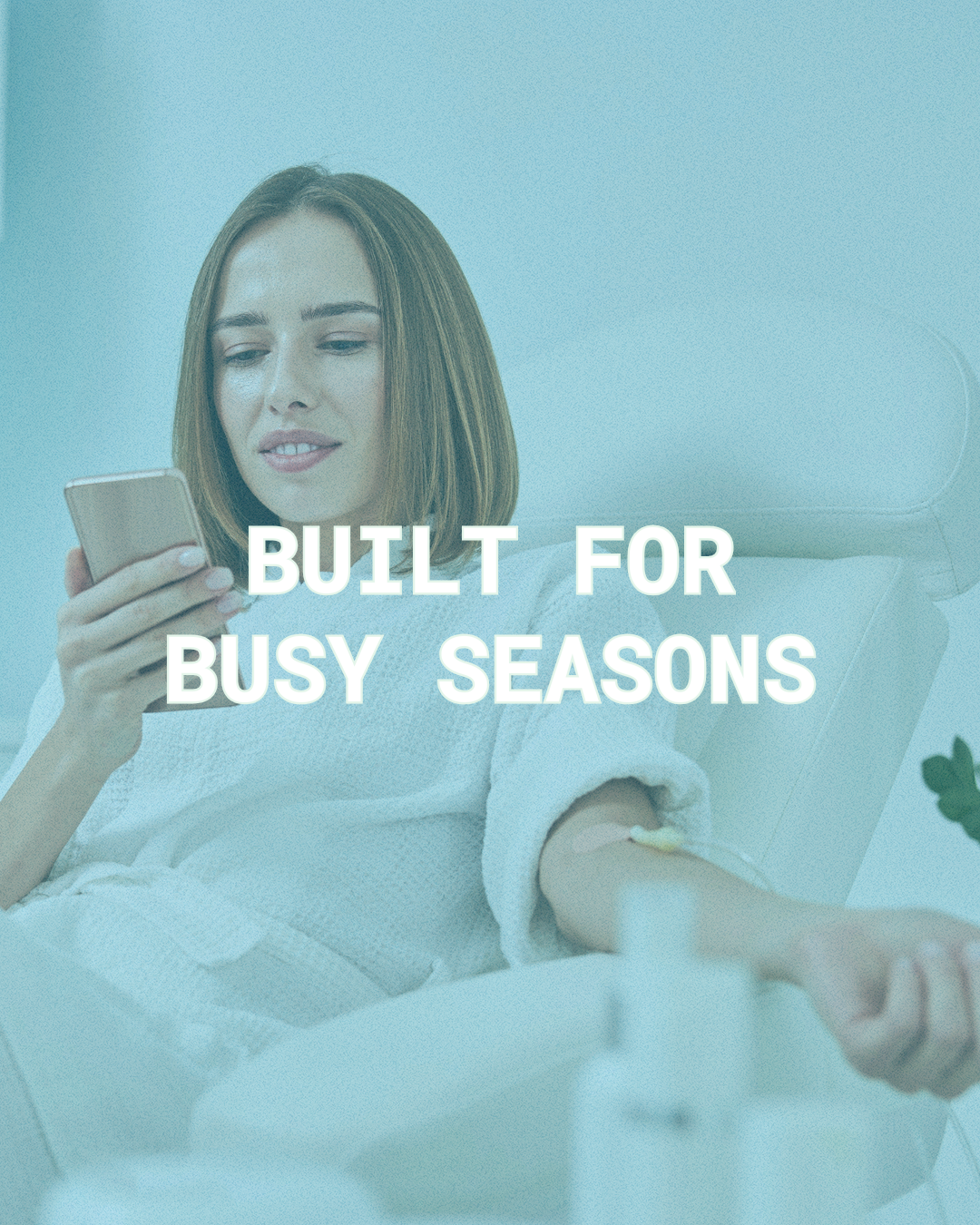
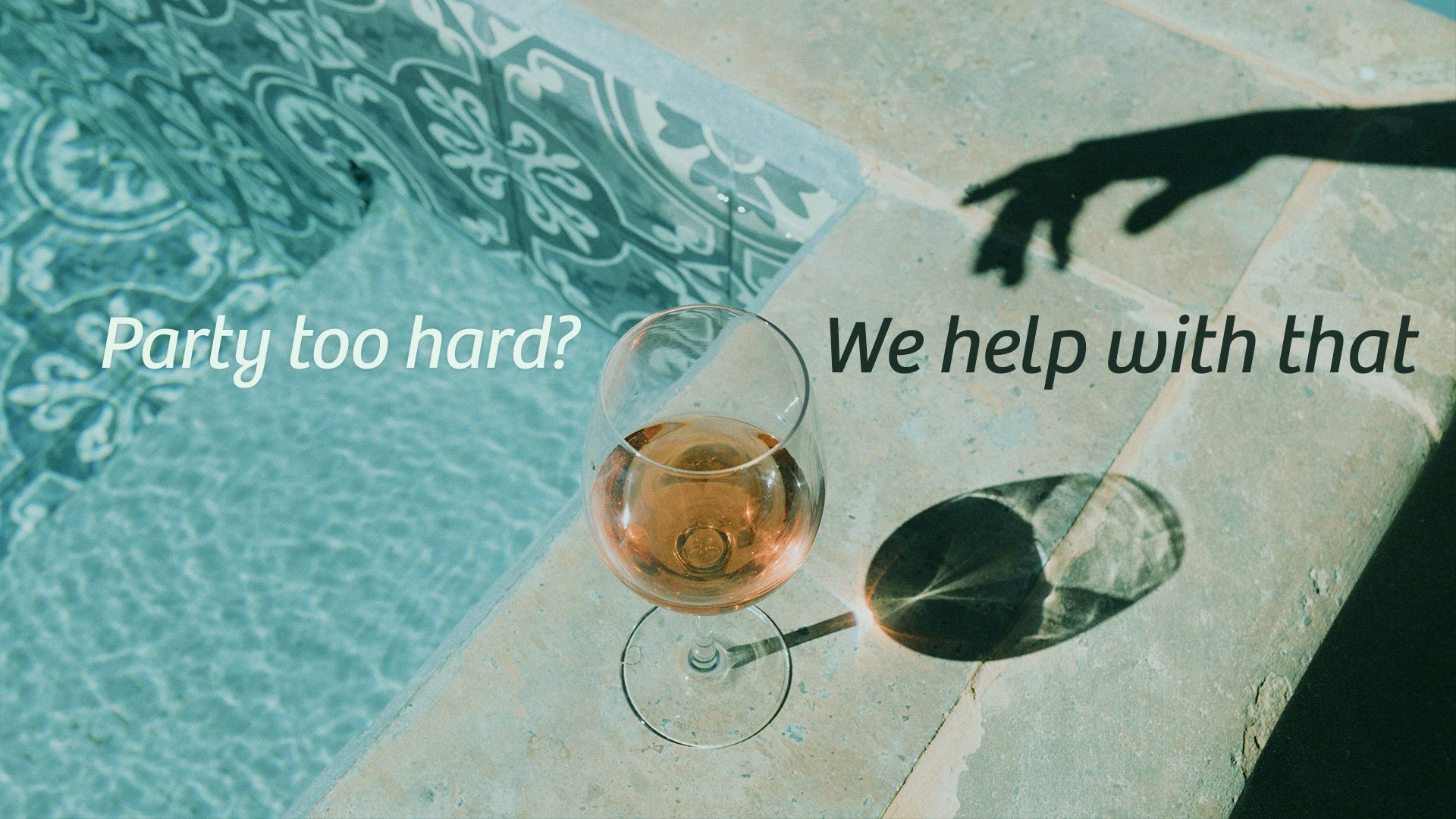
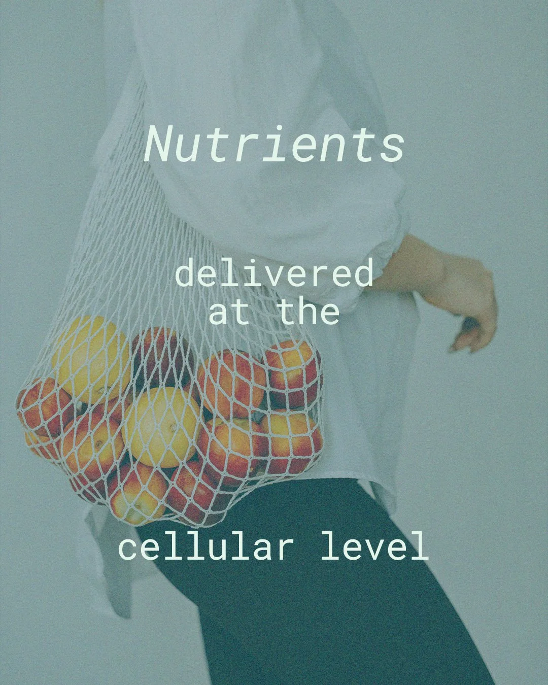
LI Hydration was built on more than clinical care. It was built on compassion and a desire to help people feel better in their bodies again. Founded by Lyne Gibbs, a registered nurse and wellness specialist, the brand serves clients across Long Island and New York City. It was created to support people through busy seasons, burnout, and everyday life. The focus is simple. Provide high-quality care that feels both professional and deeply personal.


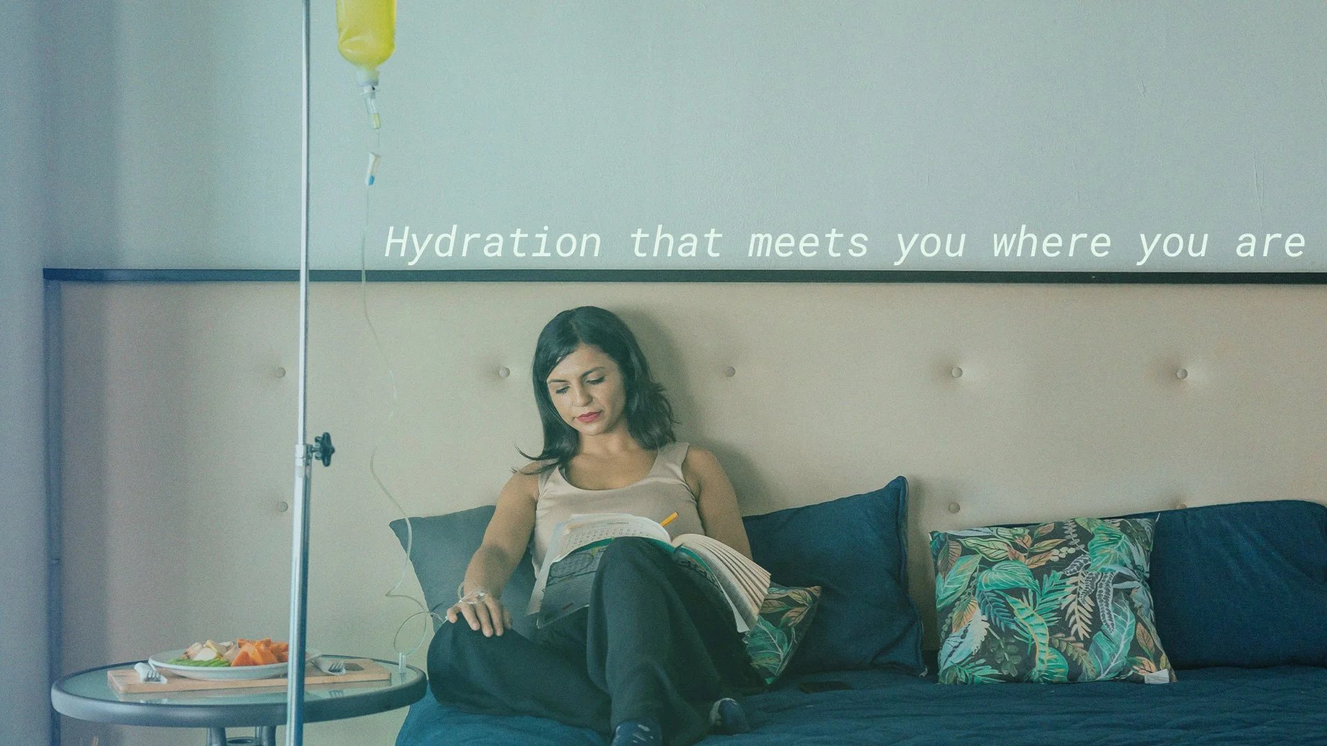
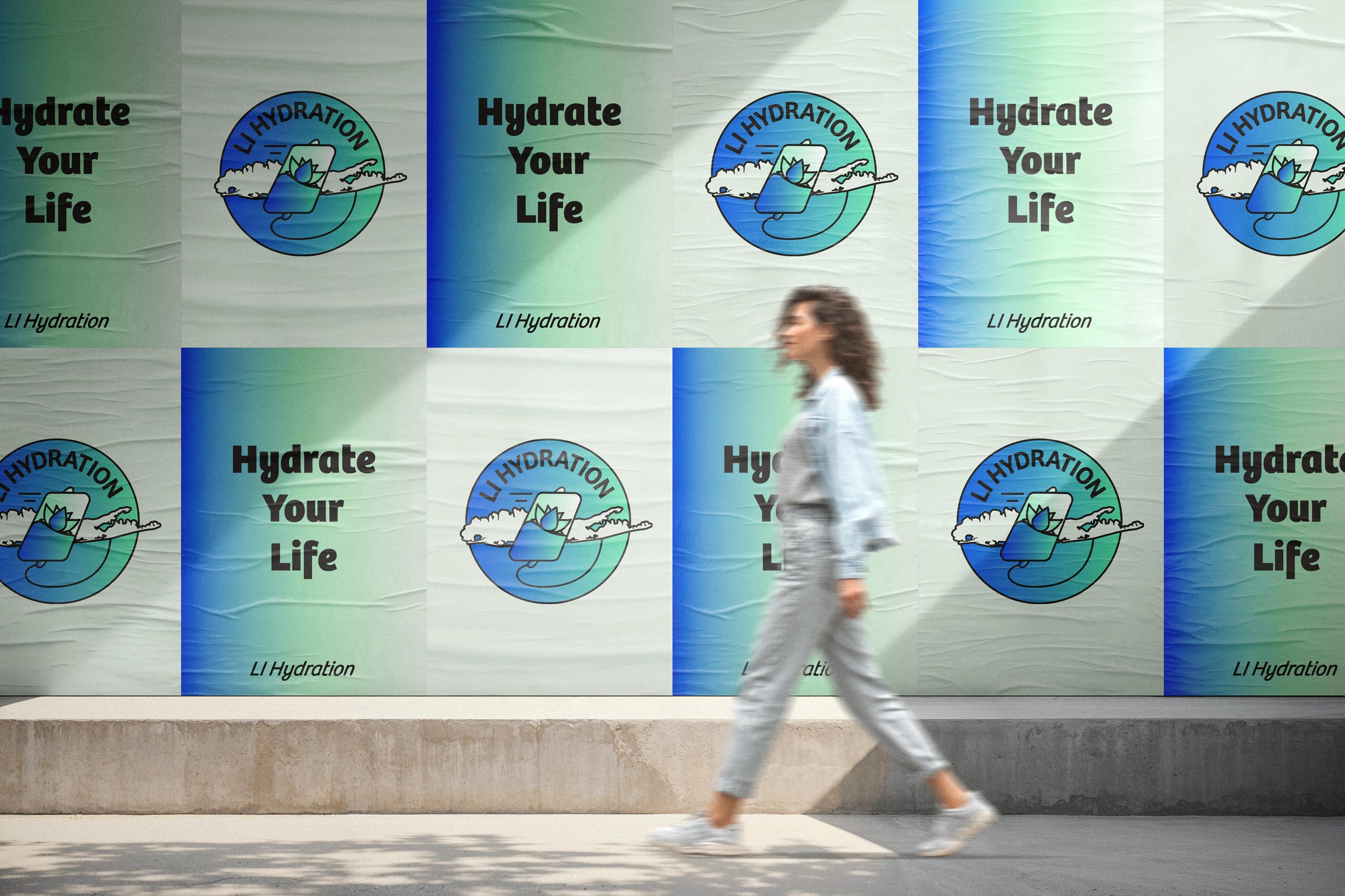
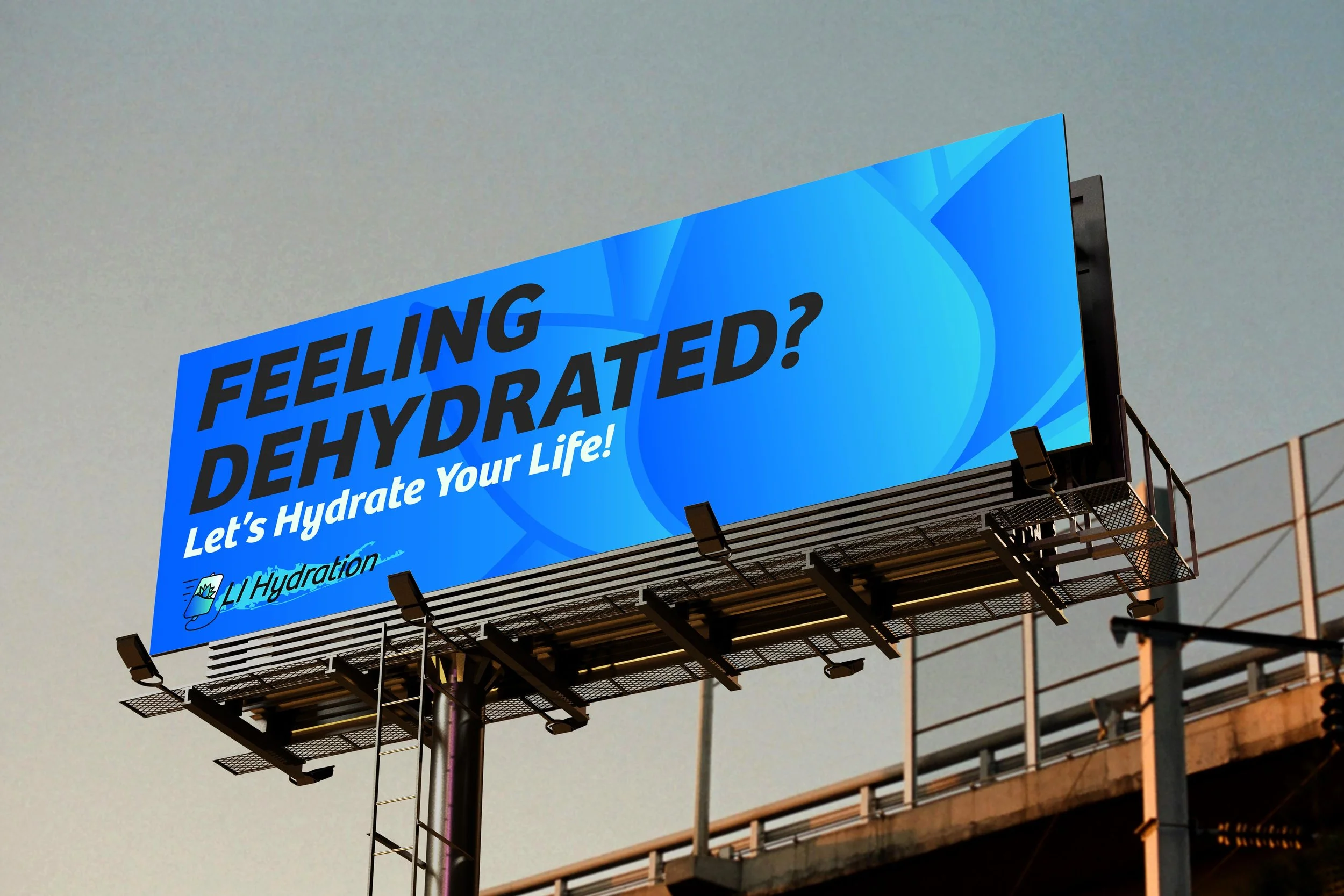
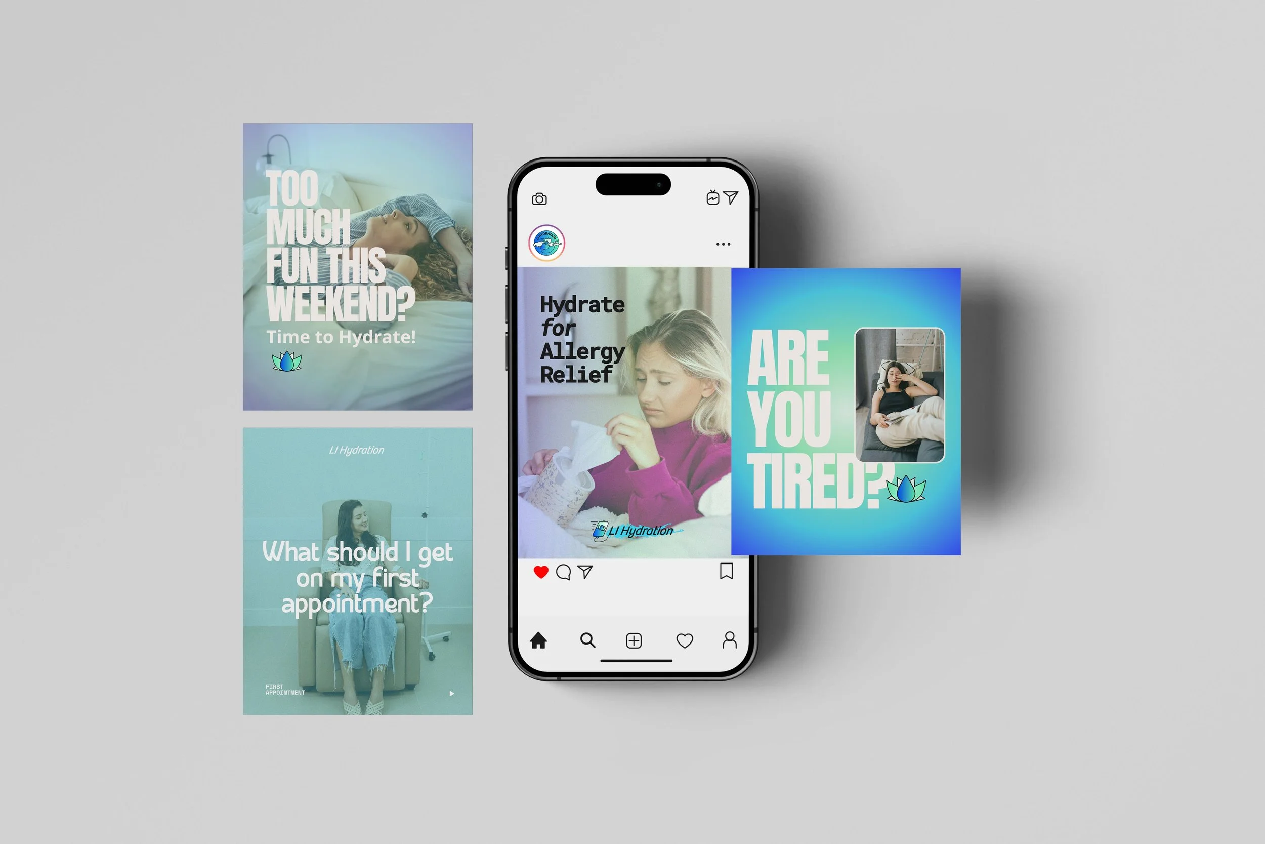
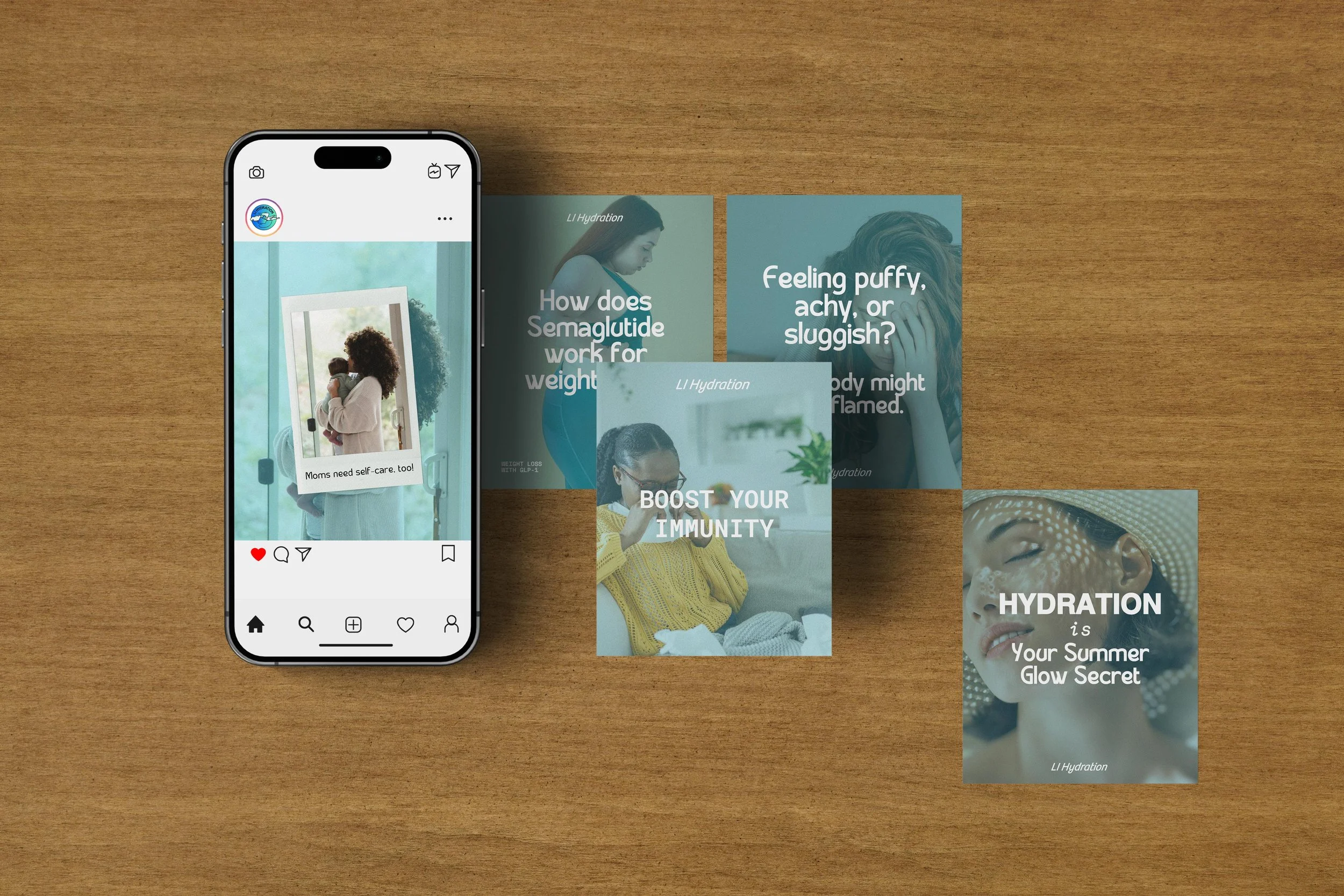
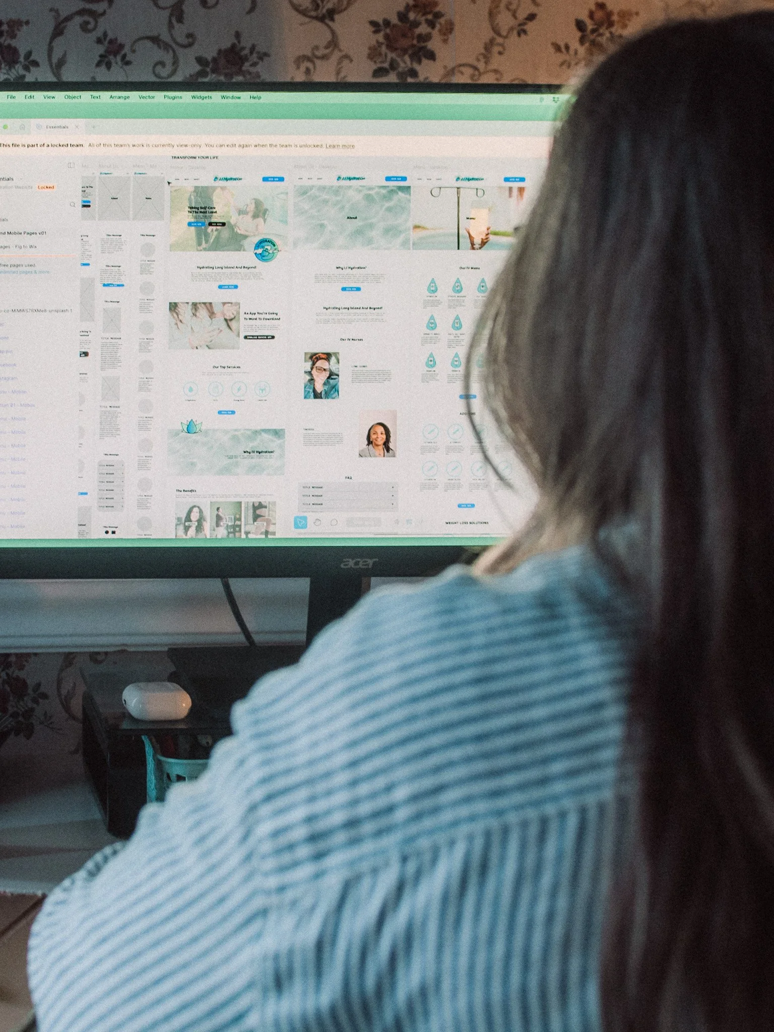
Website Experience
Paxton Creative Co brought the LI Hydration brand to life online with a calm, wellness-driven design that feels both elevated and easy to navigate. Each page was designed to guide users naturally, with clear calls to action and a layout that supports quick, confident booking.
The Homepage, About, Menu, and Contact pages were built as a flexible foundation, allowing the brand to grow without losing clarity. While booking is handled through a third-party system, the experience remains seamless from start to finish.
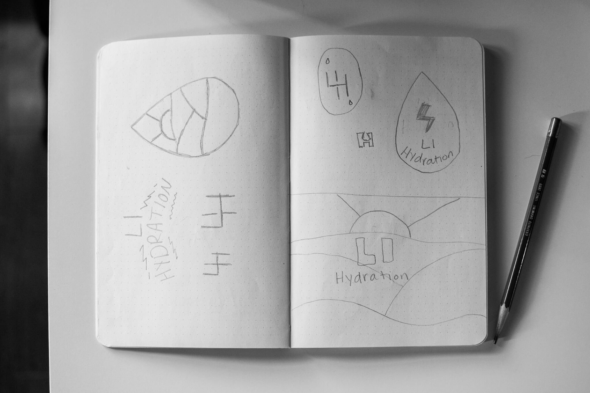
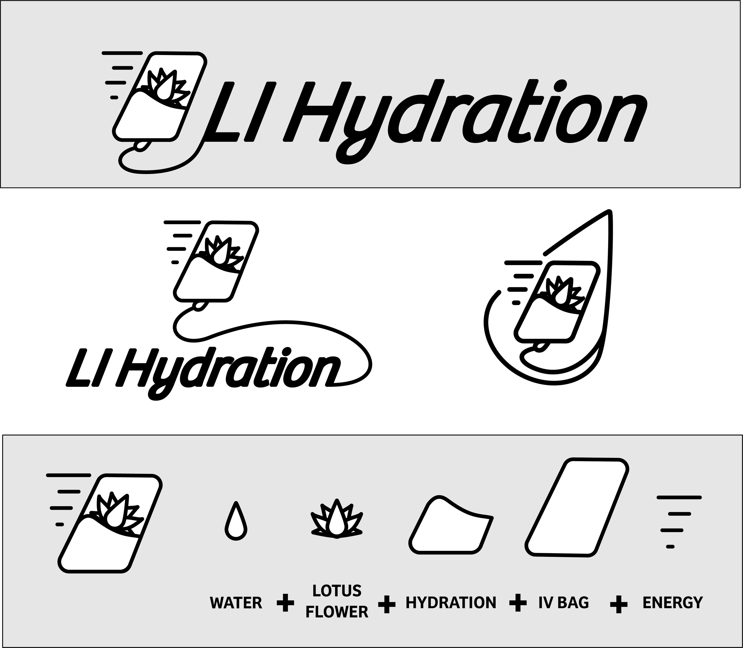
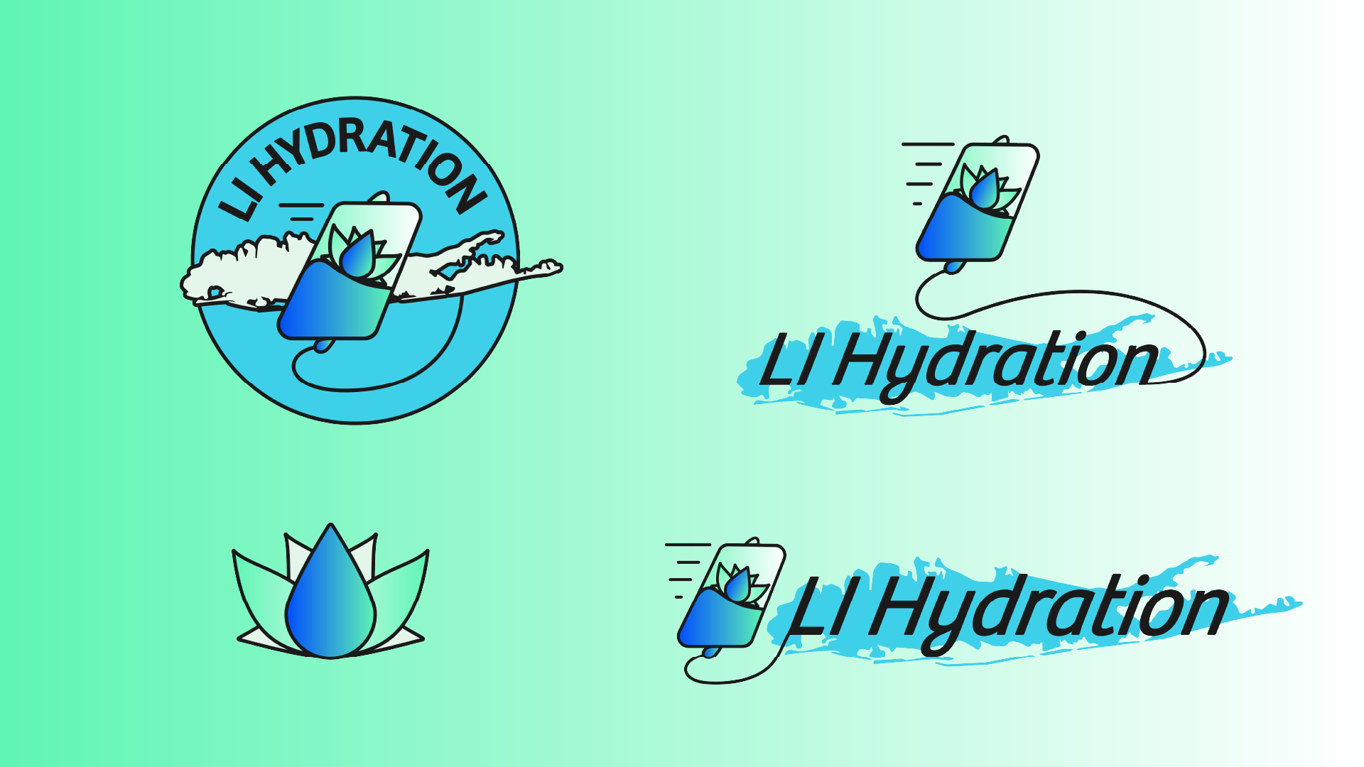
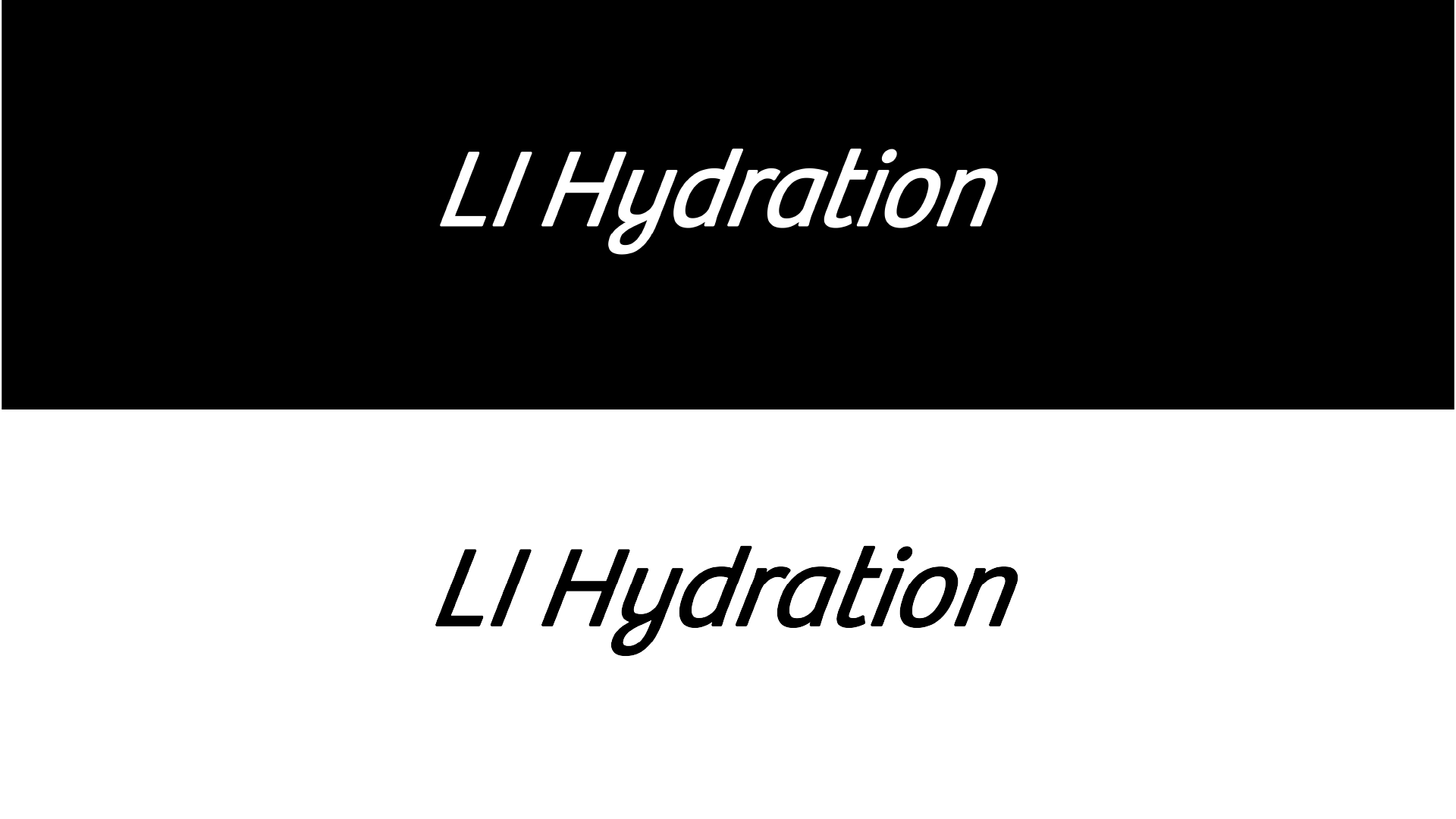
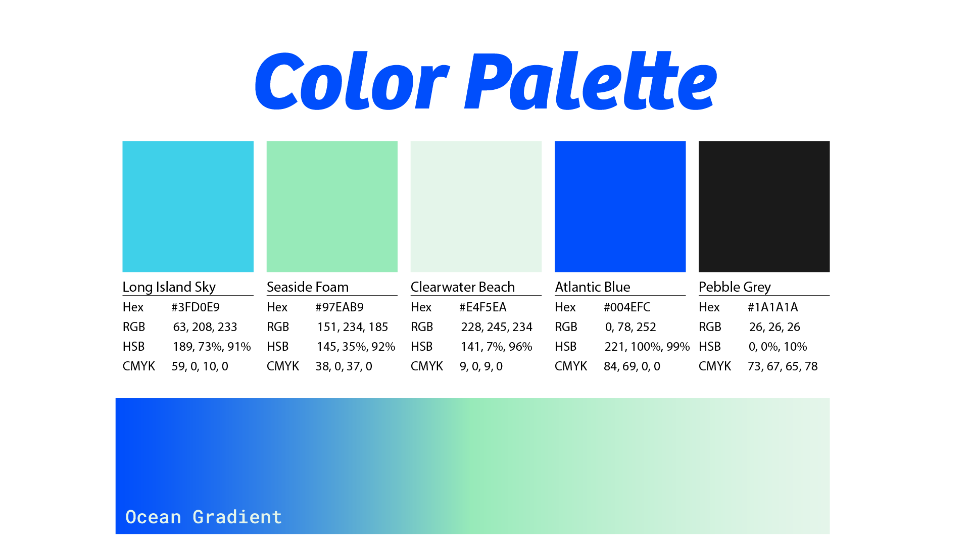
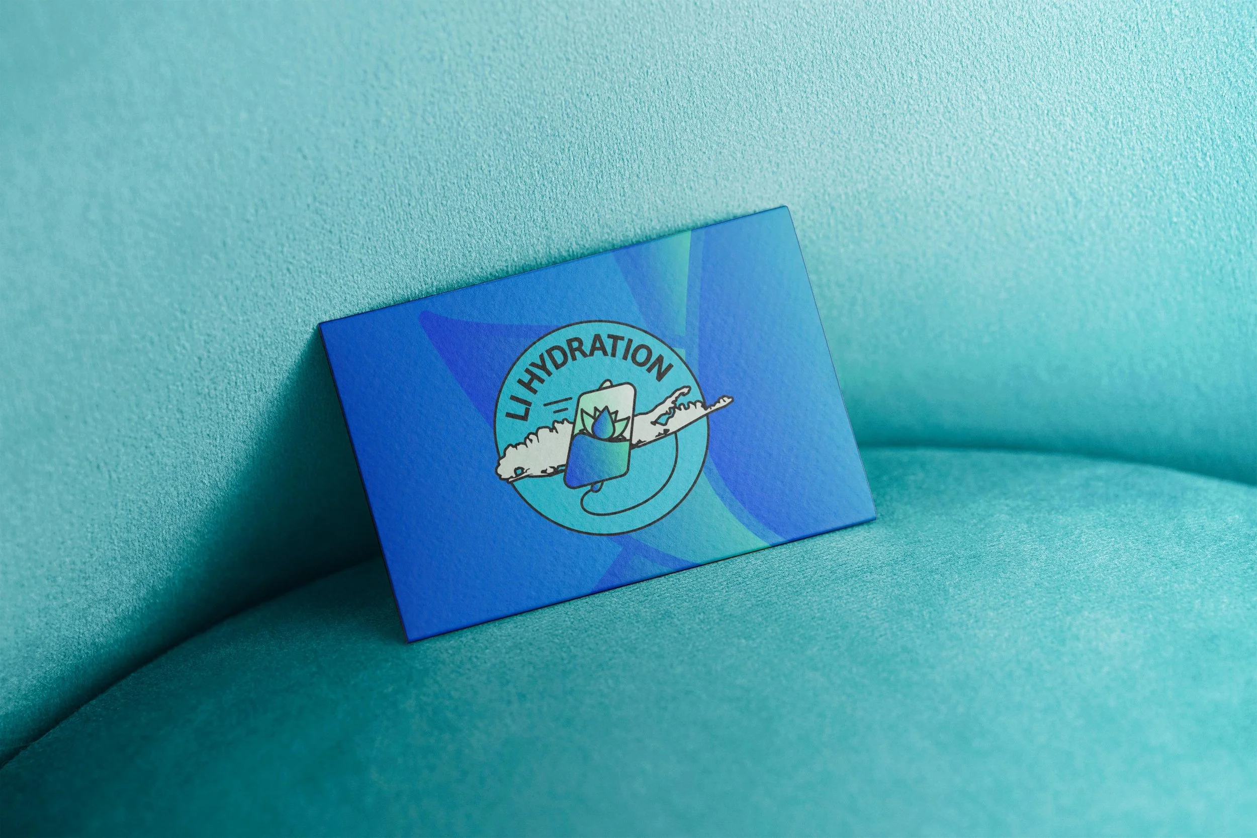
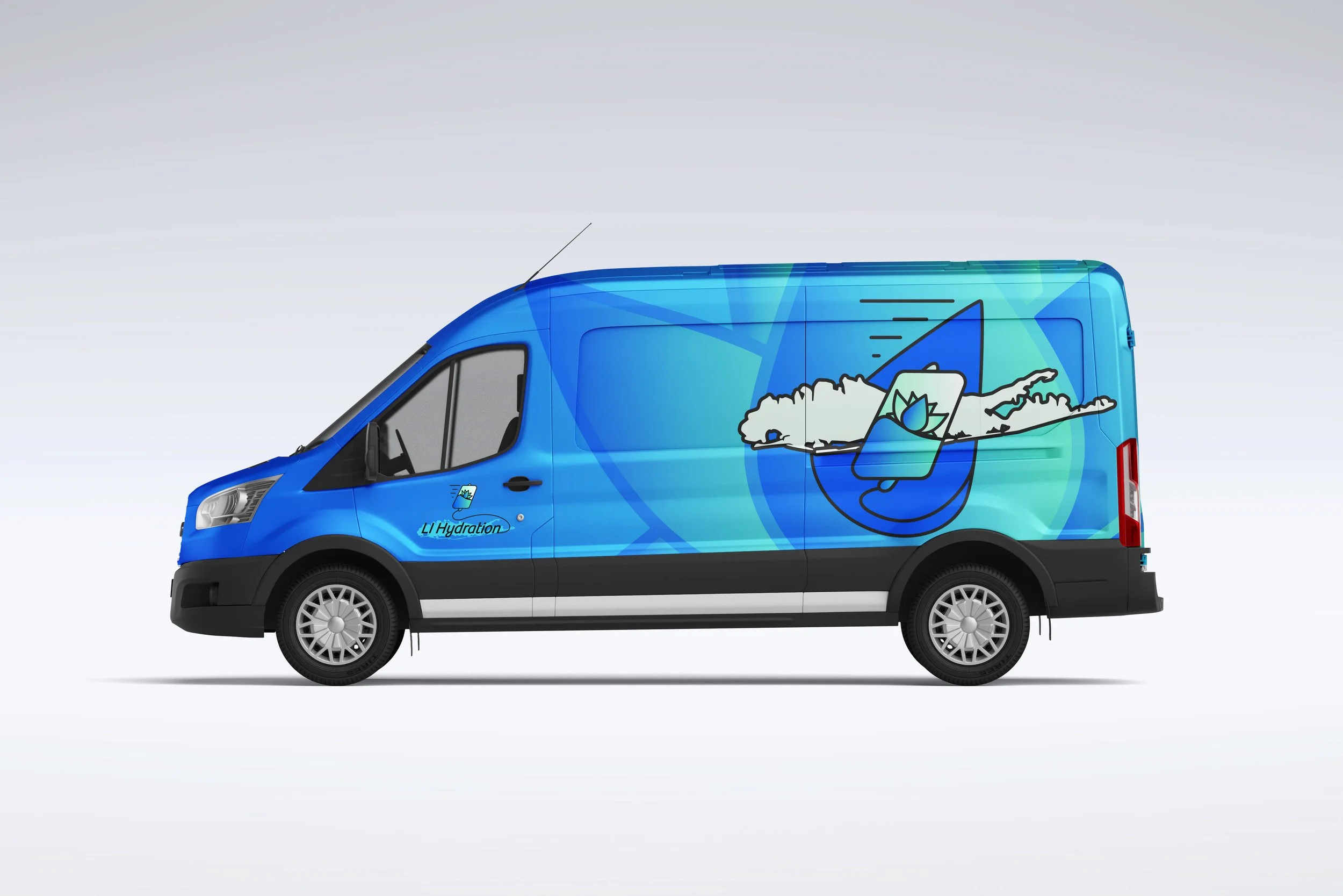
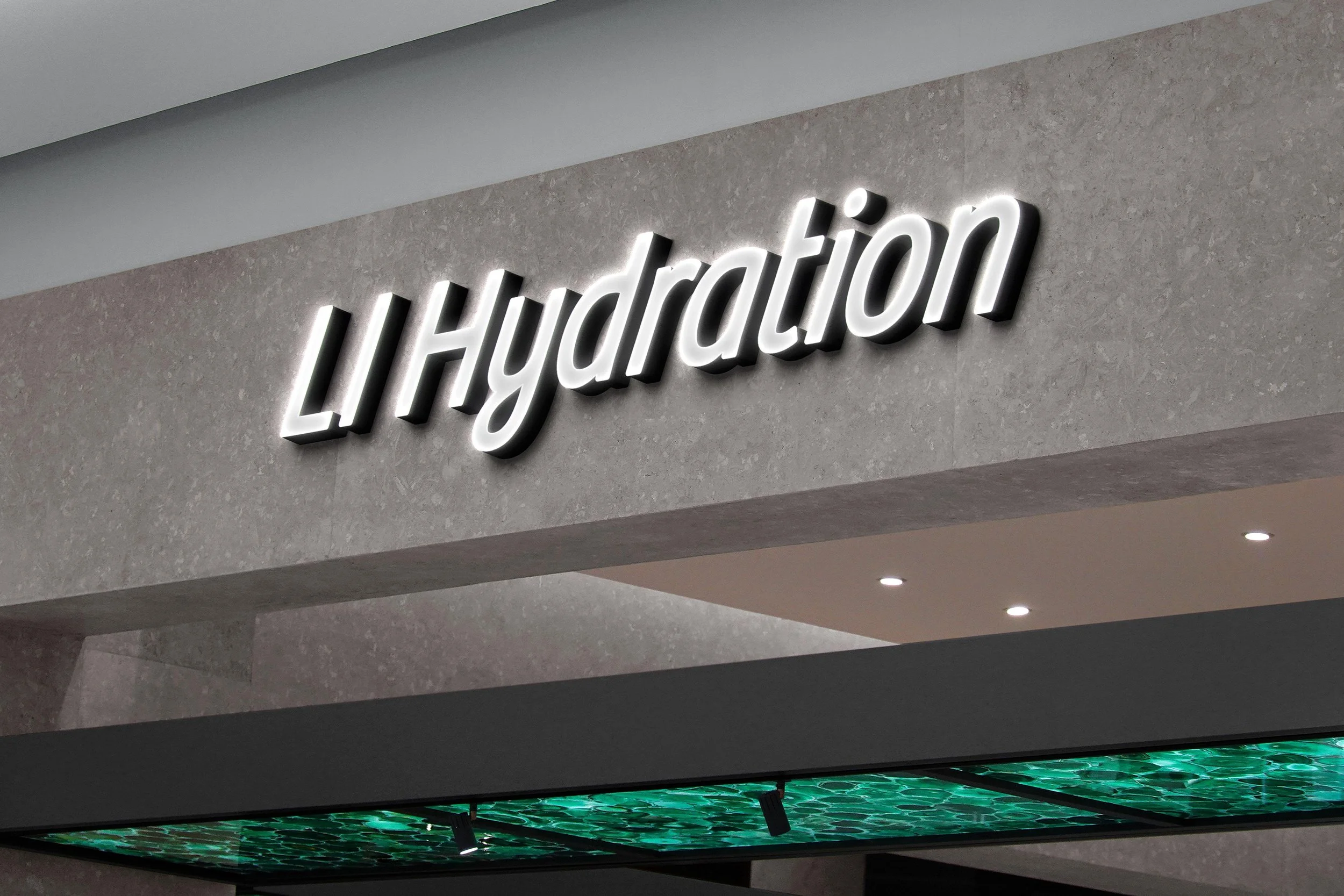
Logo Suite
The LI Hydration logo suite was designed to reflect both care and movement.
A central water droplet represents hydration at its most essential level, held within a lotus-inspired form that speaks to restoration and balance. The subtle tilt of the mark draws from the shape of an IV bag, adding a sense of motion and energy. It also offers a quiet nod to Long Island, grounding the brand in the community it serves.
The result is a mark that feels fluid, grounded, and deeply connected to the purpose behind the brand.
Founder at LI Hydration
Lyne Gibbs


Clarity builds trust. Strategy builds growth.
Your brand should do both. Whether you’re launching something new or finally ready for a brand that reflects the heart of what you do — I’m here to help you bring it to life with strategy, storytelling, and design that actually works.
Let’s build a brand that looks good — and moves people.