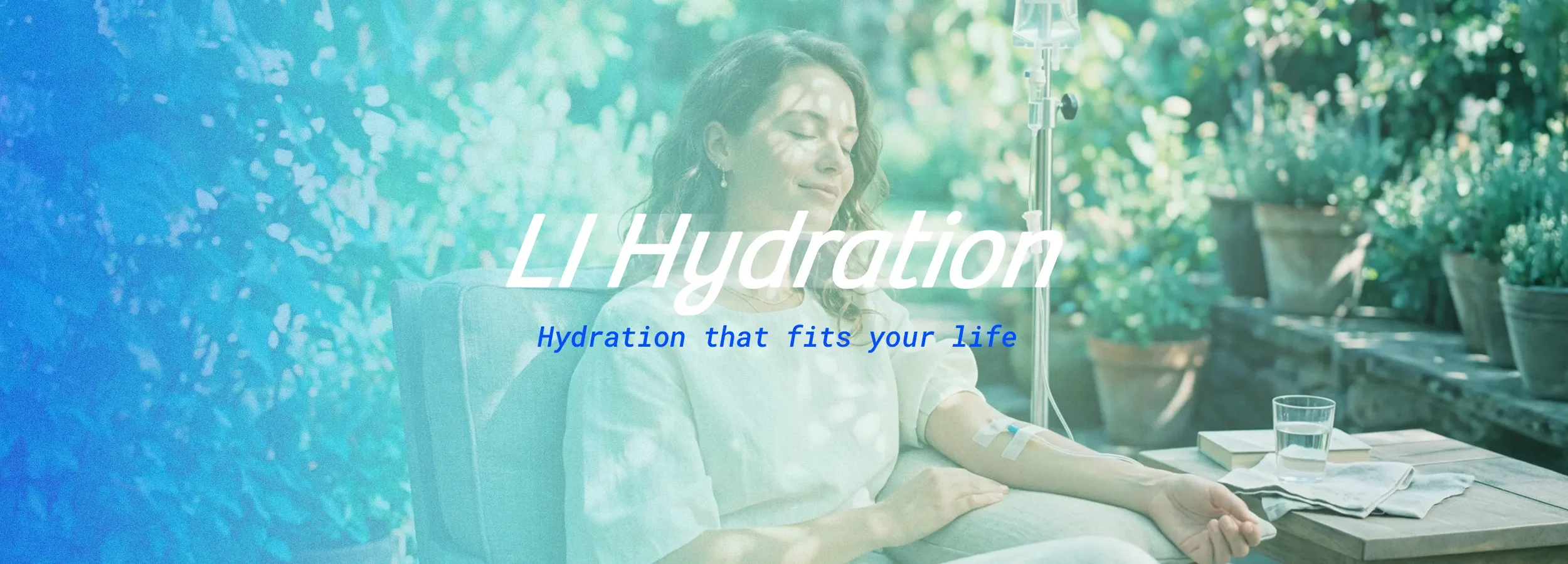
Branding + Website · Long Island, NYLI Hydration
A wellness brand built to feel less clinical and more like an extension of everyday life.
I created a full brand identity and website for LI Hydration, a mobile IV hydration and wellness service serving Long Island and New York City.
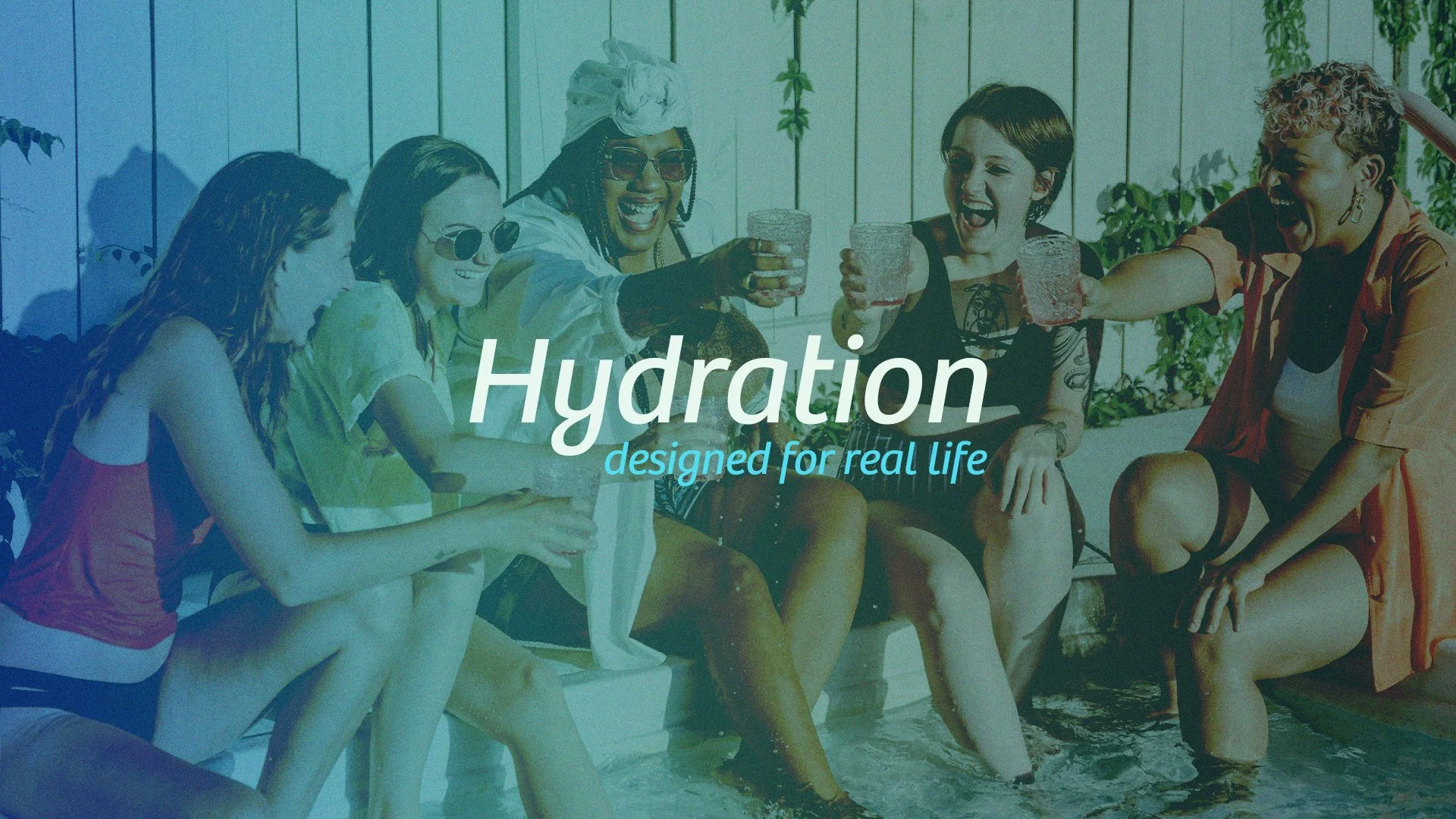
The goal was to build something that felt calm, trustworthy, and easy to step into, while reflecting the level of care behind the experience. The brand needed to feel less clinical and with a splash of fun and more of an extension of everyday wellness.
The Story
LI Hydration is a wellness brand rooted in holistic care and the belief that feeling good shouldn't be complicated. Founded by Lyne Gibbs — a registered nurse with a heart for people — the vision was always clear: bring high-quality IV hydration and wellness to Long Island and New York City in a way that felt as warm as it did credible.
She just needed a brand that could carry that vision.
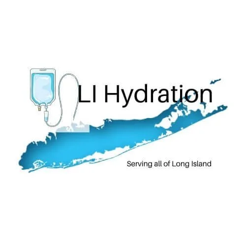
Before Logo
The Problem
Lyne had spent months trying to piece something together — hiring designers on Fiverr, building in Canva, trying to make things work. But nothing captured the level of excellence she held or the warmth behind what she was building. The early branding lacked cohesion and credibility, and for a wellness brand asking people to trust her with their health, that gap mattered.
The Direction
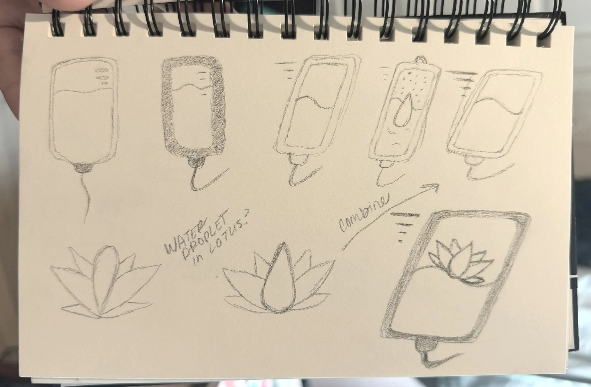
The goal was to hold a balance between feeling credible enough to be trustworthy and warm enough to feel human. Starting with the brand's core nouns — water, energy, lotus, IV bag, droplet — I explored marks that felt fluid and rooted at the same time. The sketch that sparked everything was simple: a lotus flower nestled inside the shape of an IV bag. Natural, intentional, and unmistakably hers.
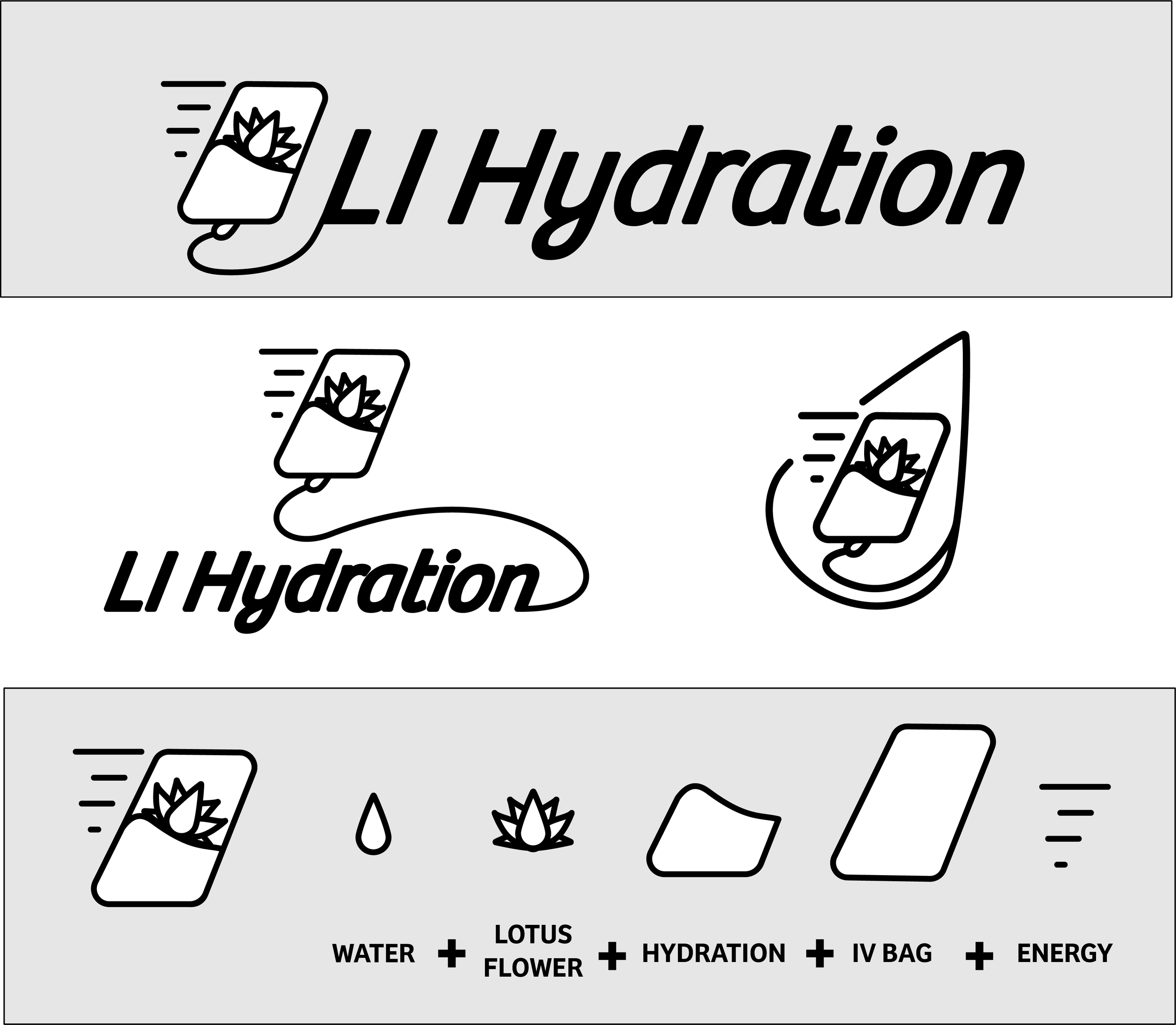
The First Concept
The first concept landed well. Lyne loved the direction — the lotus, the movement, the IV bag, and the feeling it carried. But her feedback was specific: she wanted Long Island represented in the mark. Not just in the name, but visually.
That was a real design challenge. Long Island has a distinct shape, but fitting it cleanly into a wellness mark without it feeling forced or cluttered wasn't obvious.
The challenge was that Long Island's outline is irregular and elongated — not a shape that naturally fits inside a clean wellness mark without overwhelming everything around it. Making it feel intentional rather than cluttered took patience.
Brand Design
The LI Hydration mark was built to do two things at once: earn trust and feel familiar. For a wellness brand asking people to invite care into their bodies, the design couldn't afford to feel cold or generic. It needed to feel like it belonged to Long Island — and to the people who live there.
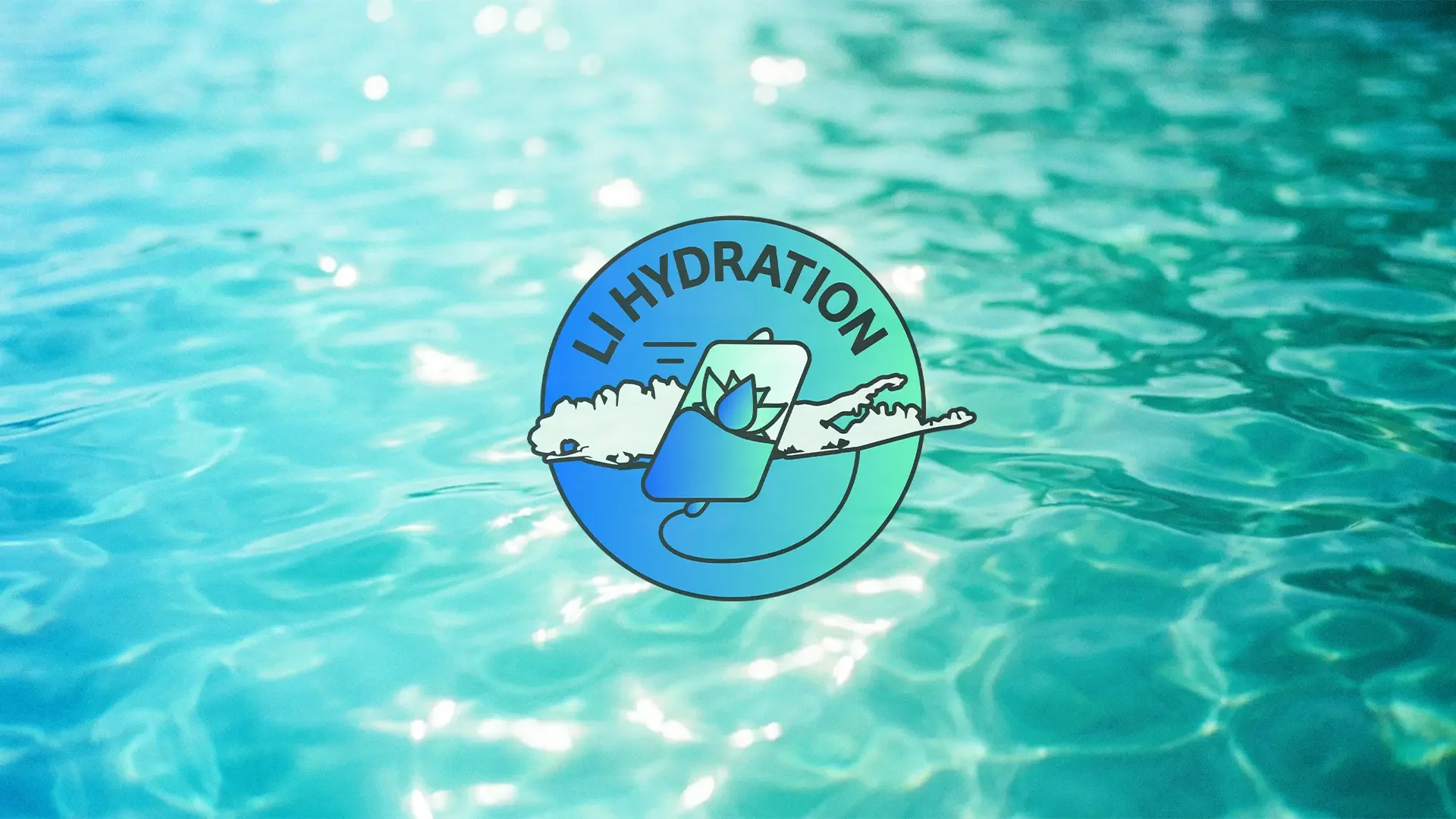
The Long Island outline does something no abstract mark could. It gives locals an immediate point of connection — a shape they recognize before they even read the name. It says this brand is for here, for us, for this place.
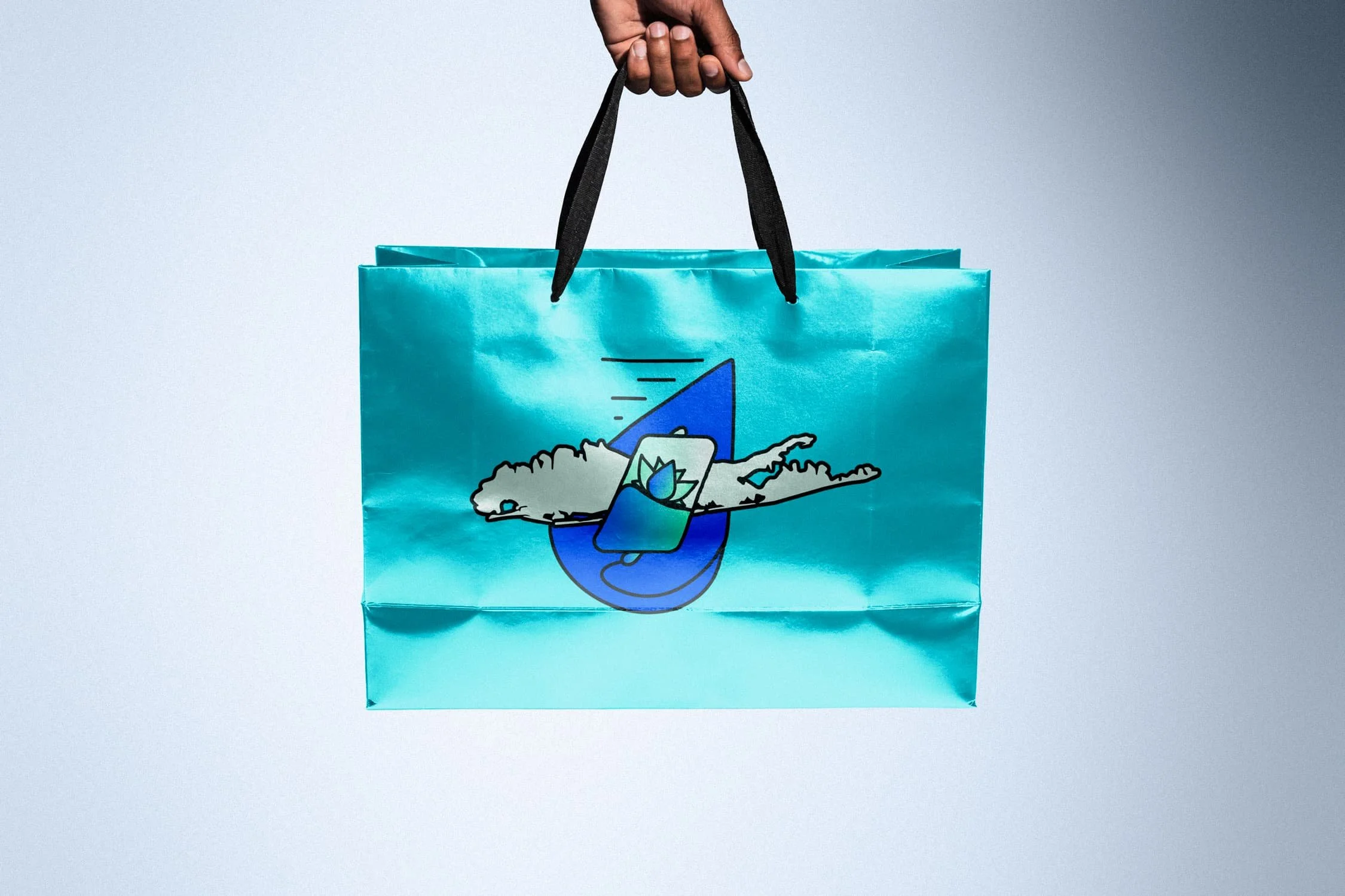
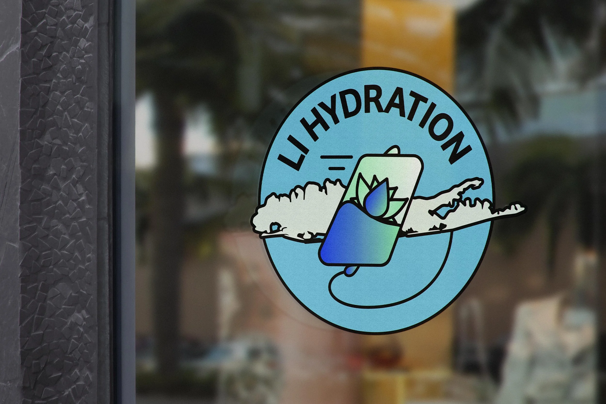
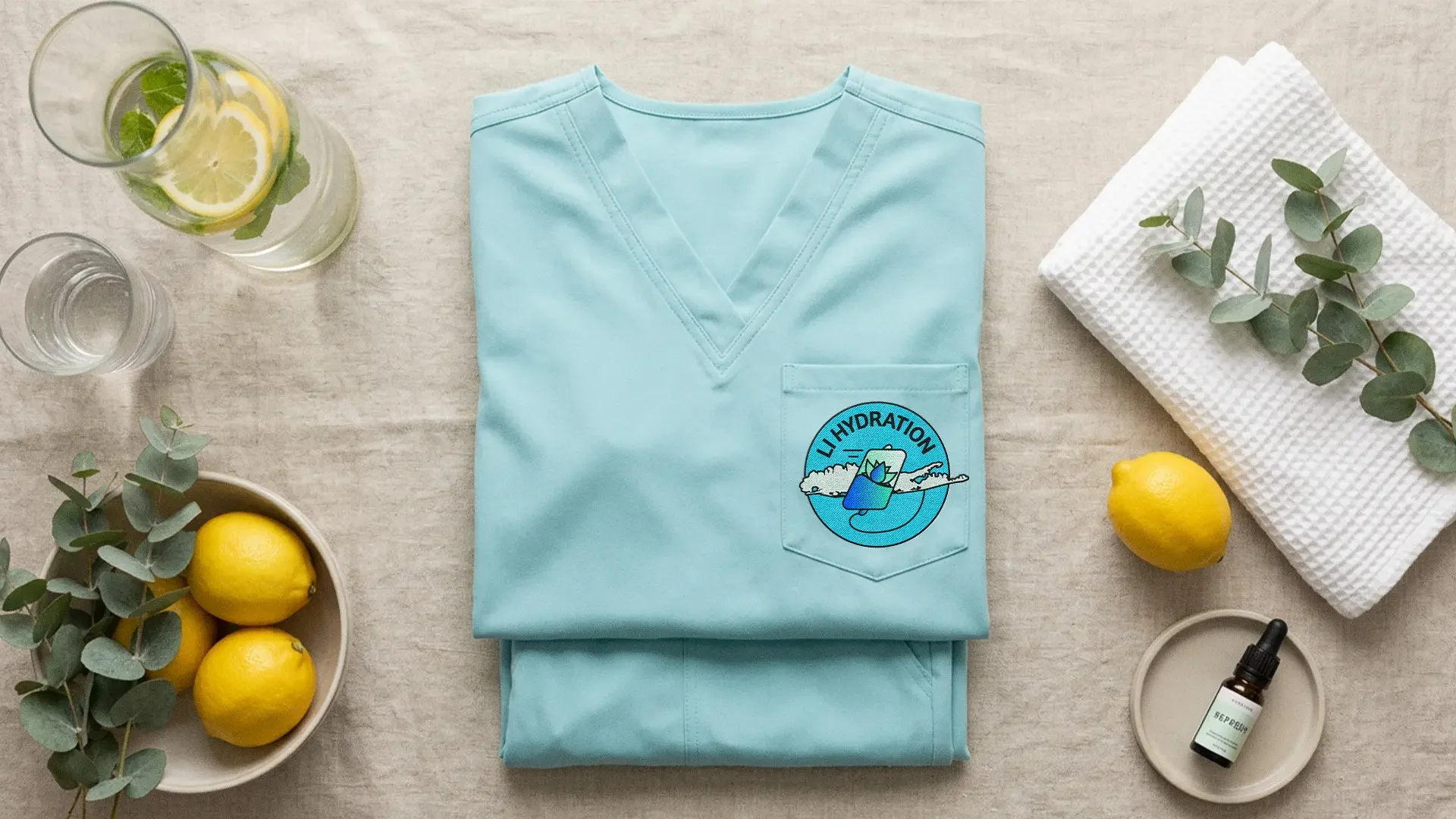
The circle badge is contained and iconic — built for signage, apparel, and anywhere the brand needs to hold its own at a small size. The horizontal logo opens it up, letting Long Island become the wordmark itself, bold and unmistakable at full width. Together they give the brand flexibility without ever losing cohesion.
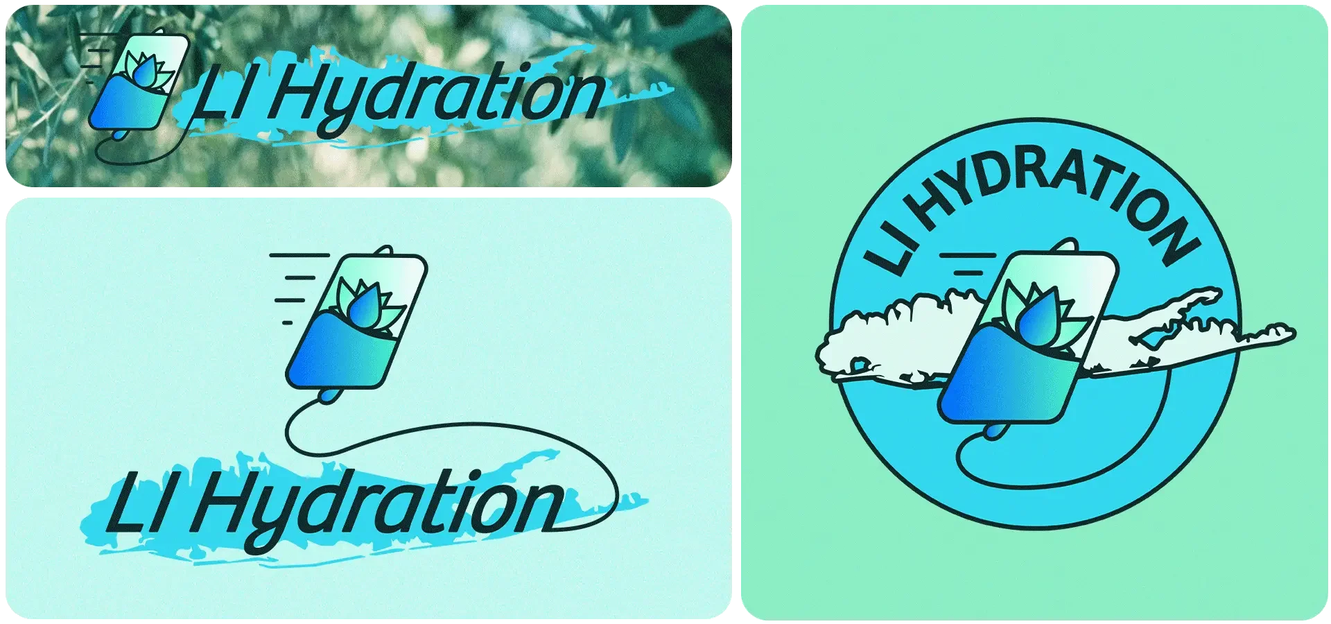
The form brings together a water droplet and a lotus-inspired shape, representing hydration, restoration, and care. A subtle tilt draws from the shape of an IV bag, introducing movement and energy without losing the calm the brand needed to carry. The colors — a gradient moving from deep ocean blue to fresh aqua green — speak directly to hydration, vitality, and the water that defines the island itself.


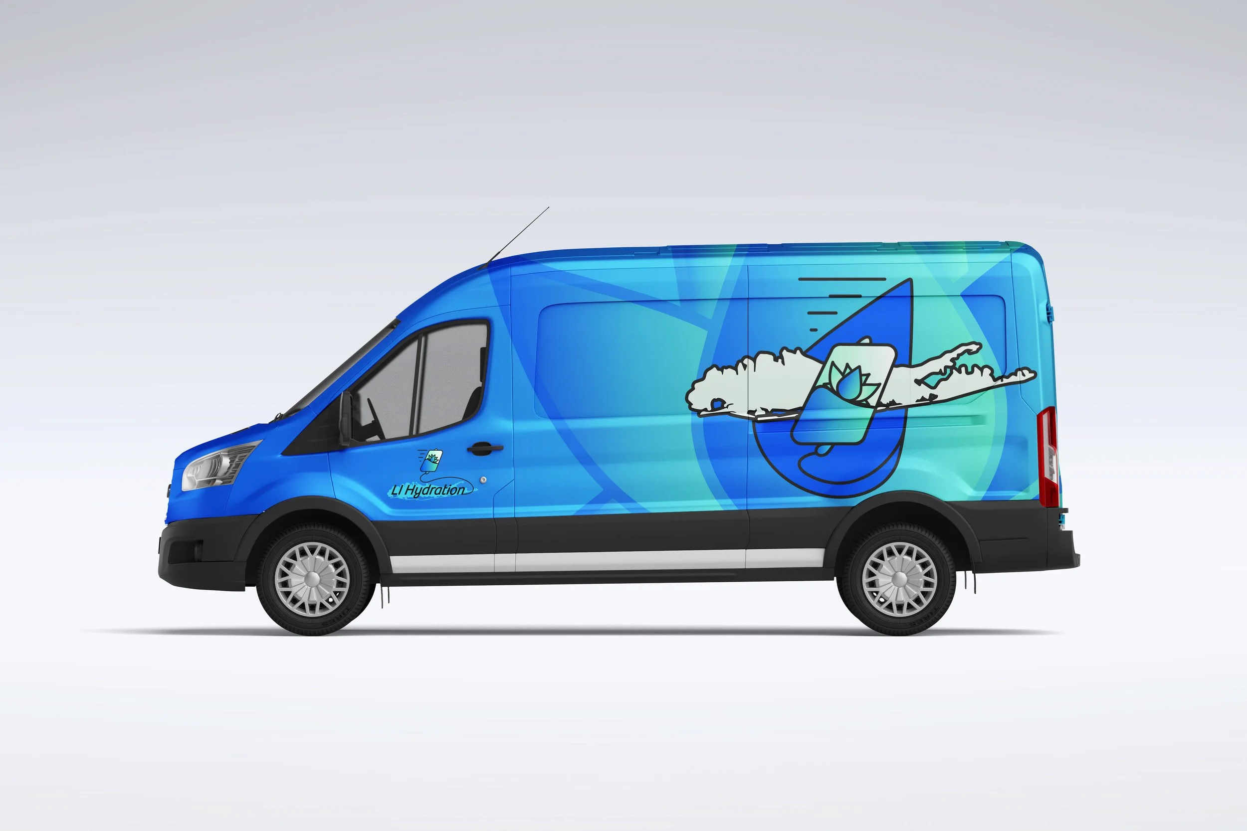
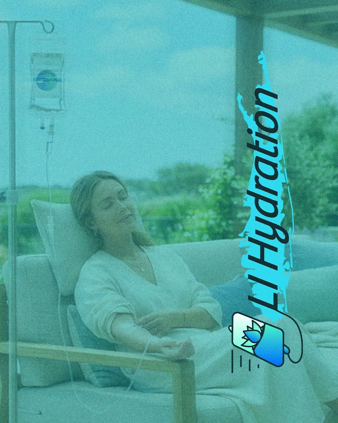
LI Hydration is a mobile wellness service — they come to you, wherever you are. The mobile mark was built to say exactly that. Starting from the same foundation as the circle badge, we shifted the water droplet forward, leaning into motion and momentum. The IV bag connects directly to the droplet, the whole mark tilted like it's already on its way to your door.

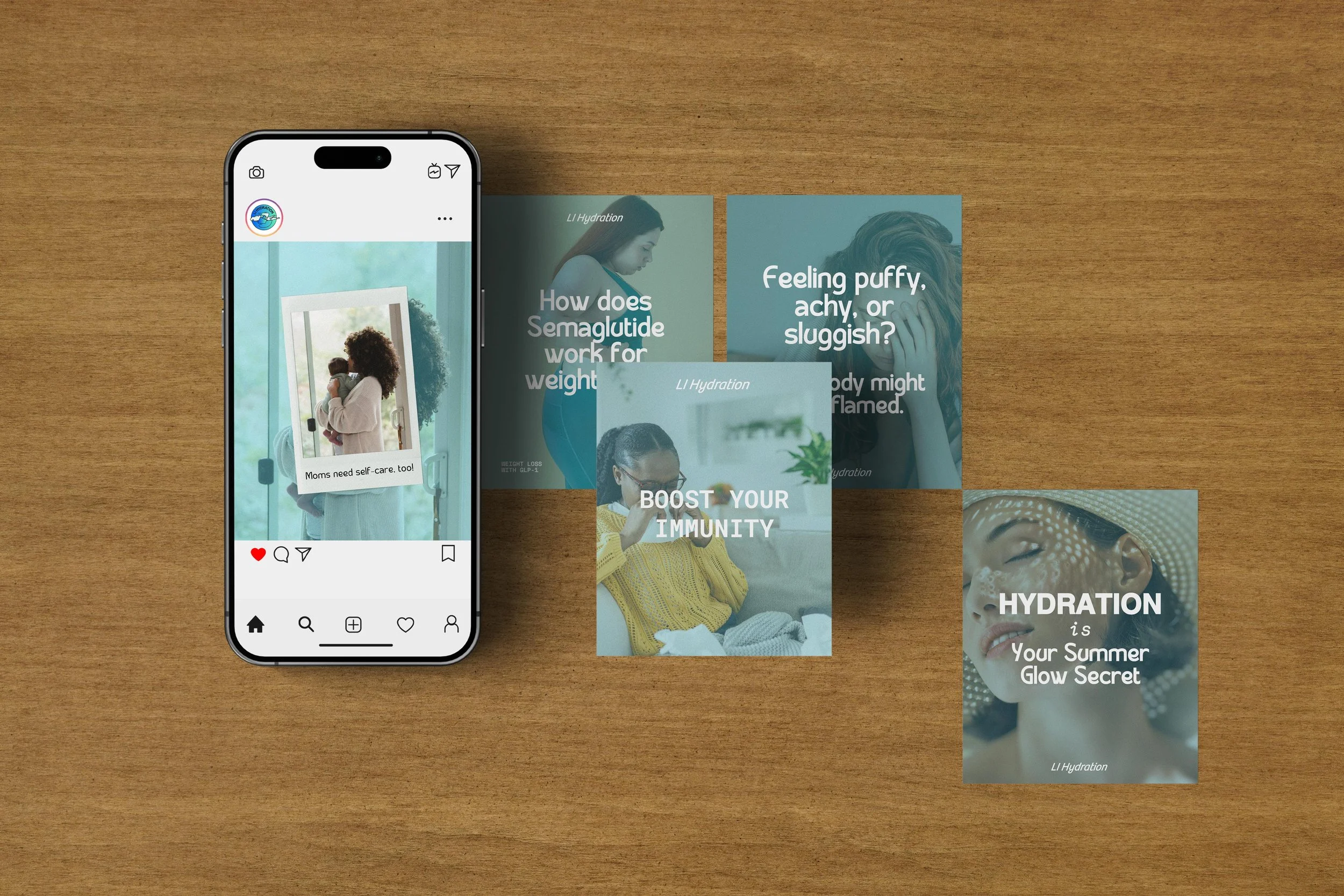

Website Experience
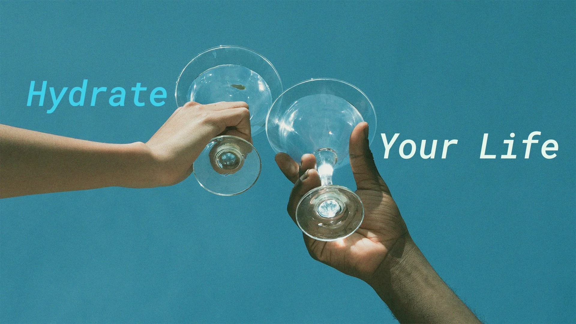
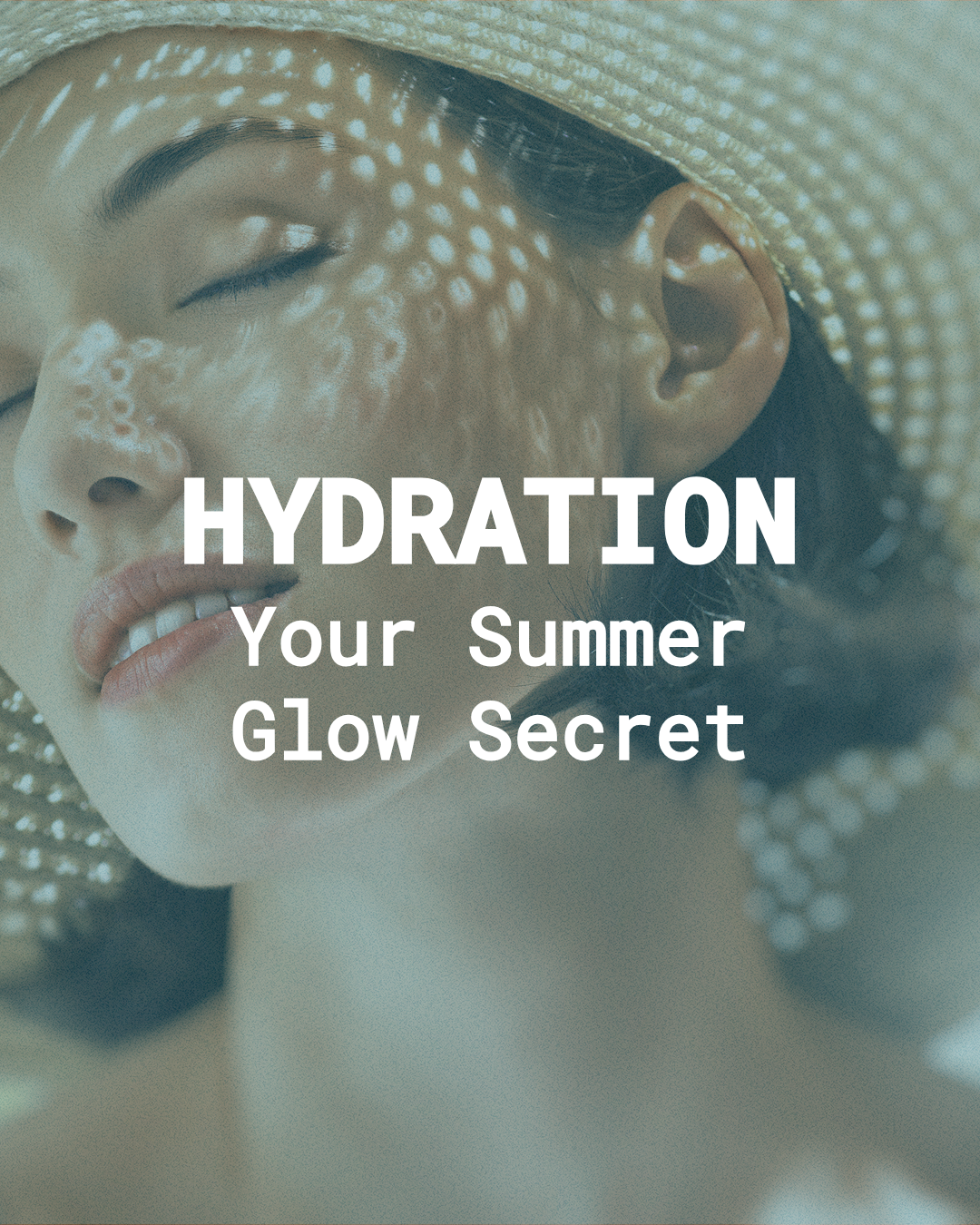
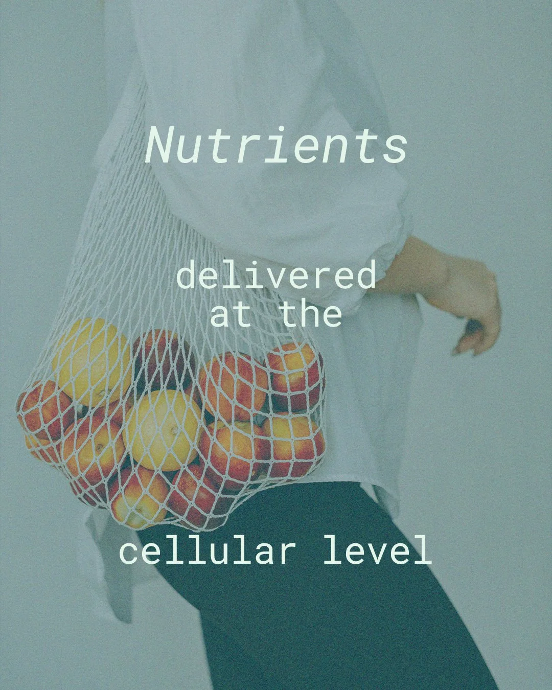
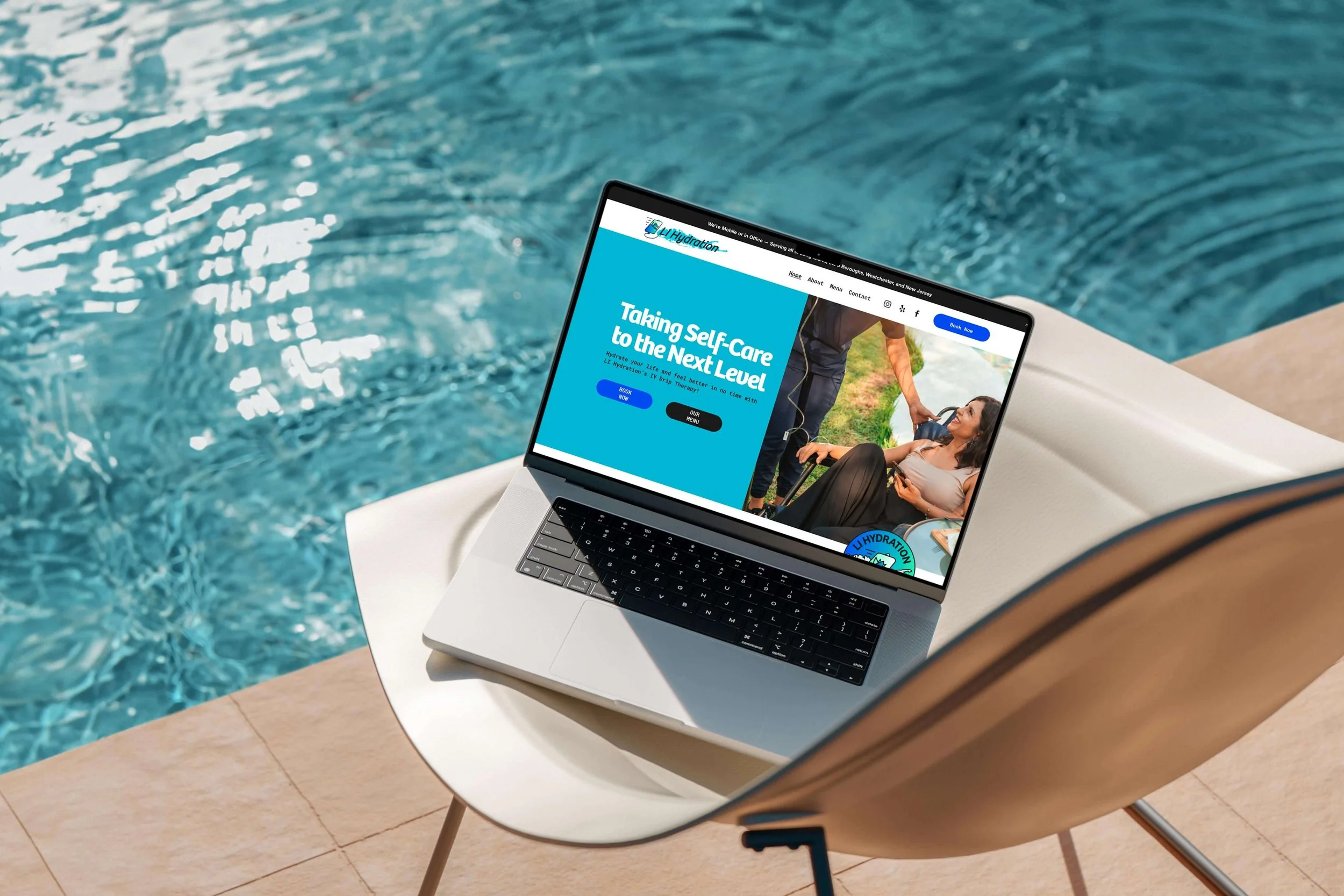
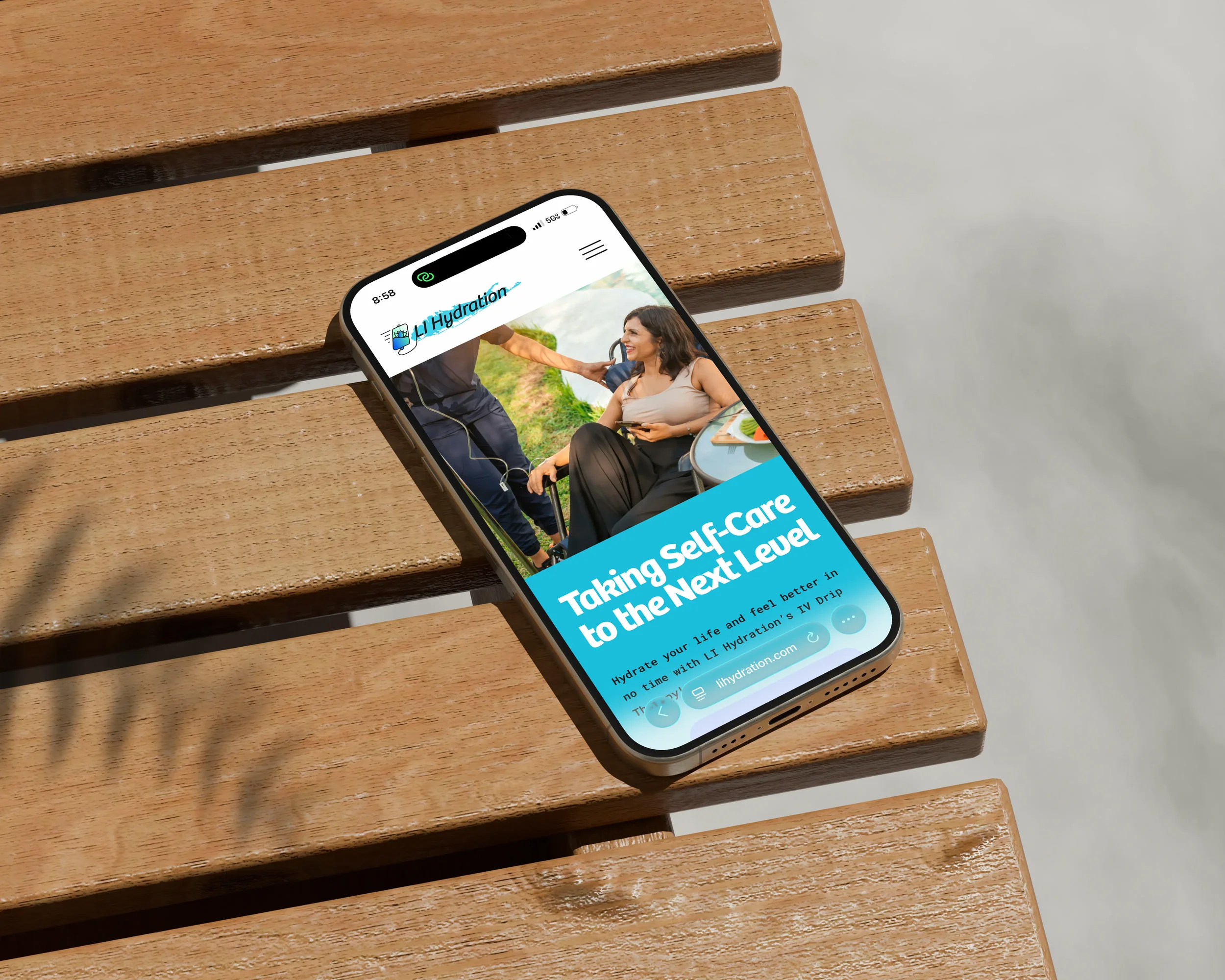
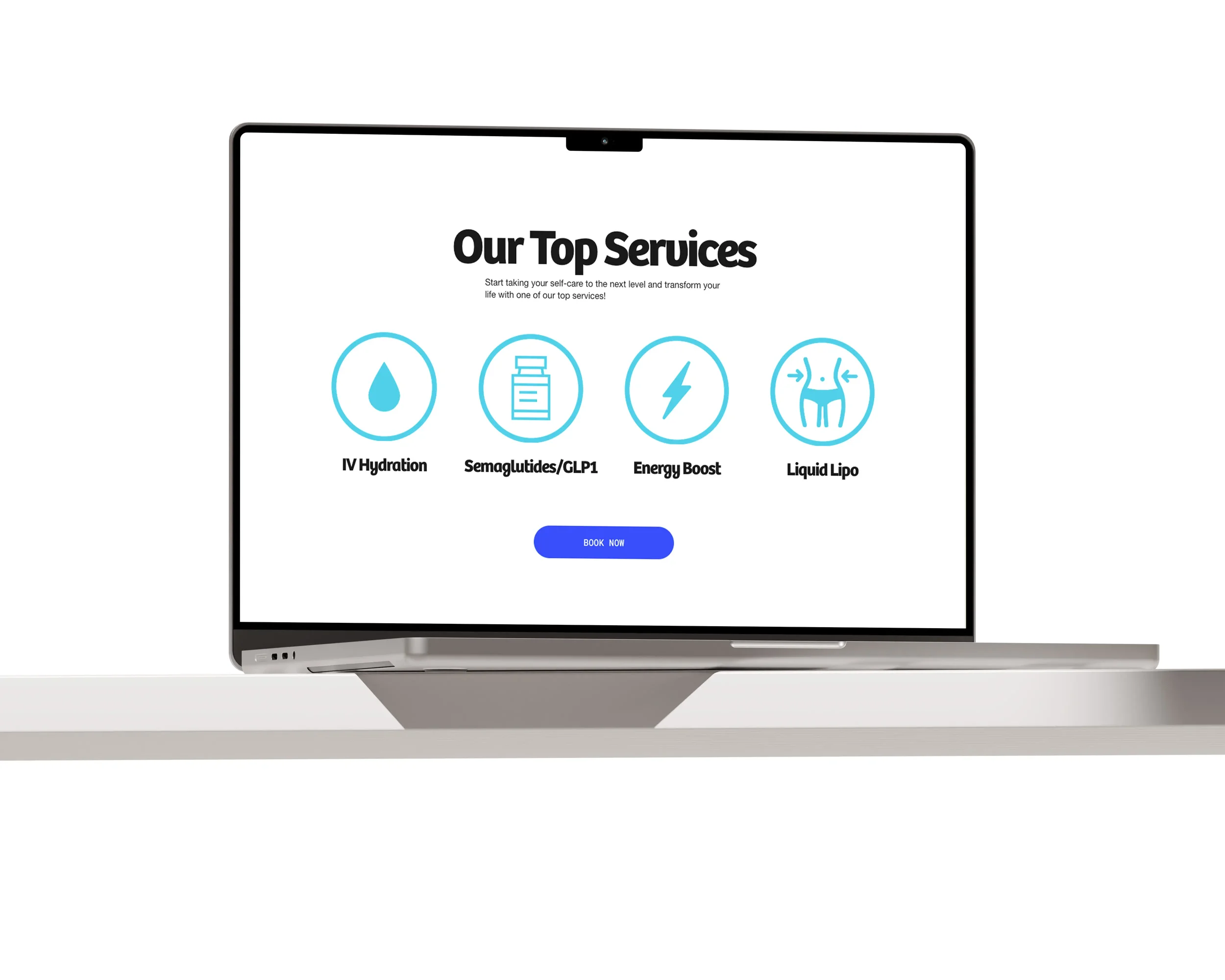
Paxton Creative Co brought the LI Hydration brand to life online with a calm, wellness-driven design that feels both elevated and easy to navigate. Each page was designed to guide users naturally, with clear calls to action and a layout that supports quick, confident booking.
The Homepage, About, Menu, and Contact pages were built as a flexible foundation, allowing the brand to grow without losing clarity. While booking is handled through a third-party system, the experience remains seamless from start to finish.
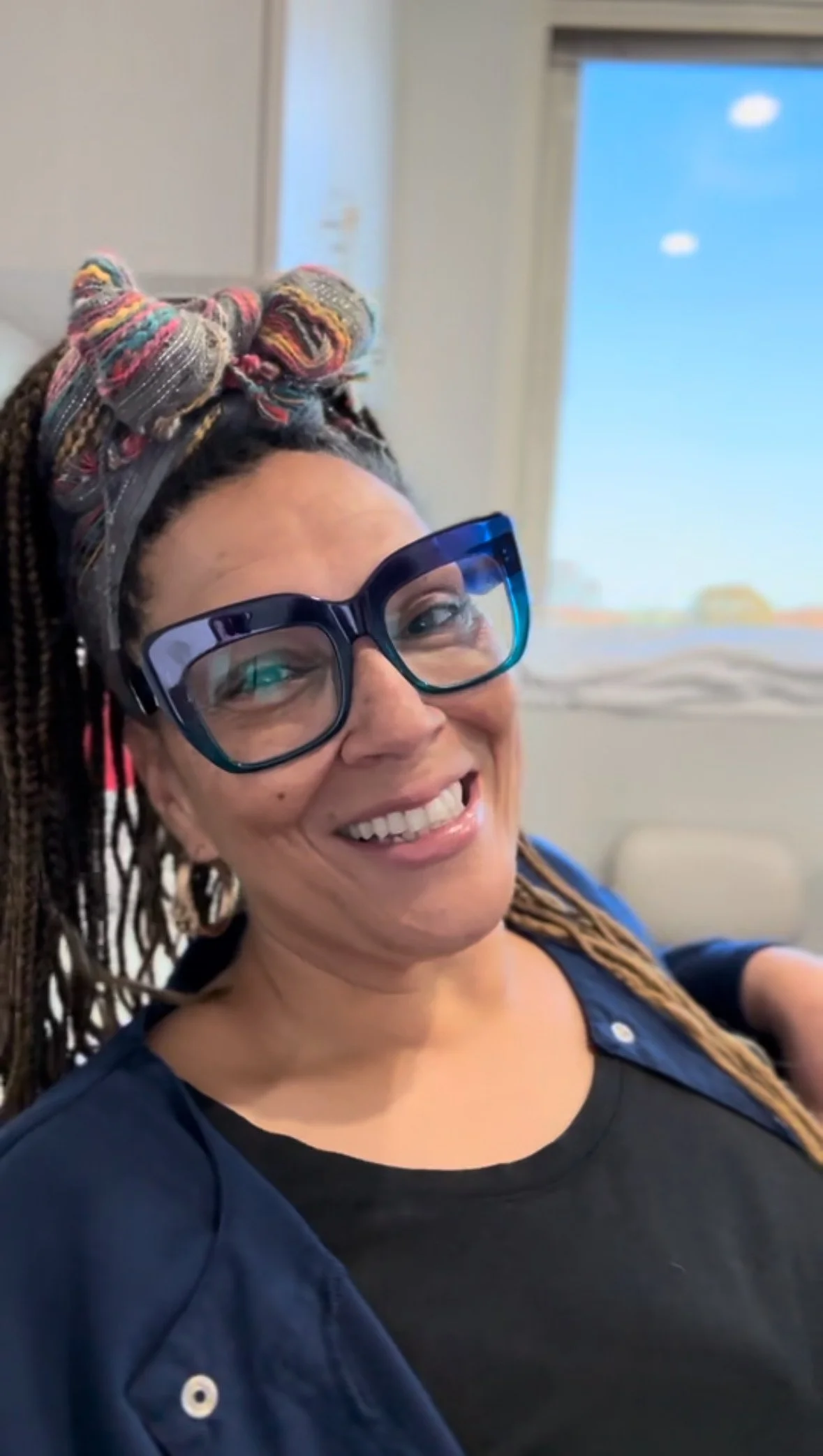
Lyne Gibbs
Founder at LI Hydration


Clarity builds trust. Strategy builds growth.
Your brand should do both. Whether you’re launching something new or finally ready for a brand that reflects the heart of what you do — I’m here to help you bring it to life with strategy, storytelling, and design that actually works.
Let’s build a brand that looks good — and moves people.