Event Branding · Catskill Christian Assembly · 2023Instead
A complete visual world for a young adult weekend retreat built around one word.
Catskill Christian Assembly is a Christian camp and retreat center nestled in the Catskill Mountains of New York, serving churches from Long Island, Connecticut, and New Jersey since 1961.
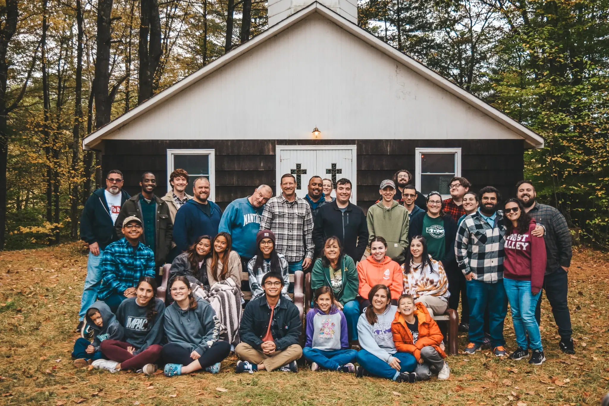
Each year they host a Young Adult Retreat — a weekend on the mountain for young adults in their 20s and 30s to step away, build community, and encounter Jesus in a place that has been doing exactly that for generations.
The Brief
Every retreat theme at CCA gets its own visual identity. Instead of generic church graphics, each weekend gets a world — a palette, a mark, a feeling that carries the message from the first slide to the last page of the booklet.
For the 2023 Young Adult Fall Retreat, the message was simple and direct. You can look around and see people living in a lot of different ways. But Jesus calls you to something different. Instead of conforming to the norm, answer the call to live differently.
One word. A whole weekend built around it.

The Direction
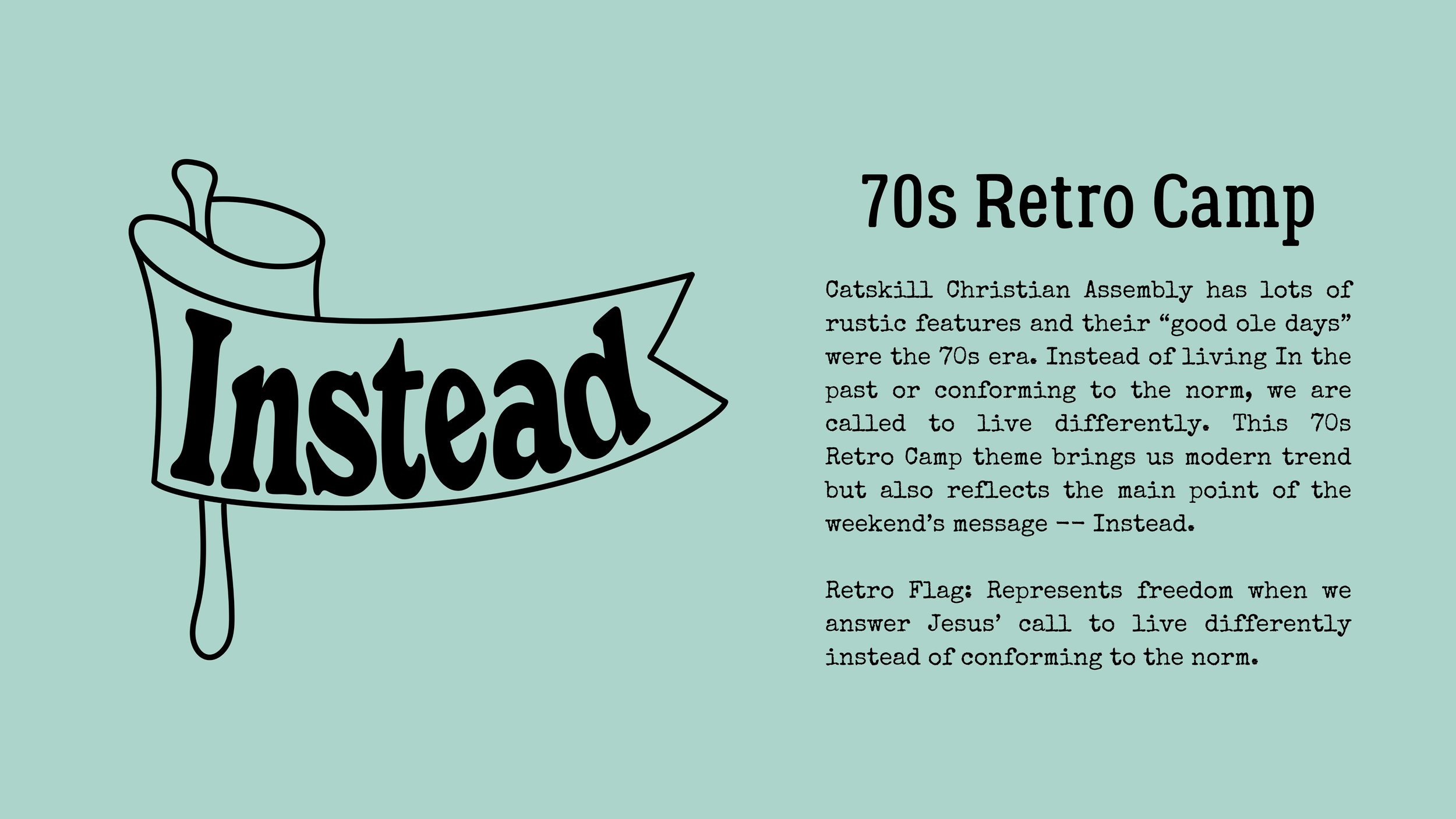
CCA's roots go back to the 70s — it's where the camp's culture was formed, where the "good ole days" still live in the stories people tell around the campfire. That era felt like the right creative anchor. A 70s retro camp aesthetic that was modern enough to feel fresh but rustic enough to feel like home on the mountain.
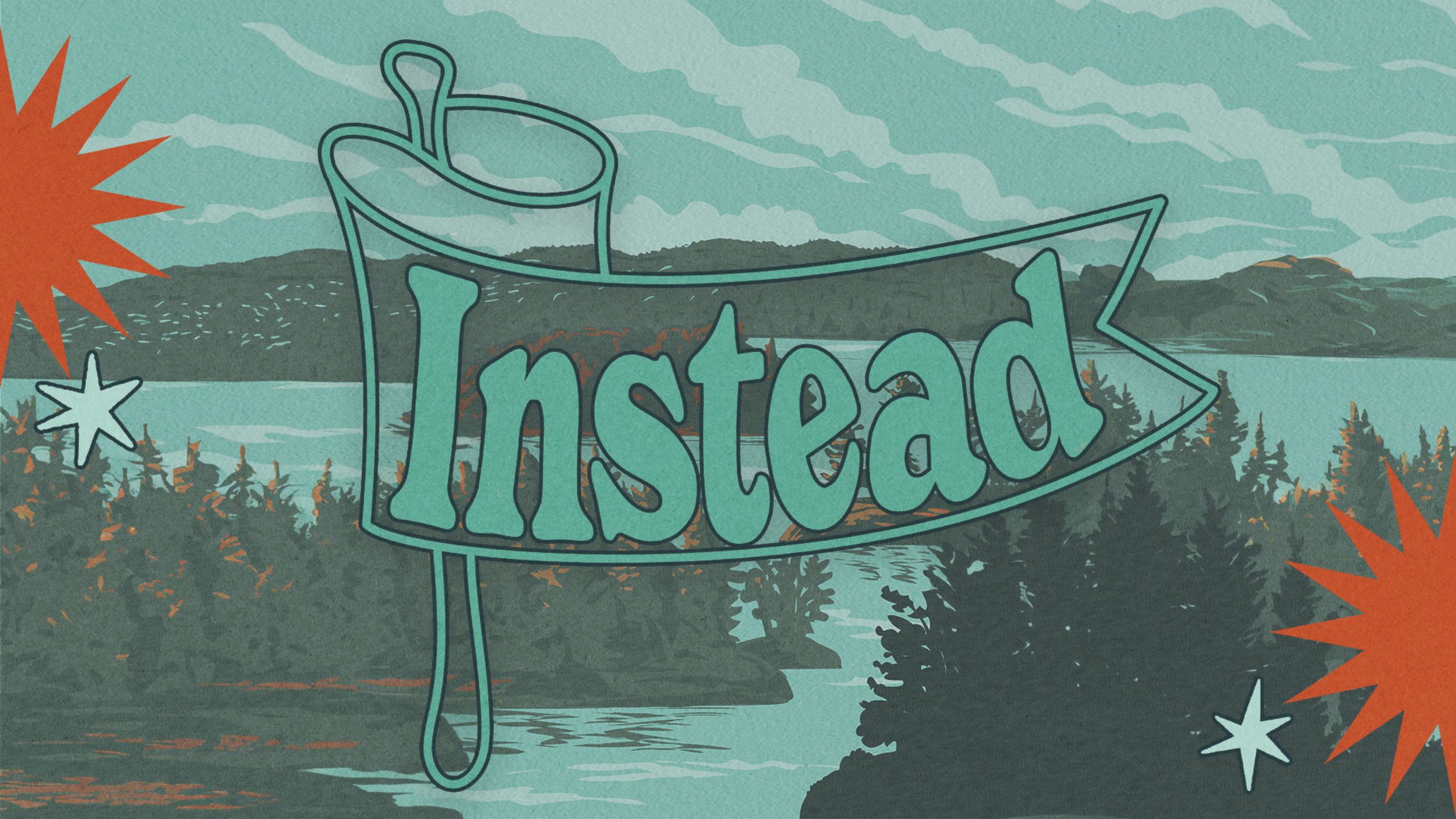
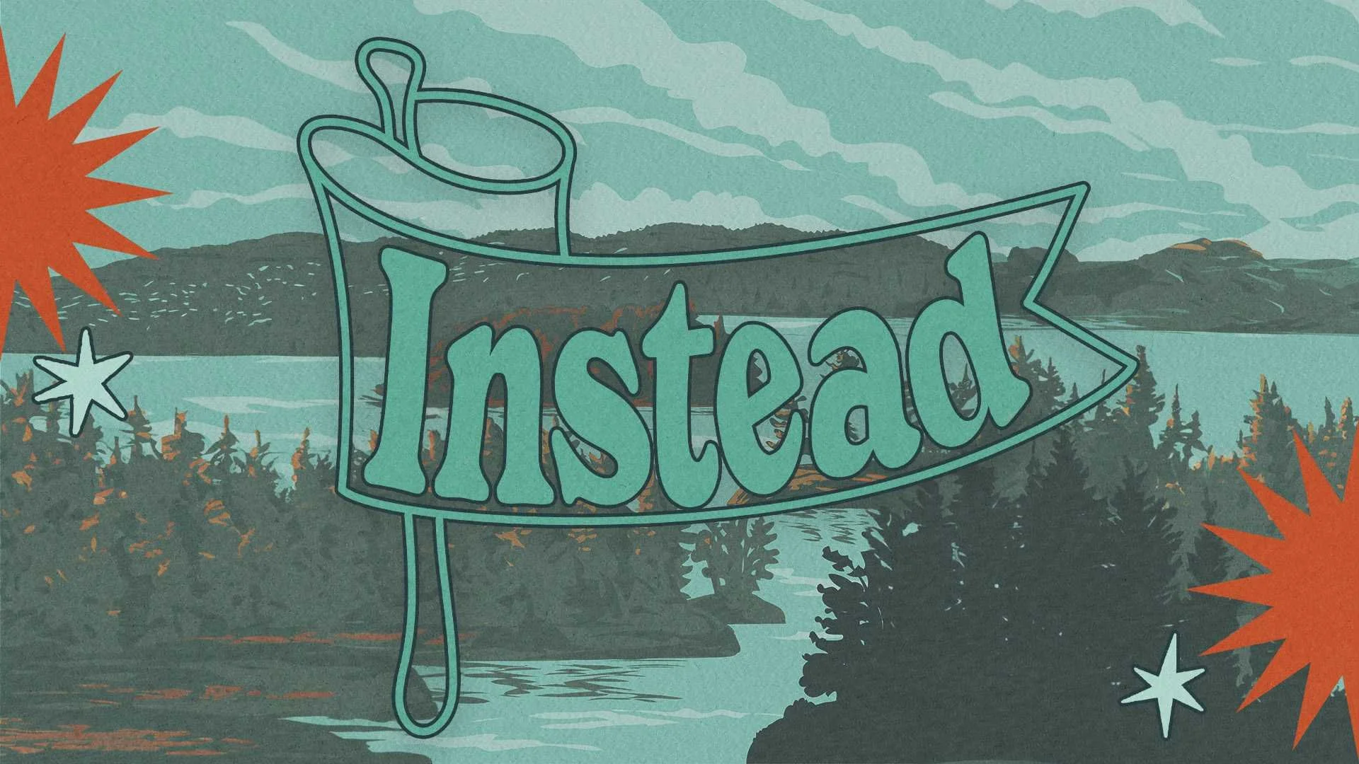
The color palette landed on teal, burnt orange, and deep forest tones. Textured, warm, and a little sun-faded. The kind of palette that feels like it belongs on a vintage national park poster — or a camp t-shirt from 1974.
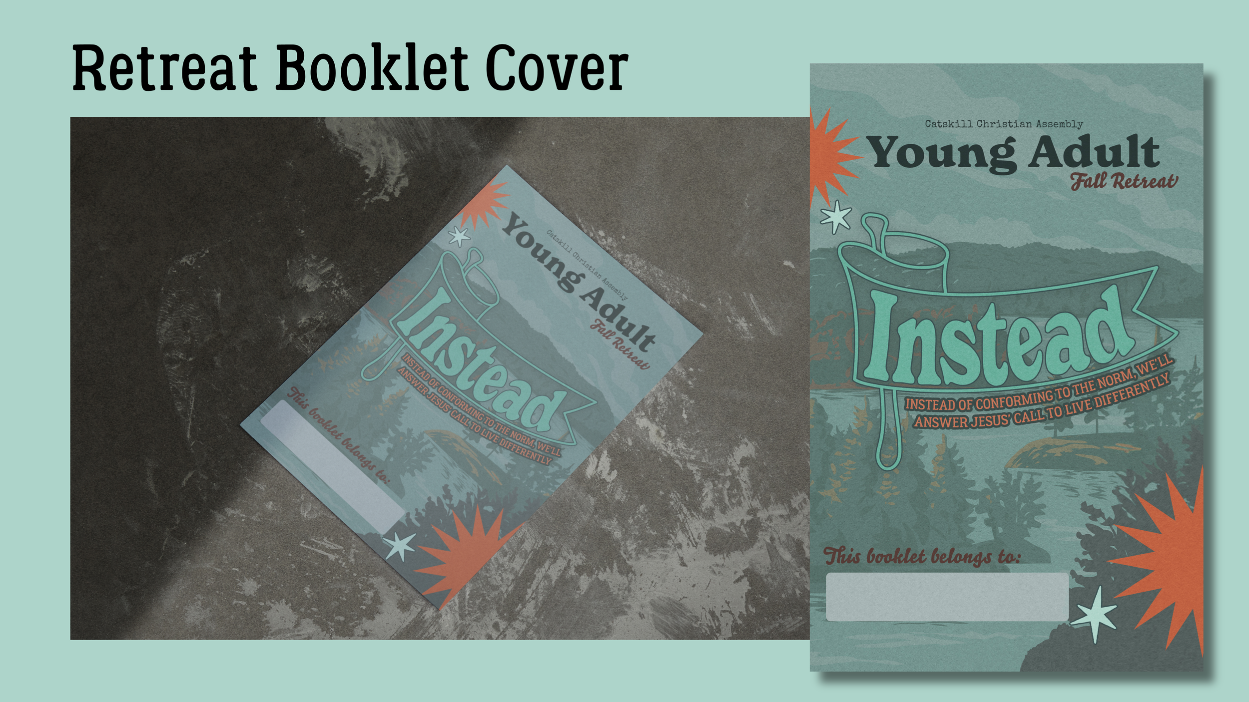
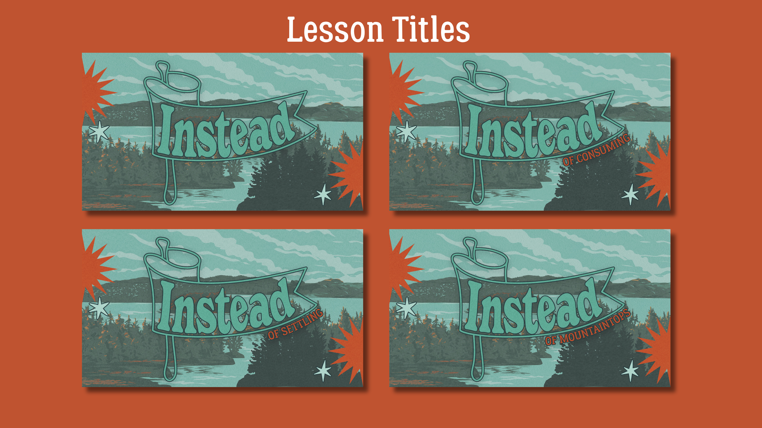
The flag mark came from a collaboration with Analise, who brought the art direction for that shape. The retro camp flag represents freedom — the kind that comes when you answer Jesus' call to live differently rather than settling for what everyone else is doing. I built the full visual system around it.
The Visual System
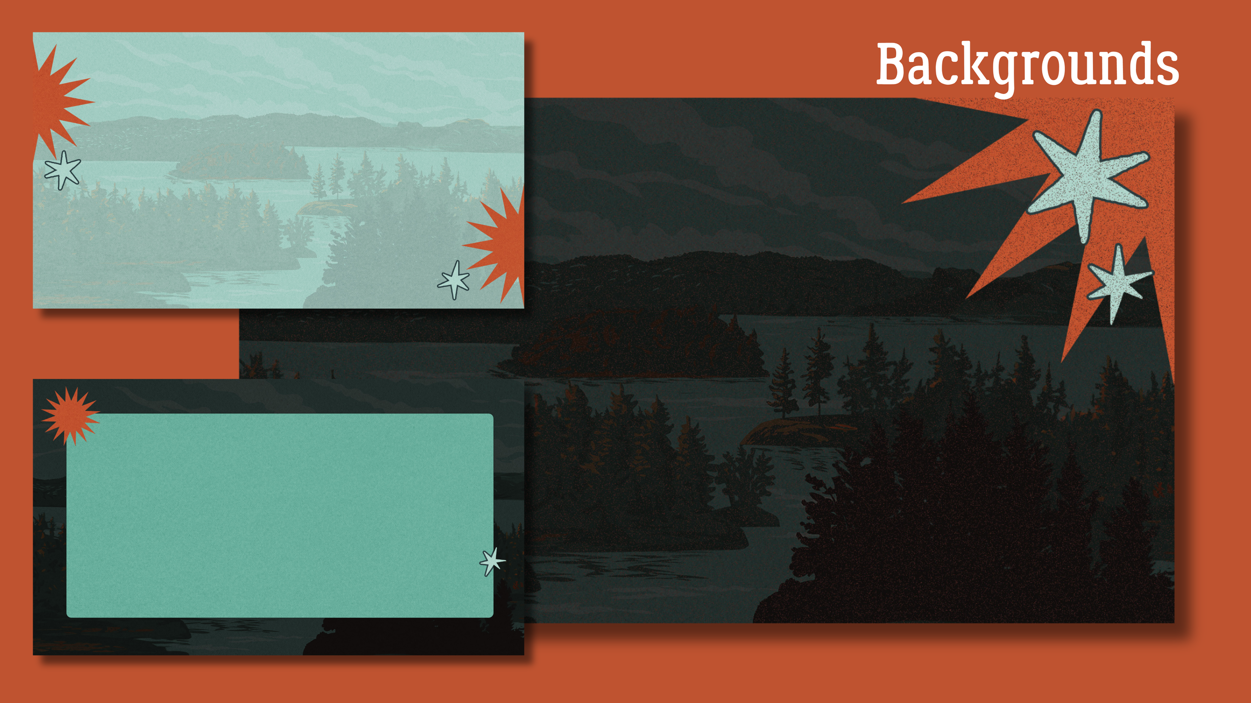
The background scene started as a landscape photo, treated and transformed through graphic design work and generative fill into something that felt illustrated and timeless — more painting than photograph. Mountains, pines, still water. The kind of scene that quiets you down before a word is even spoken.
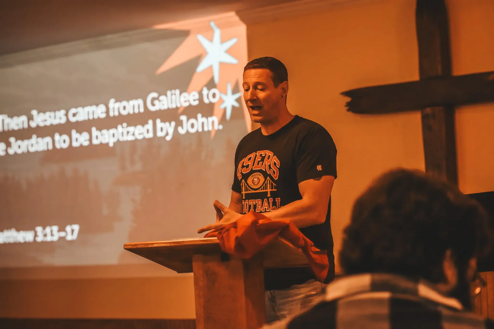
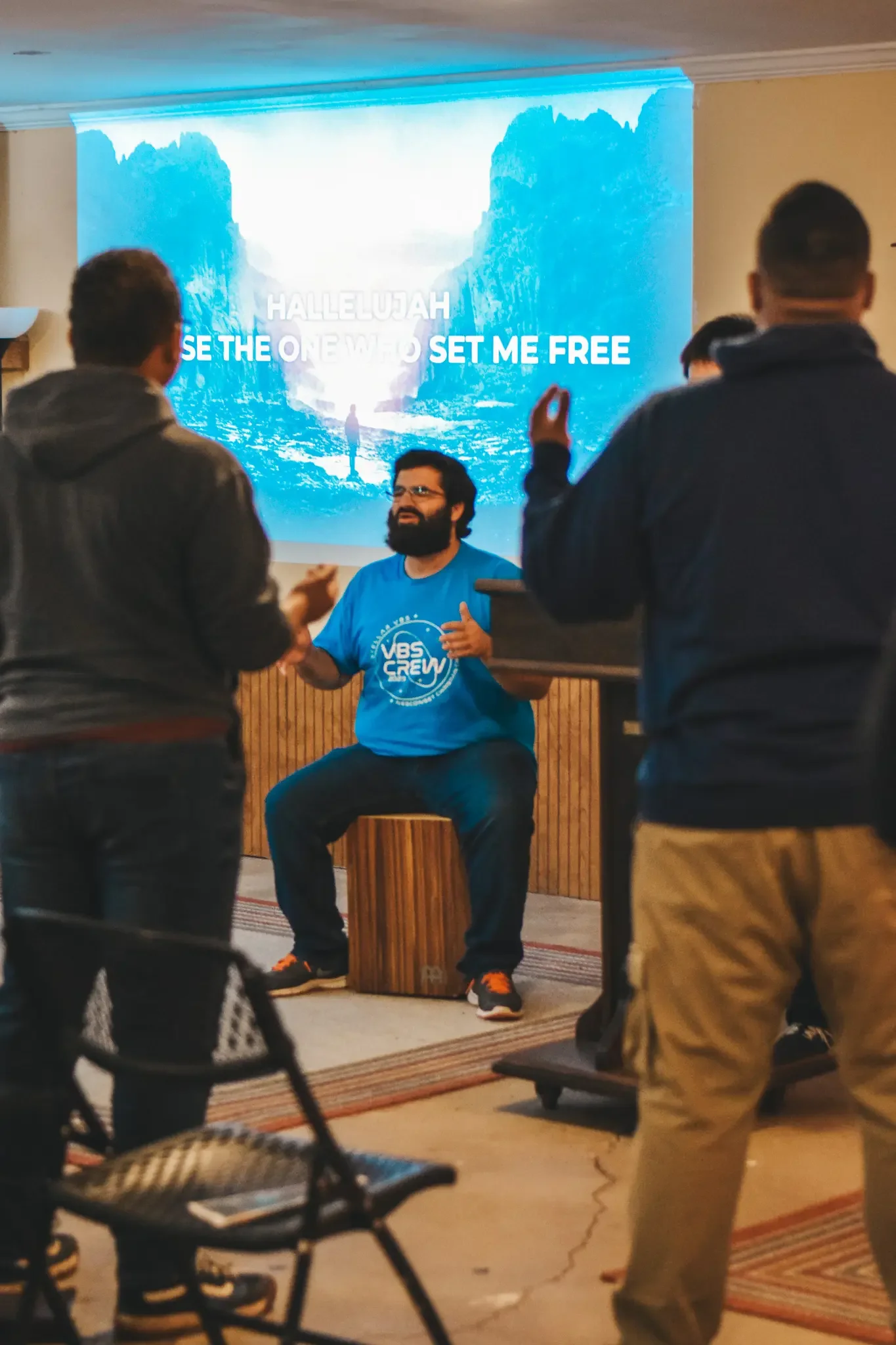
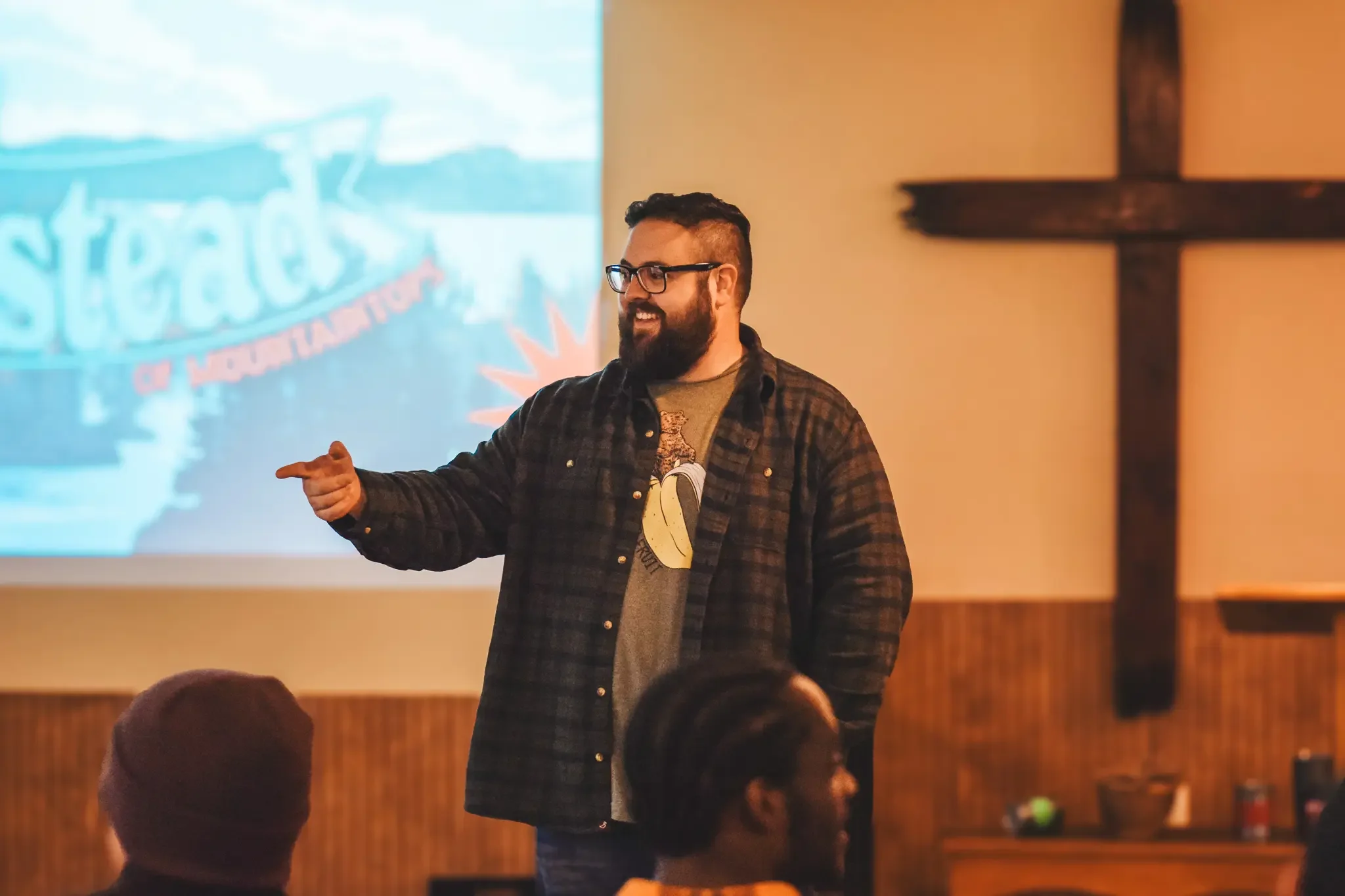
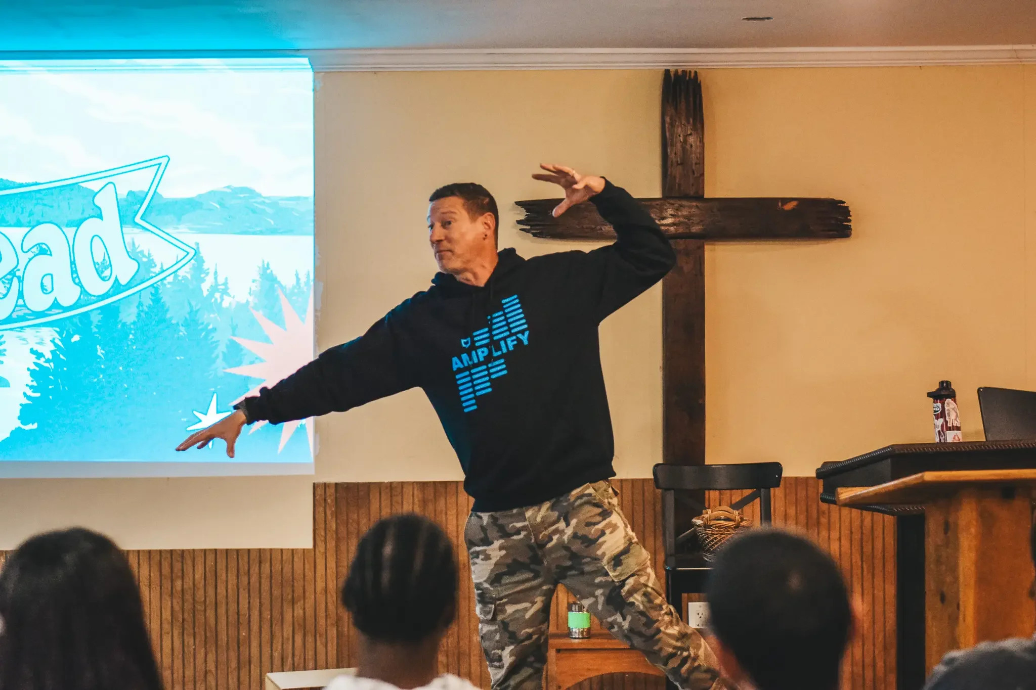
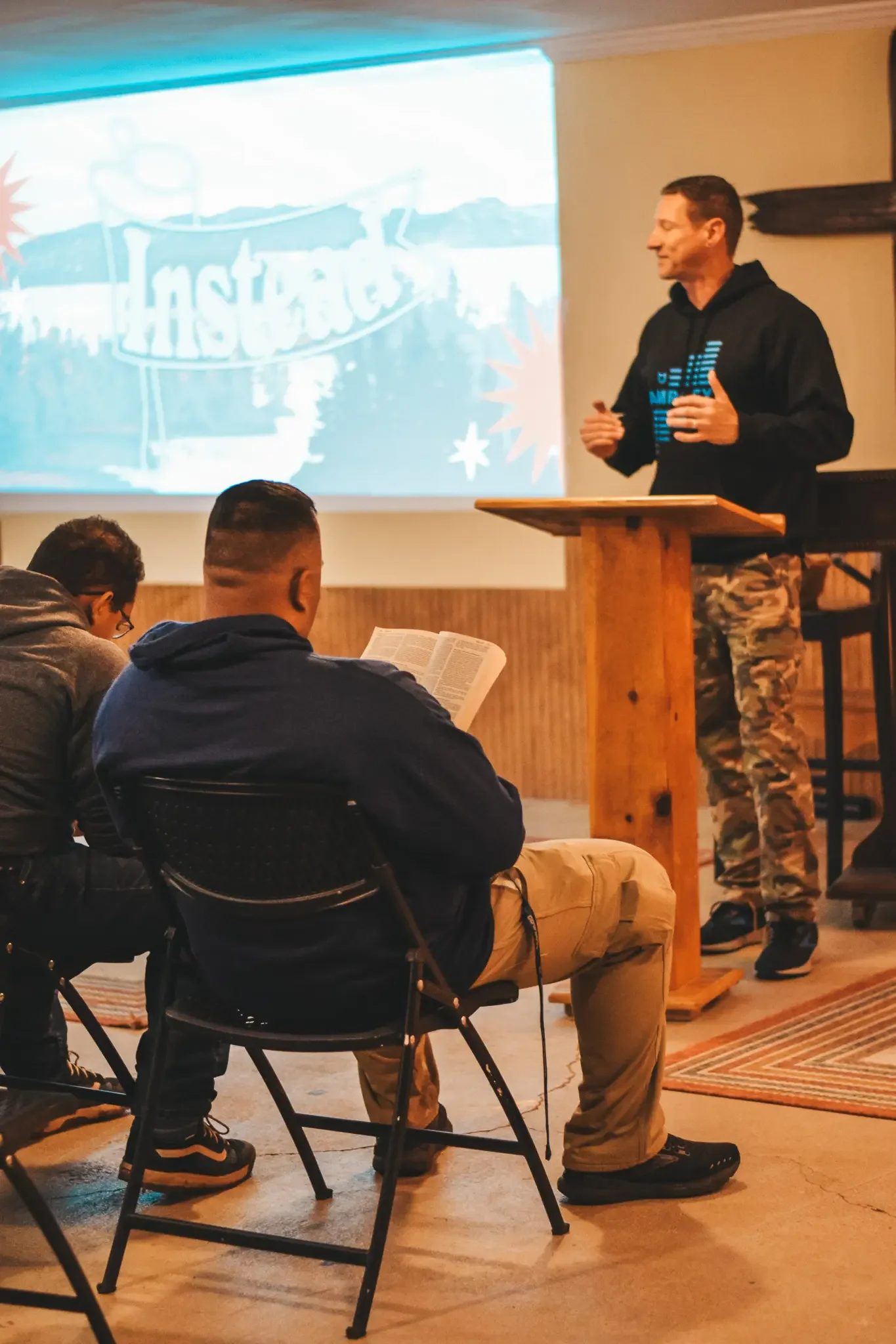
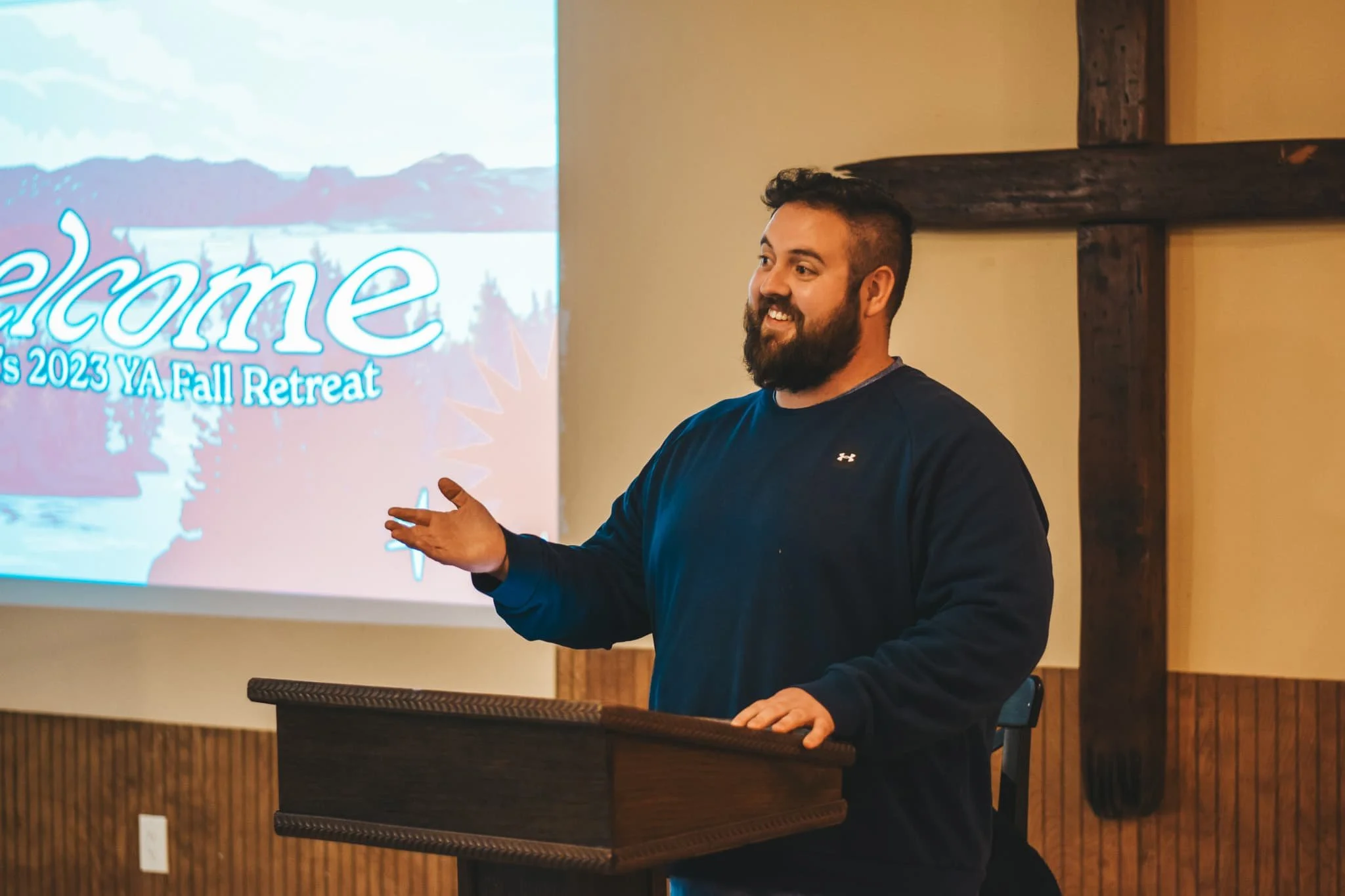
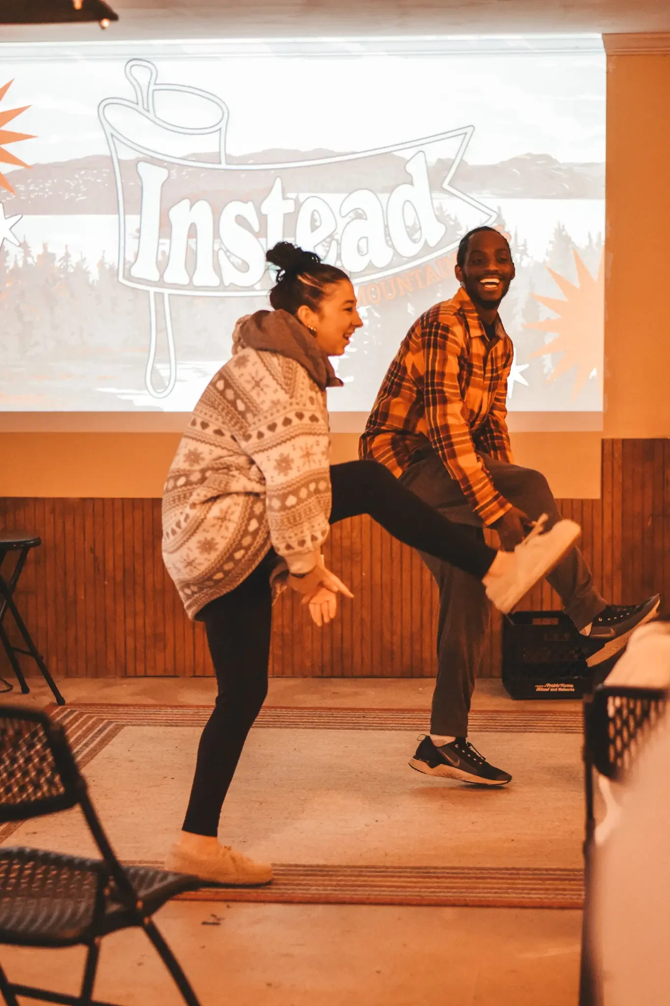
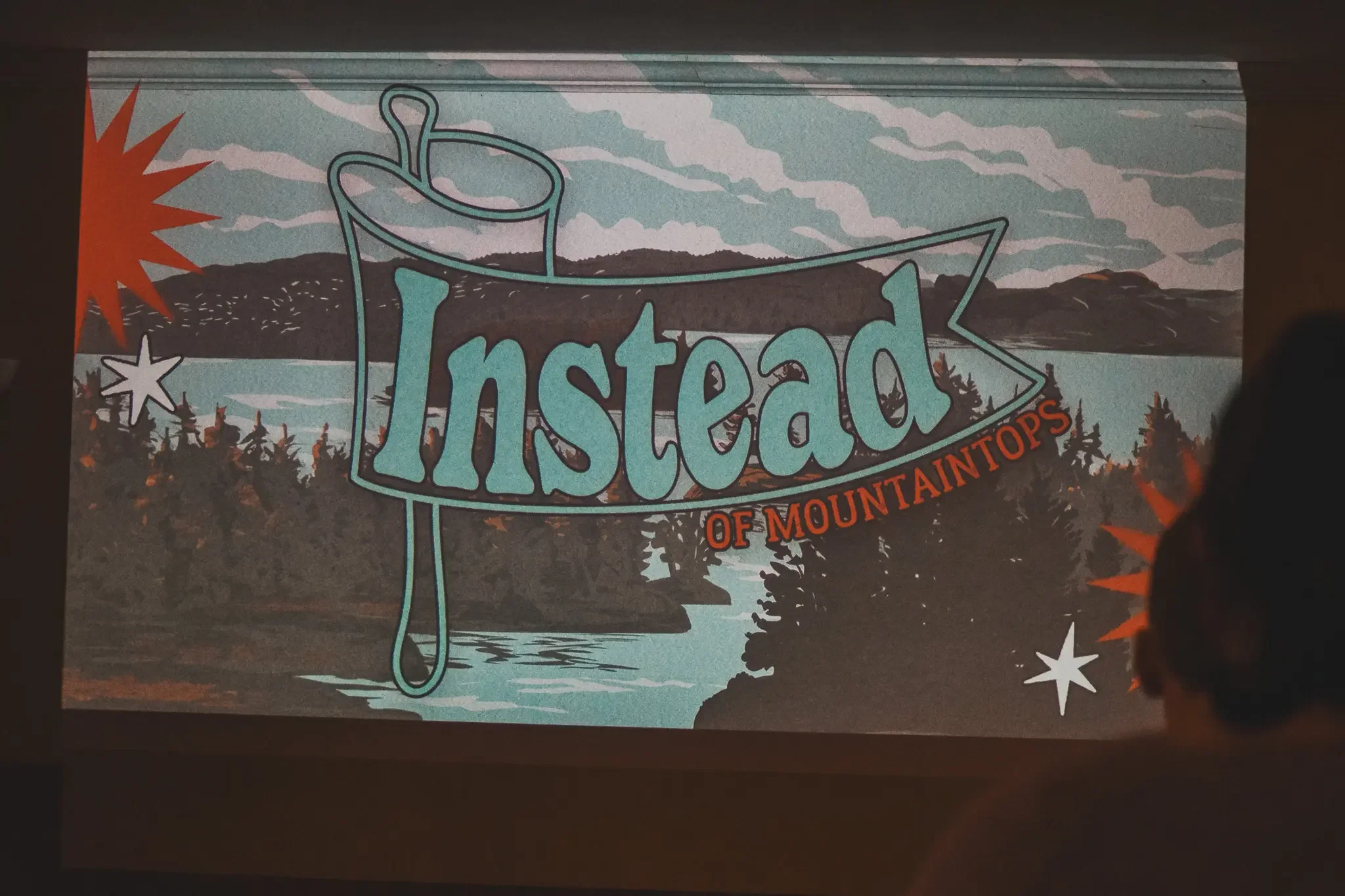
From there the system expanded. Sermon title slides for each session — Instead of Consuming, Instead of Settling, Instead of Mountaintops — each one carrying the same mark and scene with the lesson subtitle worked into the flag. Clean sermon backgrounds in both light and dark variations so the speaker's words had room to breathe on screen.

The Booklet
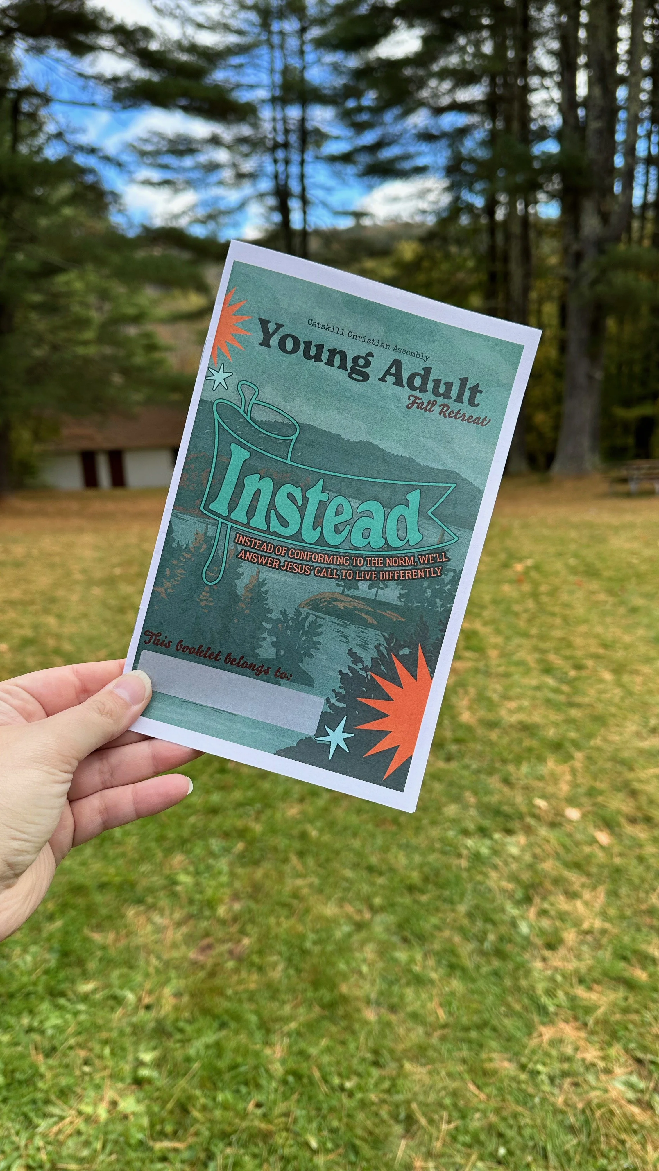
Every attendee got a physical booklet designed to be used across the whole weekend. The cover carried the full visual treatment — the flag, the landscape, the texture. Inside: a three-day schedule, a worship song setlist with a QR code linking to the Spotify playlist, notes pages for each session, and a coloring page tucked in for the quieter moments.
The whole thing was printed and placed in the hands of every person who showed up that weekend.