Branding + Website • Prattsville, NYCatskill Christian Assembly
Building a brand and website worthy of a generational legacy for a beloved Christian camp and retreat center in the Catskill Mountains.
CCA has been changing lives in the Catskill Mountains since 1961.
Generations of kids, families, and communities have been shaped by this place. For a long time, none of that showed up in how they looked online.
The Story
My relationship with Catskill Christian Assembly didn't start with a contract. It started in 2019 as a camp counselor, volunteering two weeks in the mountains. I knew what this place was from the inside — the campfires, the chapel, the creek, the moments that stay with you.
By 2023 I was rebuilding their website. By 2025 I was helping them step into their 65th year (2026) with a brand that finally matched the weight of what they had built.
That personal history matters. Knowing the mountain, the culture, and the community from the inside means the work has never been generic. It's been built by someone who actually loves this place.
The Direction
CCA had one visual asset — a badge that had carried the entire brand alone for over 20 years. Their website looked like it hadn't been touched since 2002. It was clunky, hard to navigate, and impossible to trust on a phone.
A parent once told their child they didn't feel comfortable sending them to camp based on how the website looked. That sentence stuck with me. Because I knew what this place actually was.
It just didn't look like it yet.
The Problem
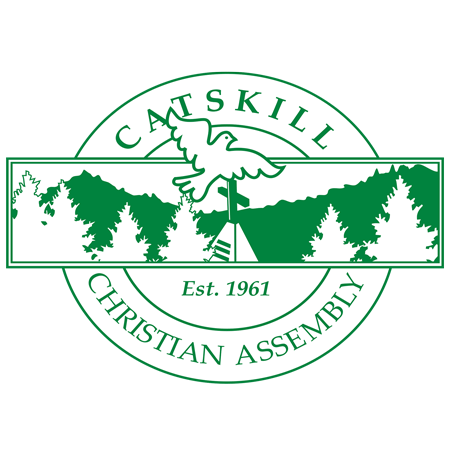
The original badge was the foundation — not something to replace, but something to build around. The mountain, the cross, the dove had been there since the beginning. What was missing was everything else: a full identity system, a type language, a visual world that could carry the brand across a website, merch, social media, and events without losing the feeling of the place.
The goal wasn't modern for the sake of modern. It was grounded, handcrafted, and rooted in story — the kind of brand a parent looks at and immediately trusts.
Brand Identity
CCA had one visual asset for over 20 years — their original circular badge. It had history in it, but it was crowded. The dove was heavy. The treeline was busy. A lot was competing for attention, and the things that actually mattered were getting lost.
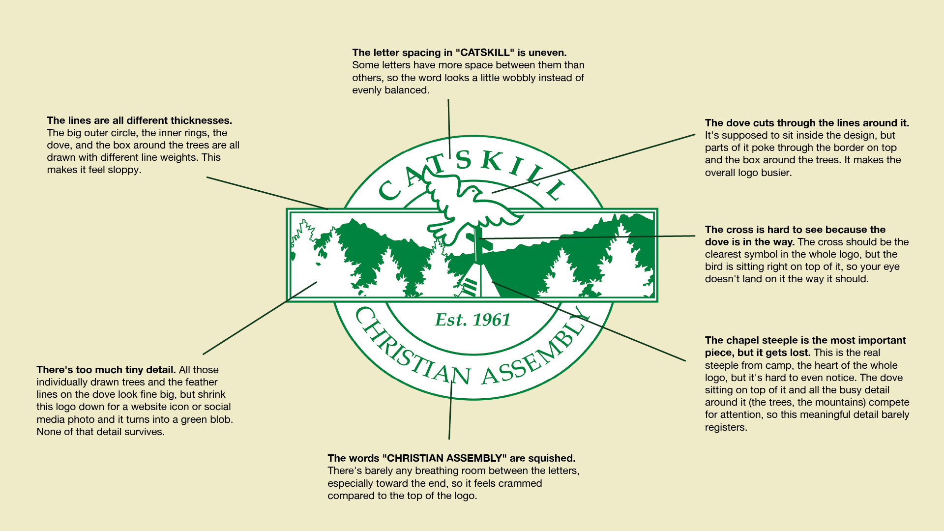
The work started by asking a simple question: what in this mark is actually doing the work?
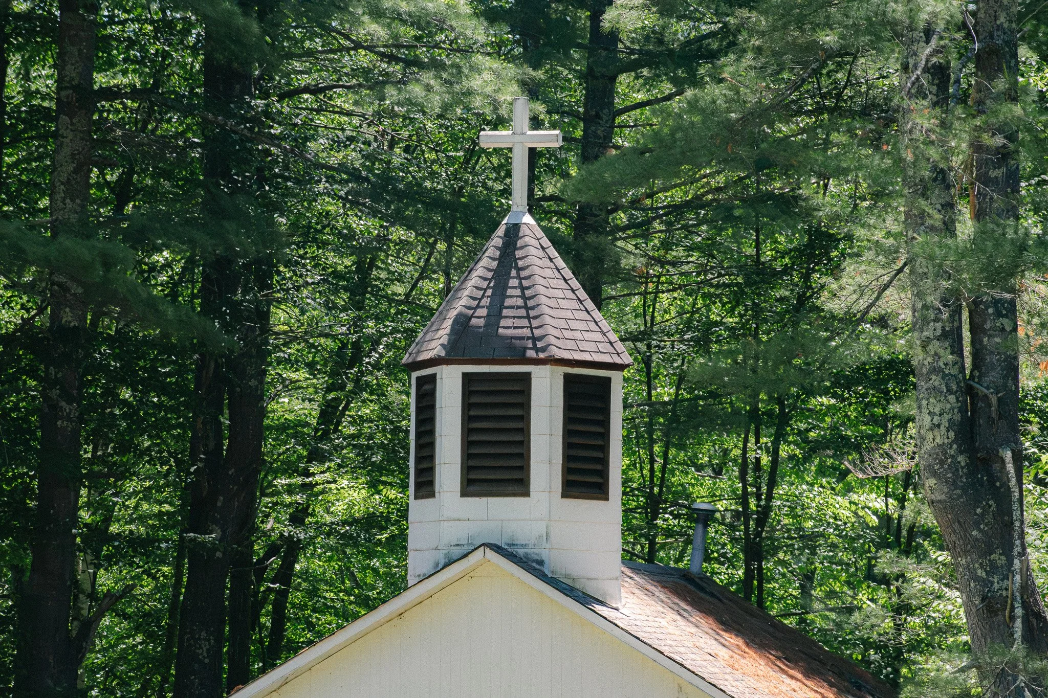
The answer was the chapel cross and the mountain behind it. Everything else was noise.
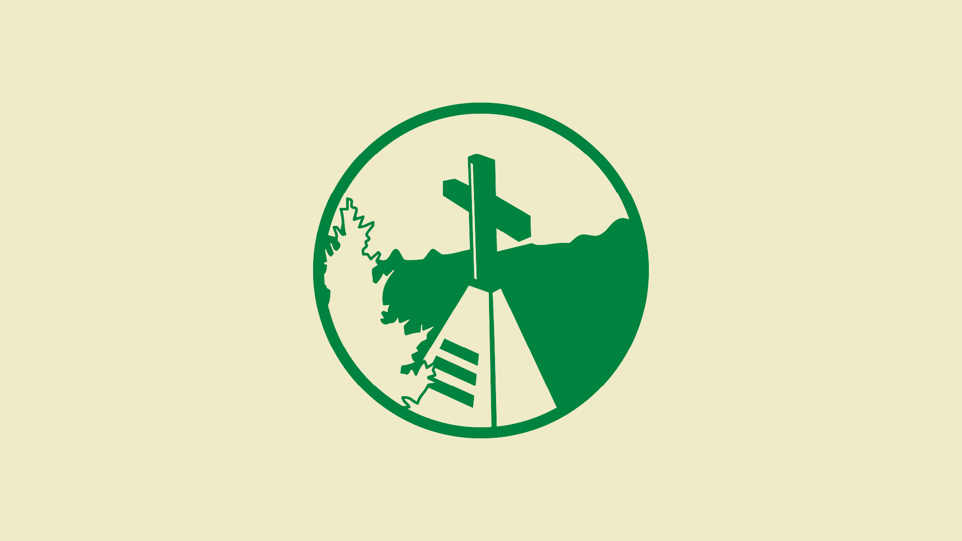
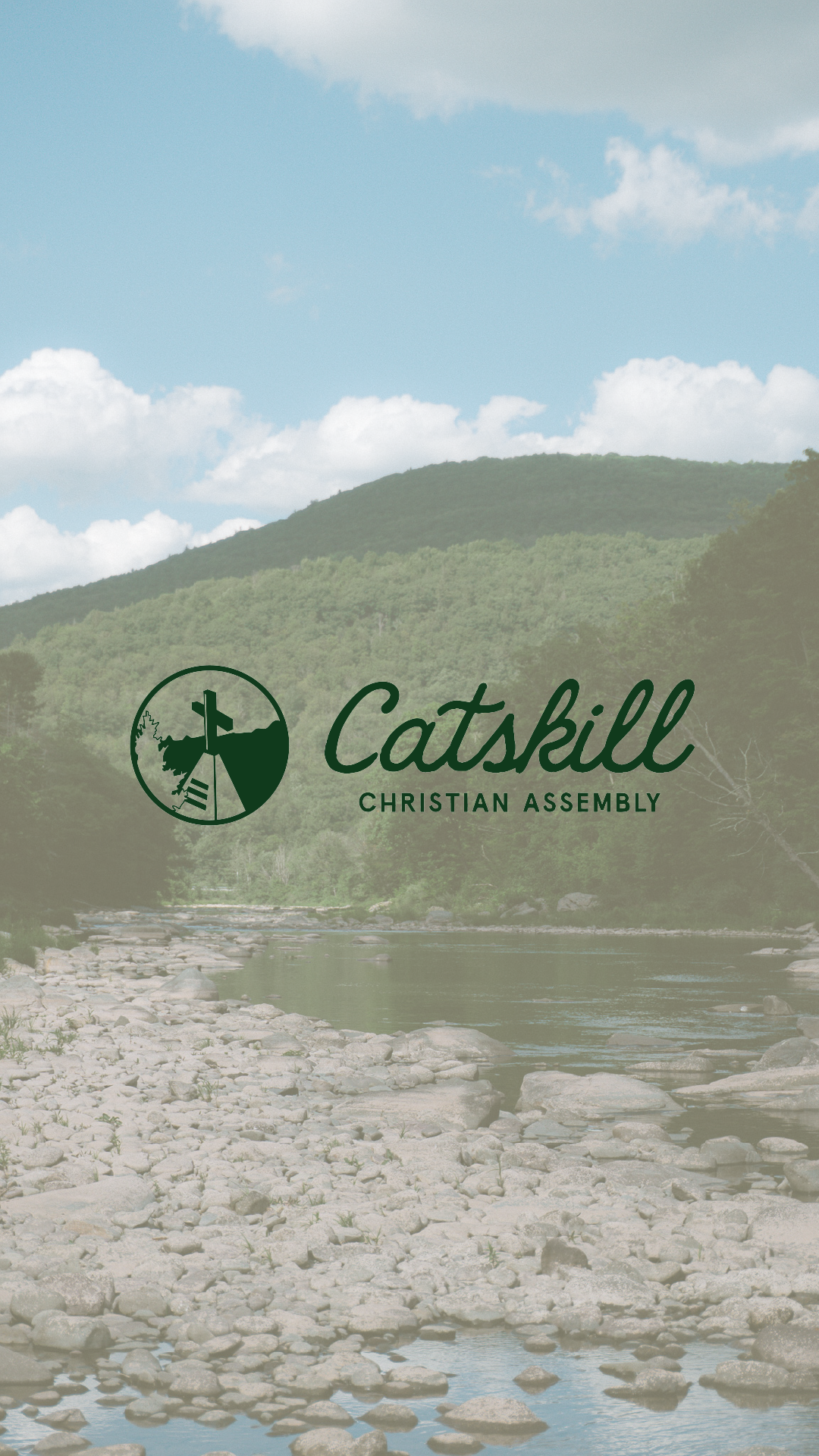
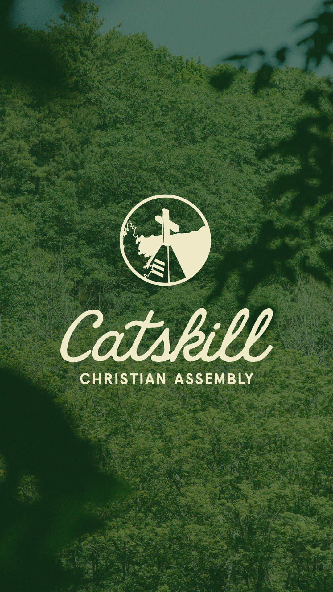
So I stripped it back. Zoomed into what mattered, cleaned the geometry, and rebuilt the mark around those two elements. The new logo mark and type system followed the same logic — bold enough to hold its own, warm enough to feel like camp.
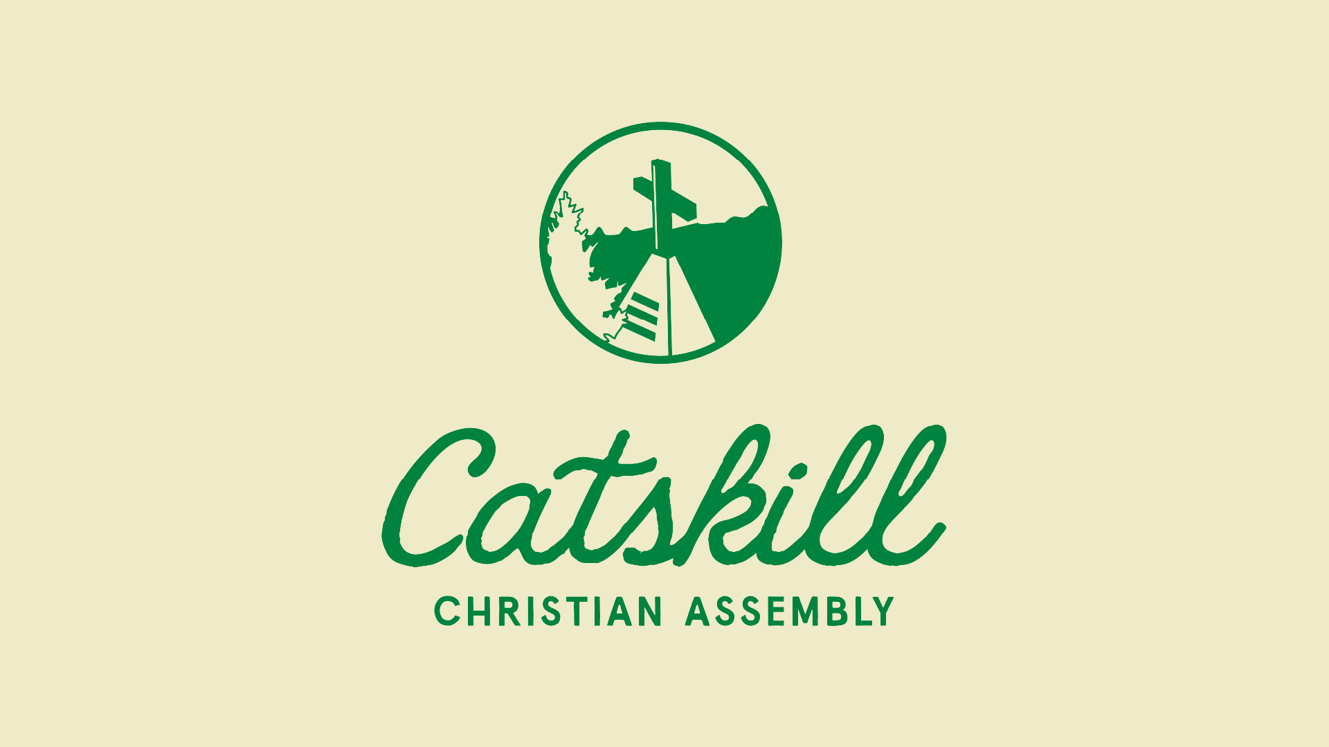
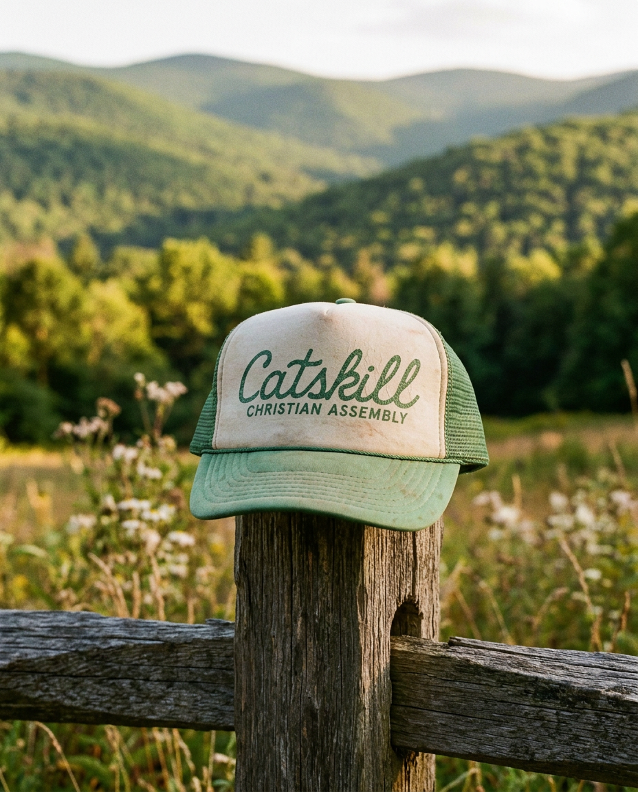
What was once one overworked badge became a full identity system. Horizontal mark. Stacked mark. Wordmark. Brandmark. Each one carrying the same DNA, built to work across a website, merch, social media, signage, and events without ever losing the feeling of the place.
The Website
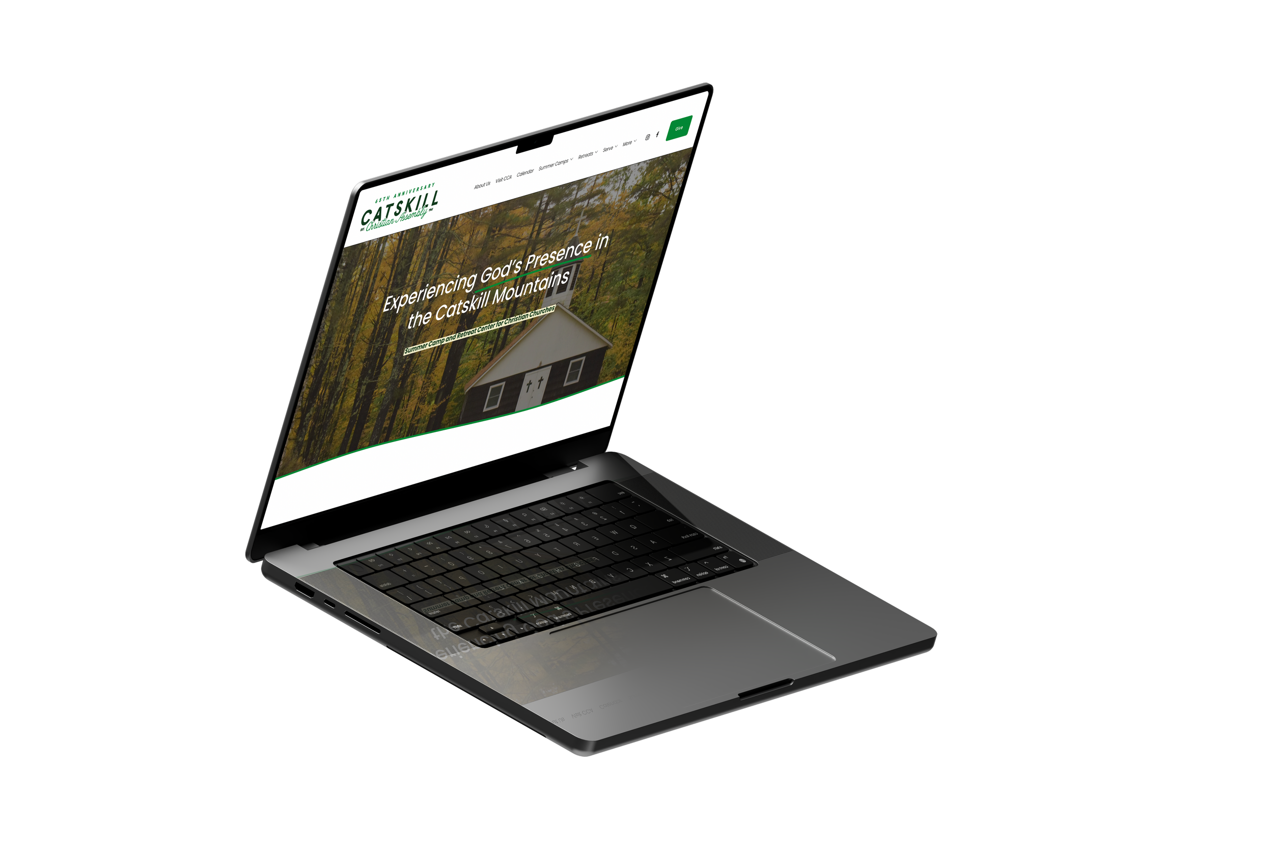
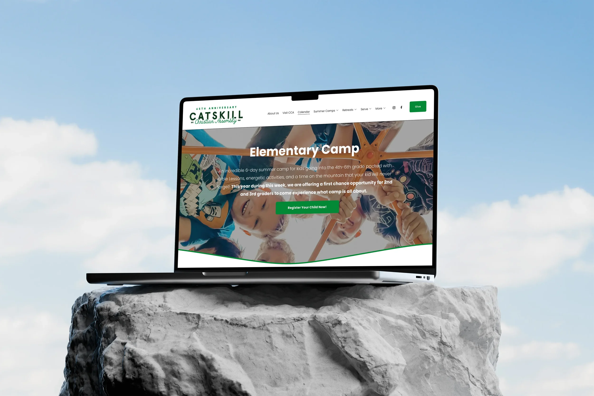
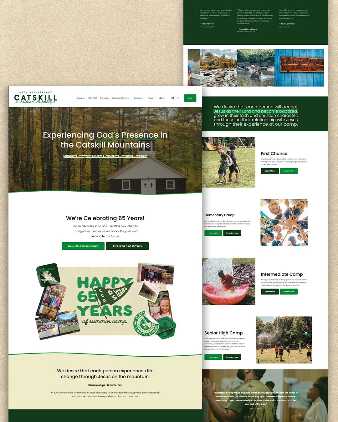
CCA needed more than a new look. They needed a website parents could actually trust — one that answered their questions, showed them the place, and made it easy to take the next step.
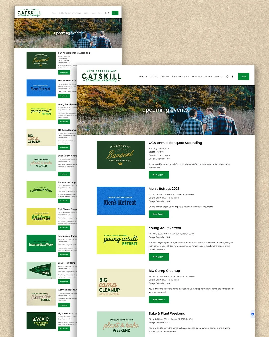
I rebuilt the site from the ground up on Squarespace, starting with the core pages: About, Events, and Contact. Over the years that foundation grew into a full site architecture — individual pages for every summer camp and retreat, a staff and serving section, FAQs, a Visit page, a Canteen shop, and a dedicated 65th Anniversary experience.
Every page was built with one question in mind: does a parent landing here feel confident enough to register their kid? The answer now is yes.
The CCA Canteen
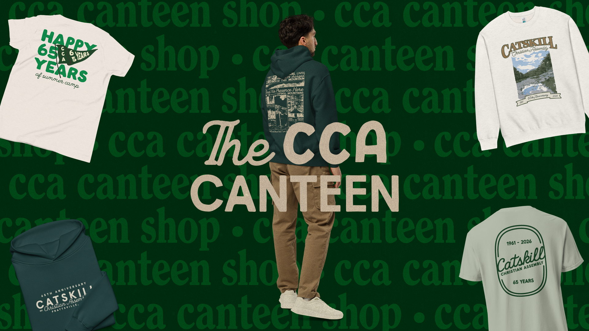
CCA had never sold merch online. Getting there meant building the whole thing from scratch — logo, shop, product setup, Printful integration, fulfillment, shipping profiles, taxes, checkout, product photography. Every piece of the ecommerce system had to be figured out and connected before a single item could go live.
The Canteen got its own identity. A separate logo mark that lives within the CCA family but has its own personality — a name and a brand that feels like a camp store should feel. Warm, simple, and a little nostalgic.
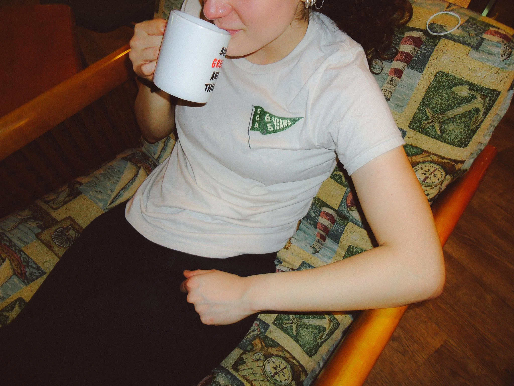
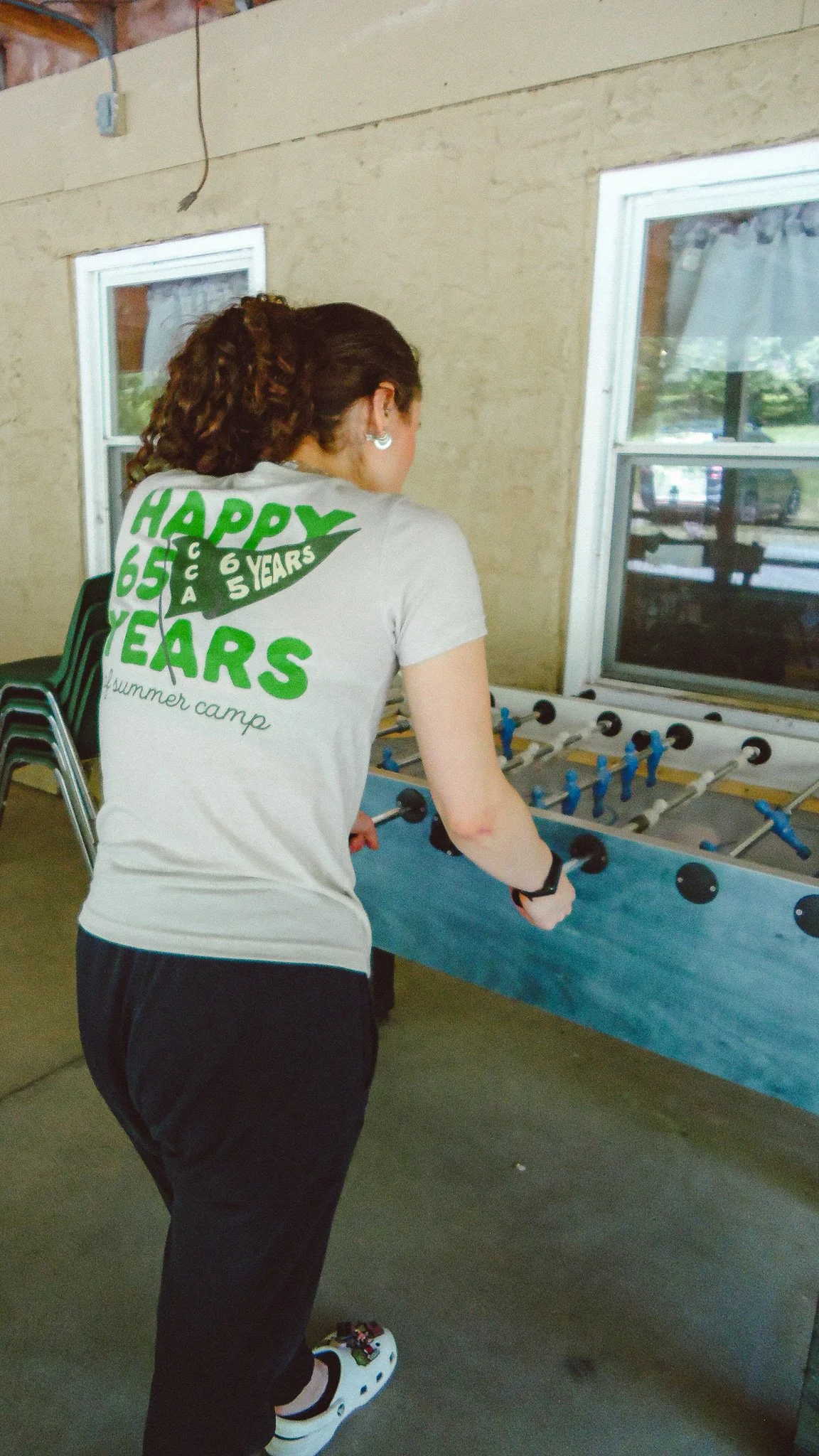
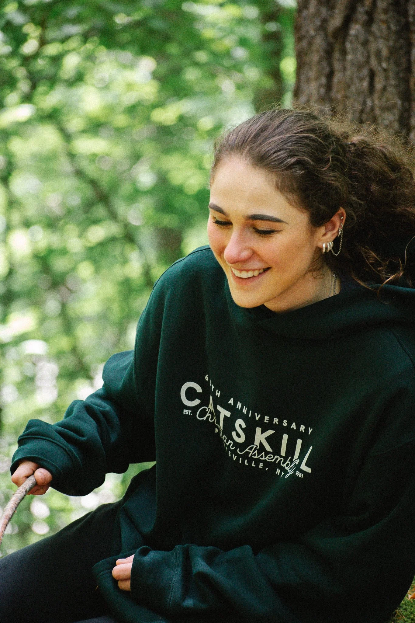
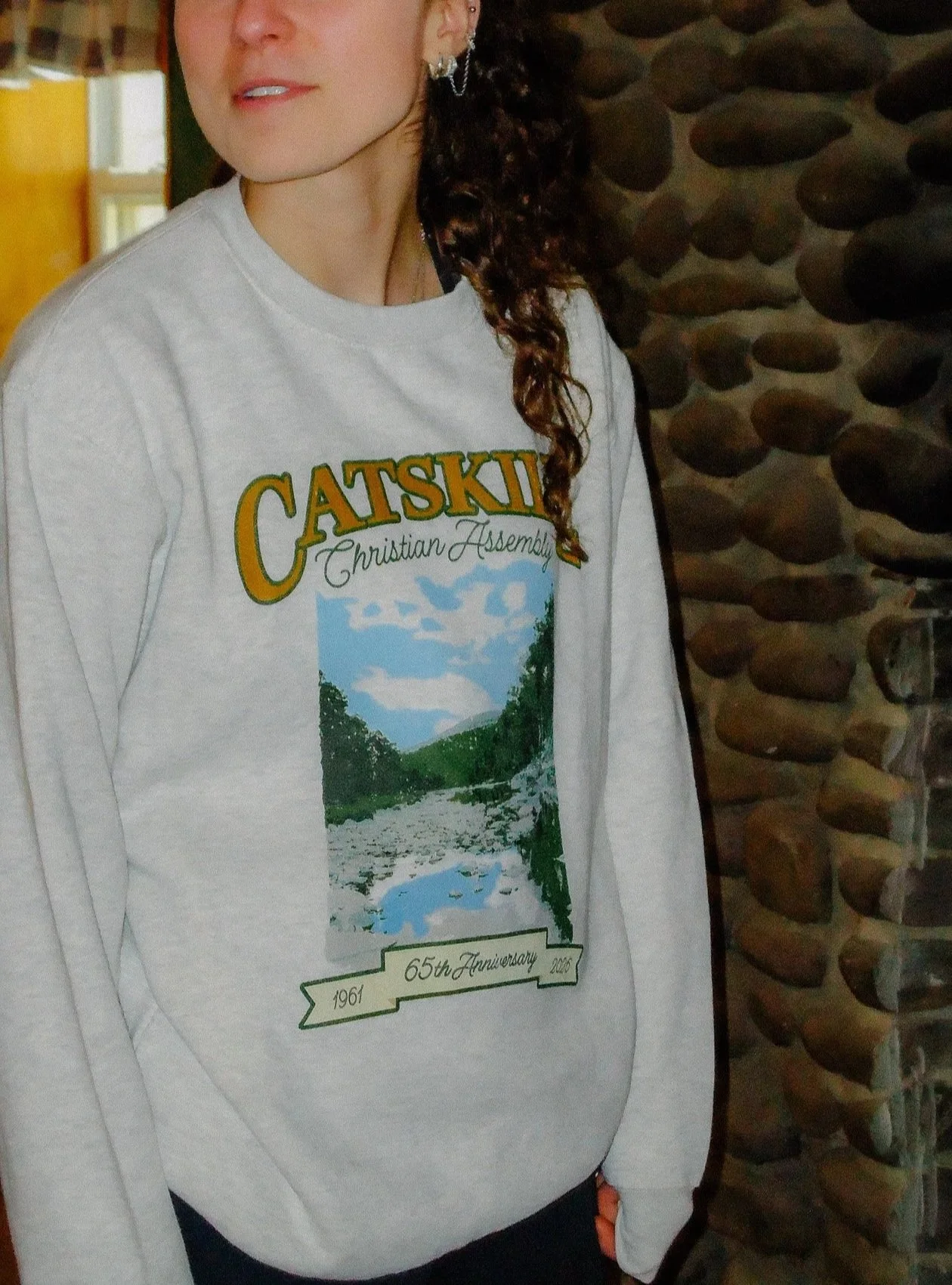
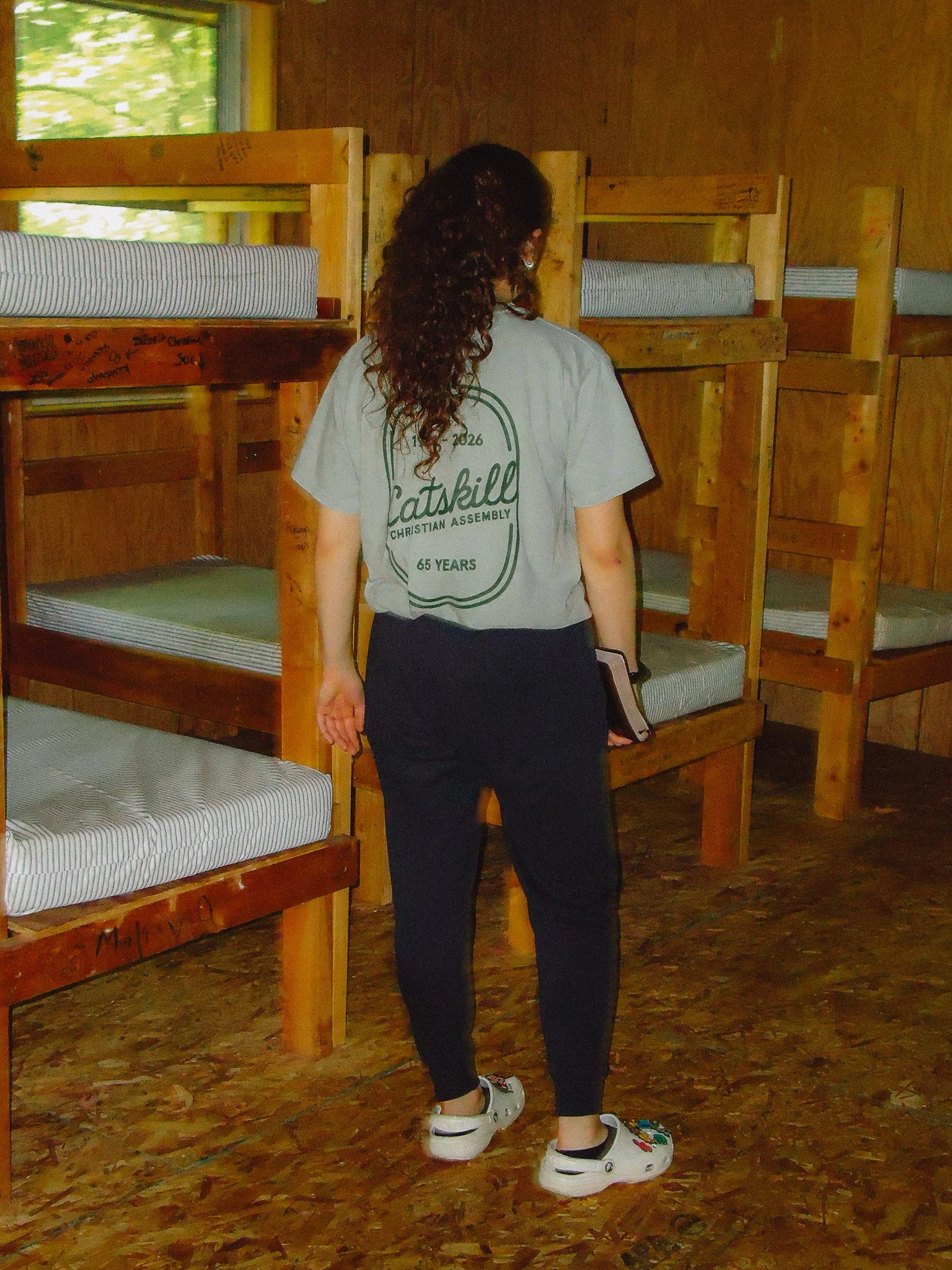
The shop launched with the 65th anniversary collection — the crewneck, the hoodie, the flag tee, and more — all designed, produced through Printful, and sold directly through the site. CCA now has a merch presence that matches the rest of the brand and a system in place to grow it for years to come.
2025 Merch Collection
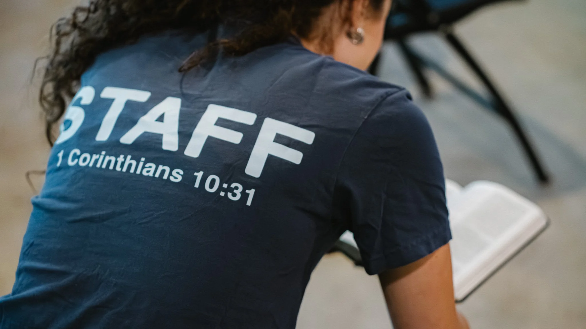
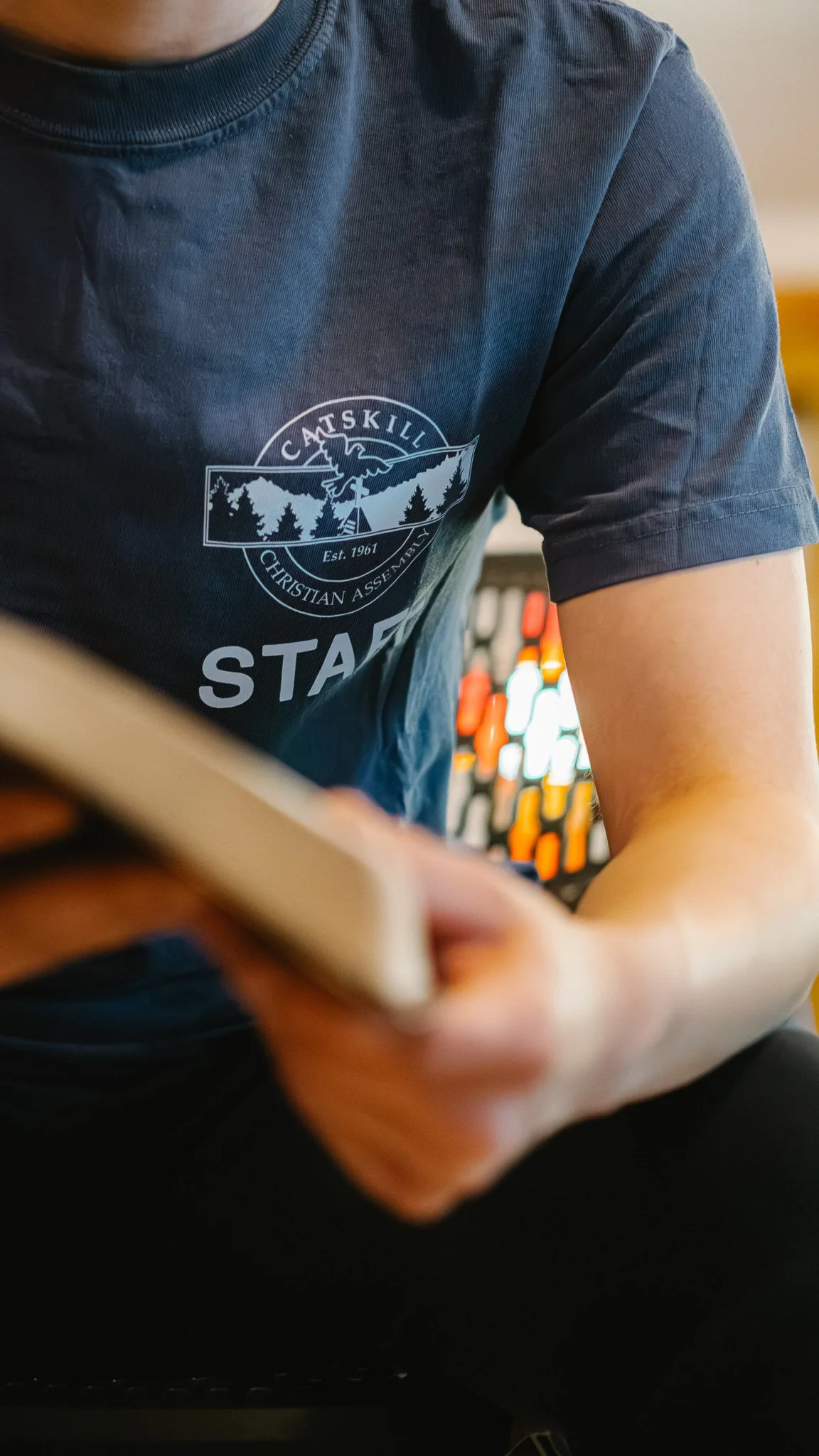
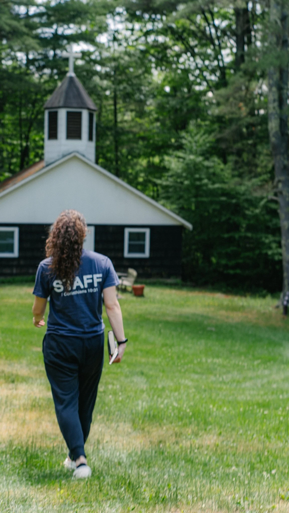
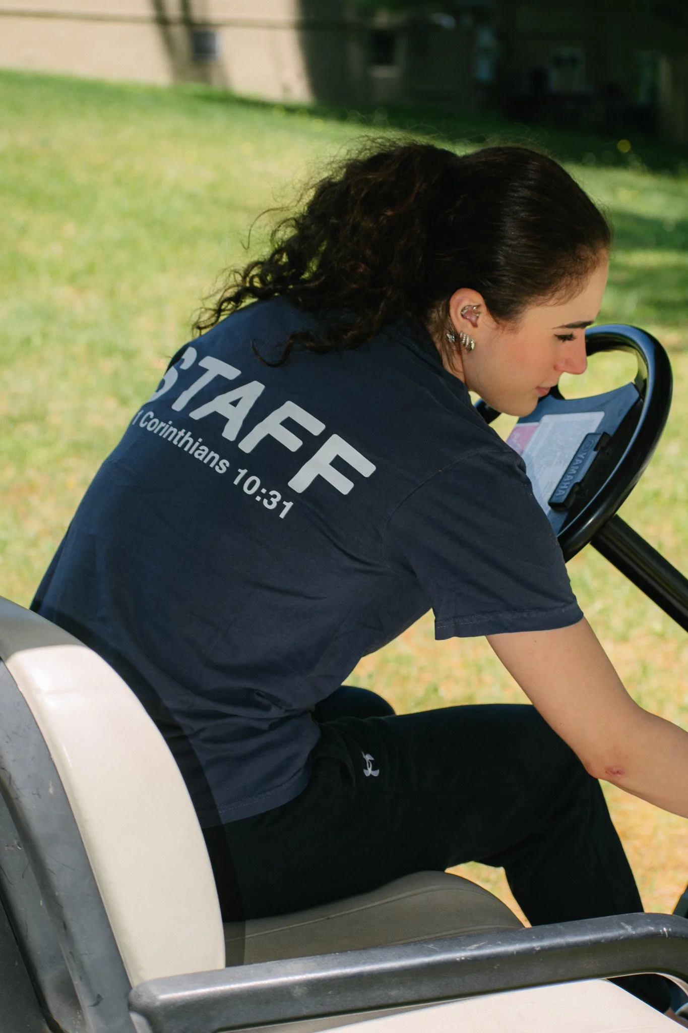
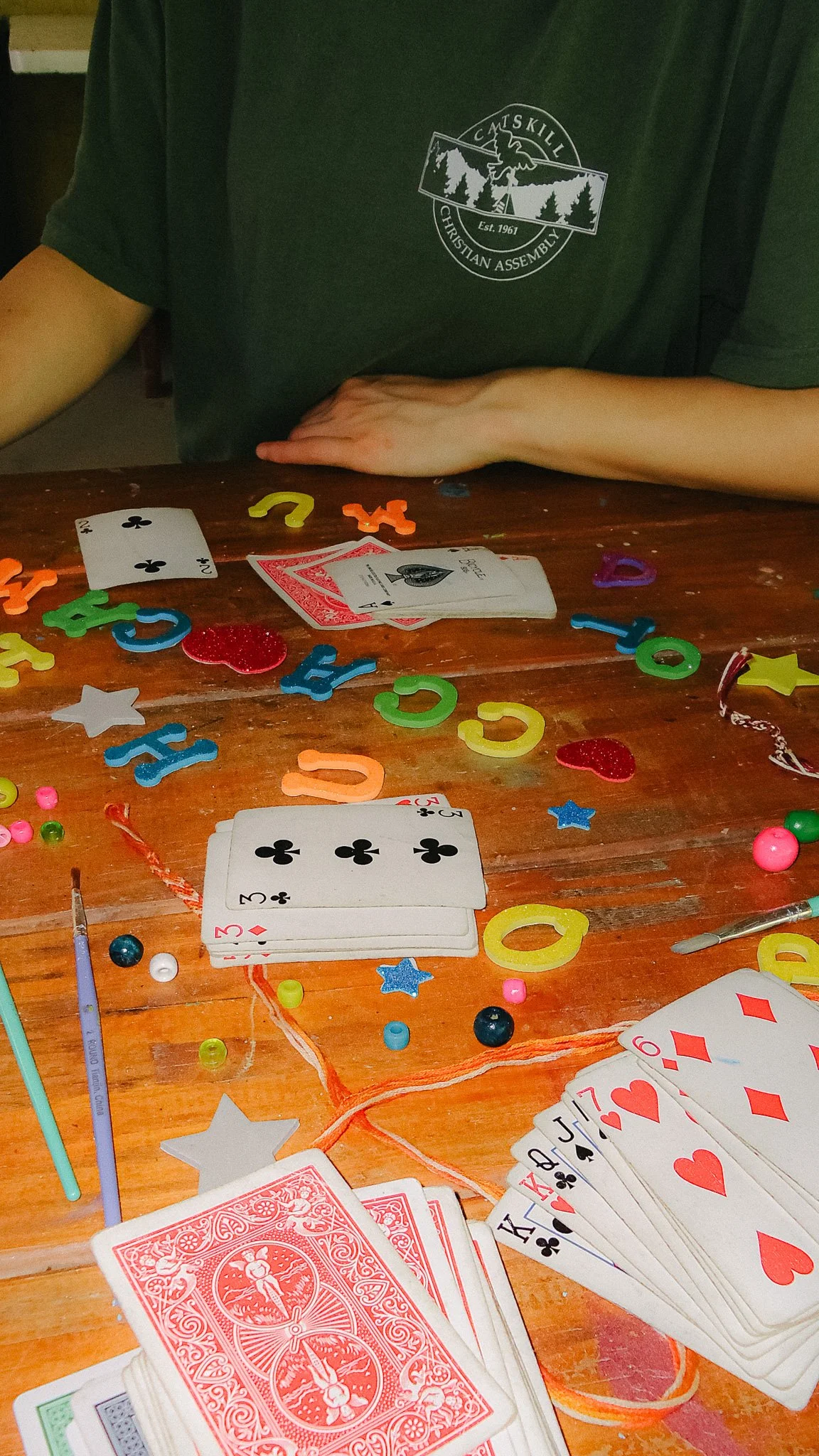
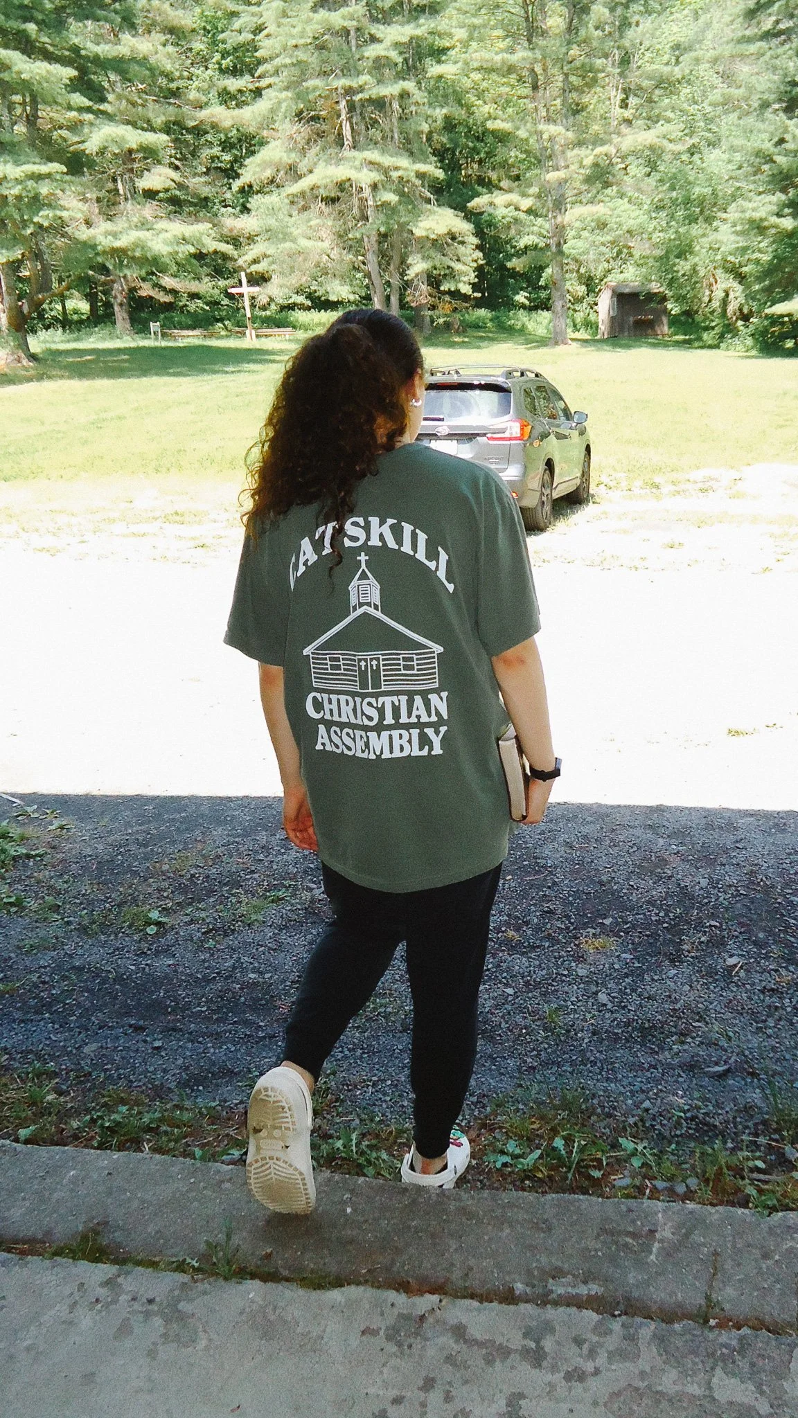
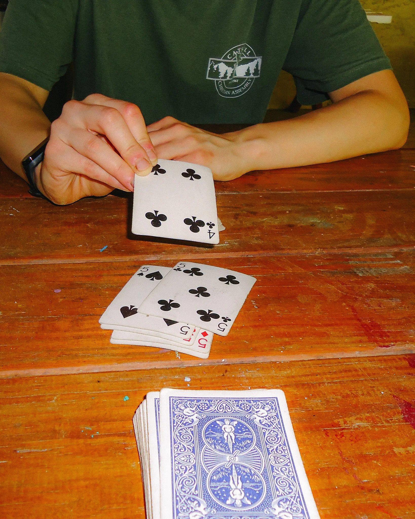
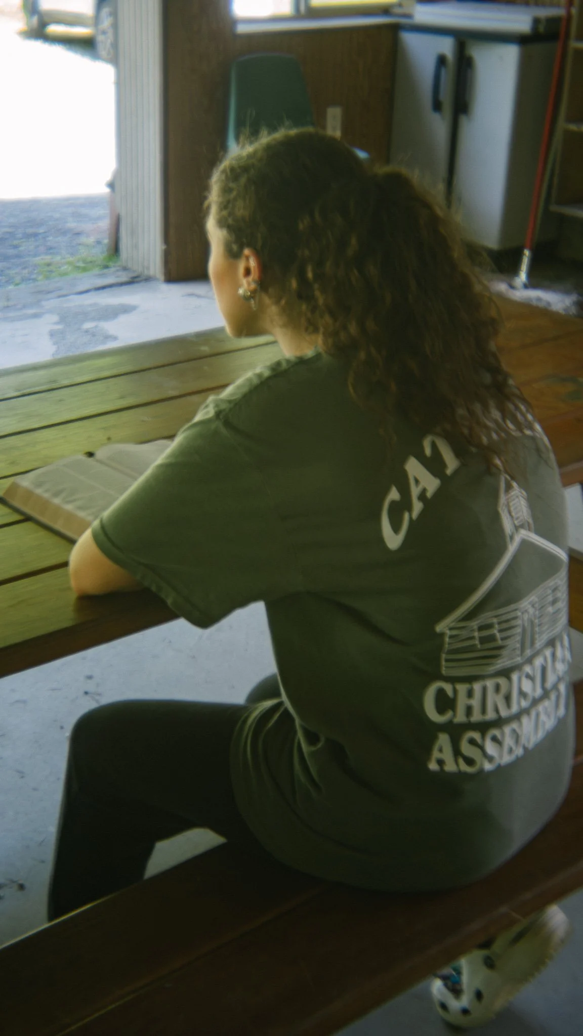
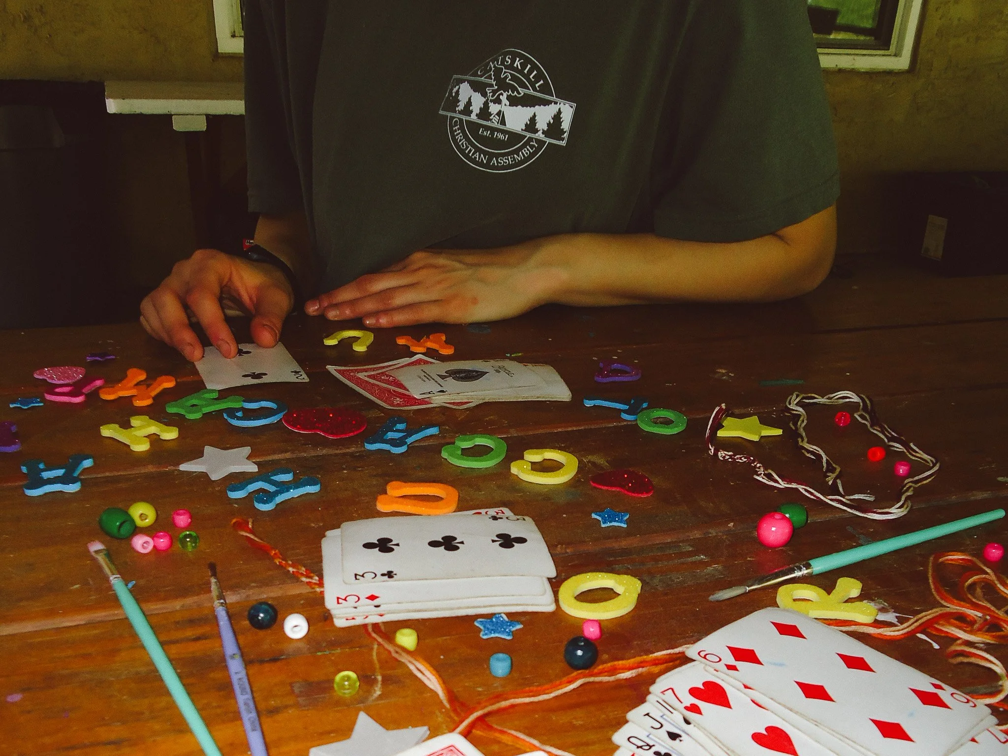
CCA hadn’t had new merch in years. The CCA leadership had a vision for new staff shirts, S.W.A.T. shirts, and a summer shirt that all ages would love. Working with the Vice President, we were able to collab on a direction for the t-shirts and create three solid designs that everyone loved. The shirts were simple with the CCA Heritage badge on the front left pocket which each one having a different back. The Summer Camp Shirt featured a hand-drawn chapel illustration that I created from the Chapel at the camp. After launching, the camp got a lot of great feedback — campers, parents, and staff all loved the shirts!
The Photography
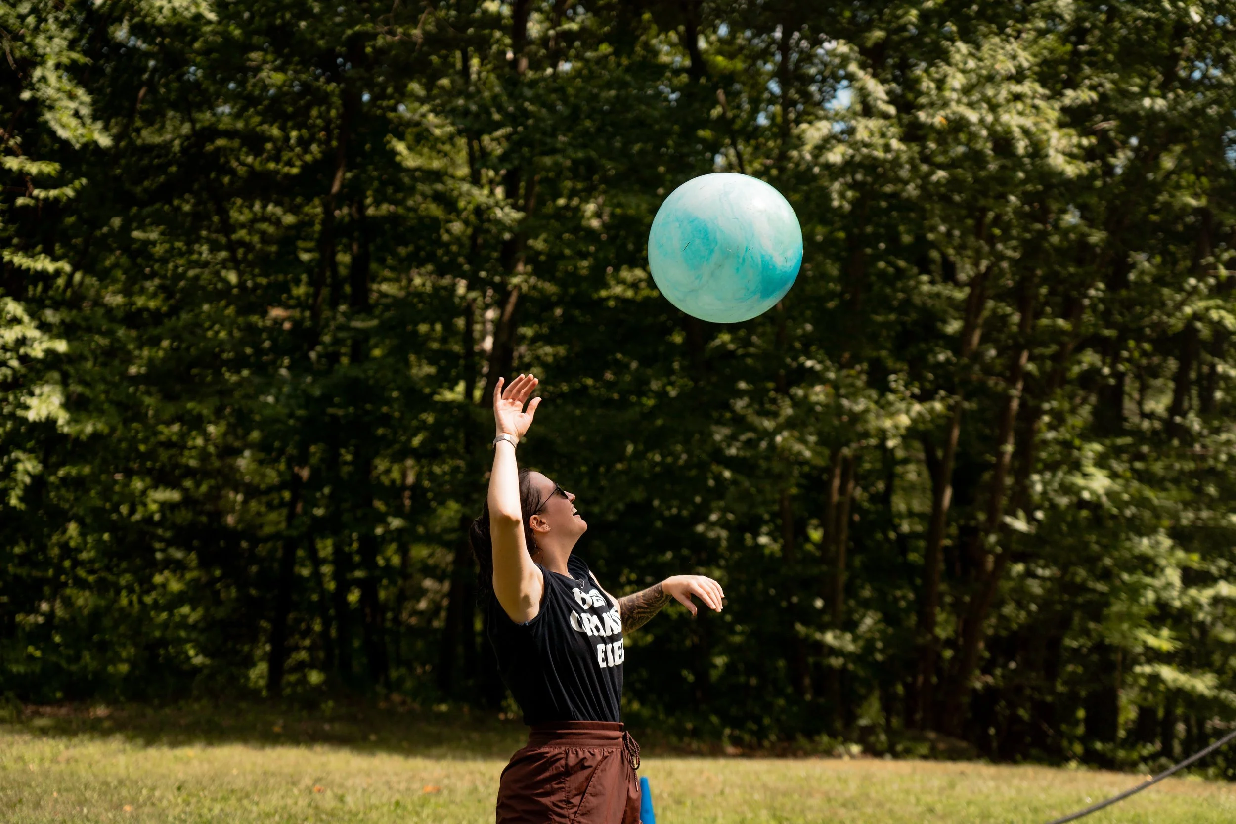
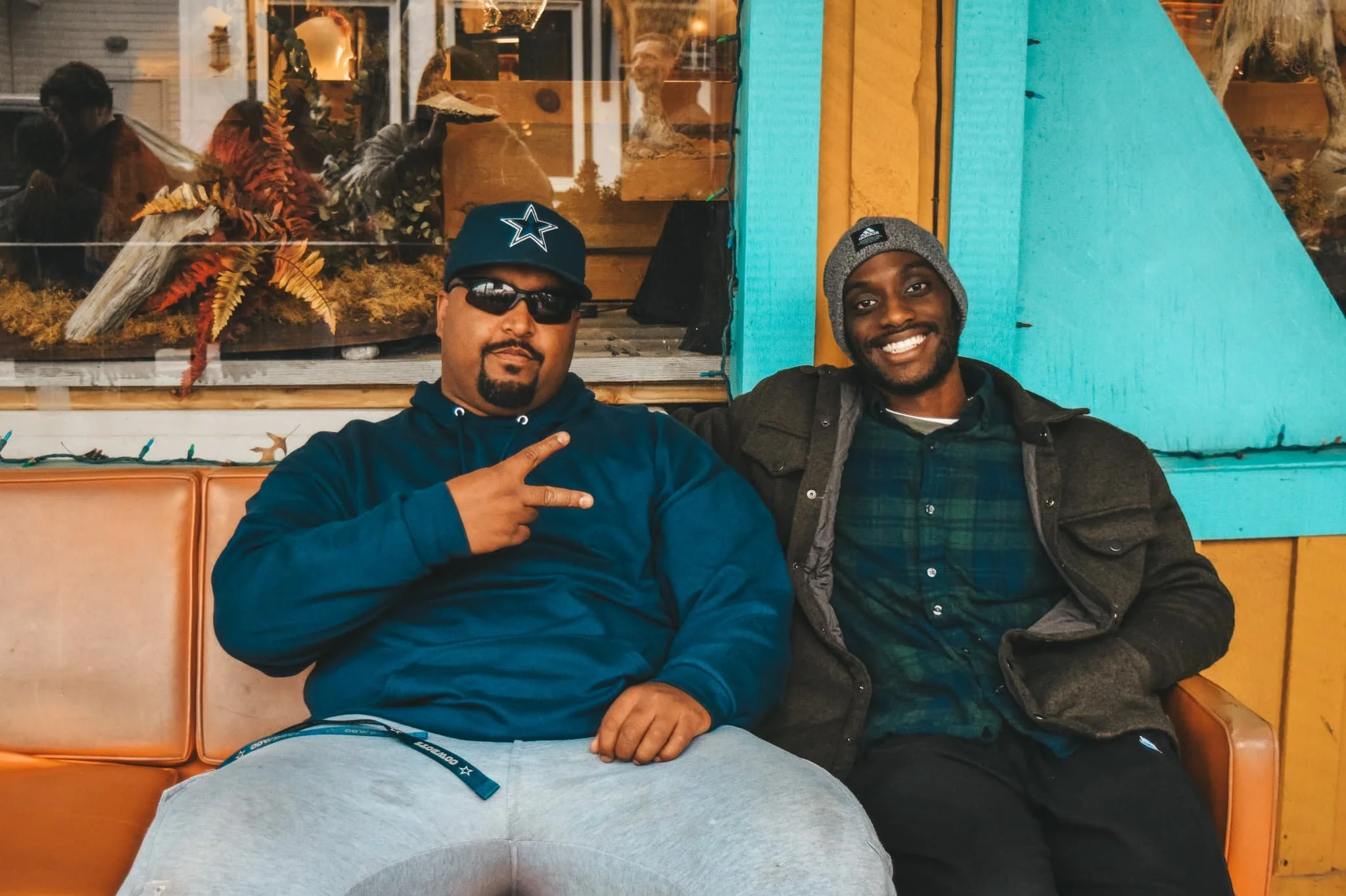
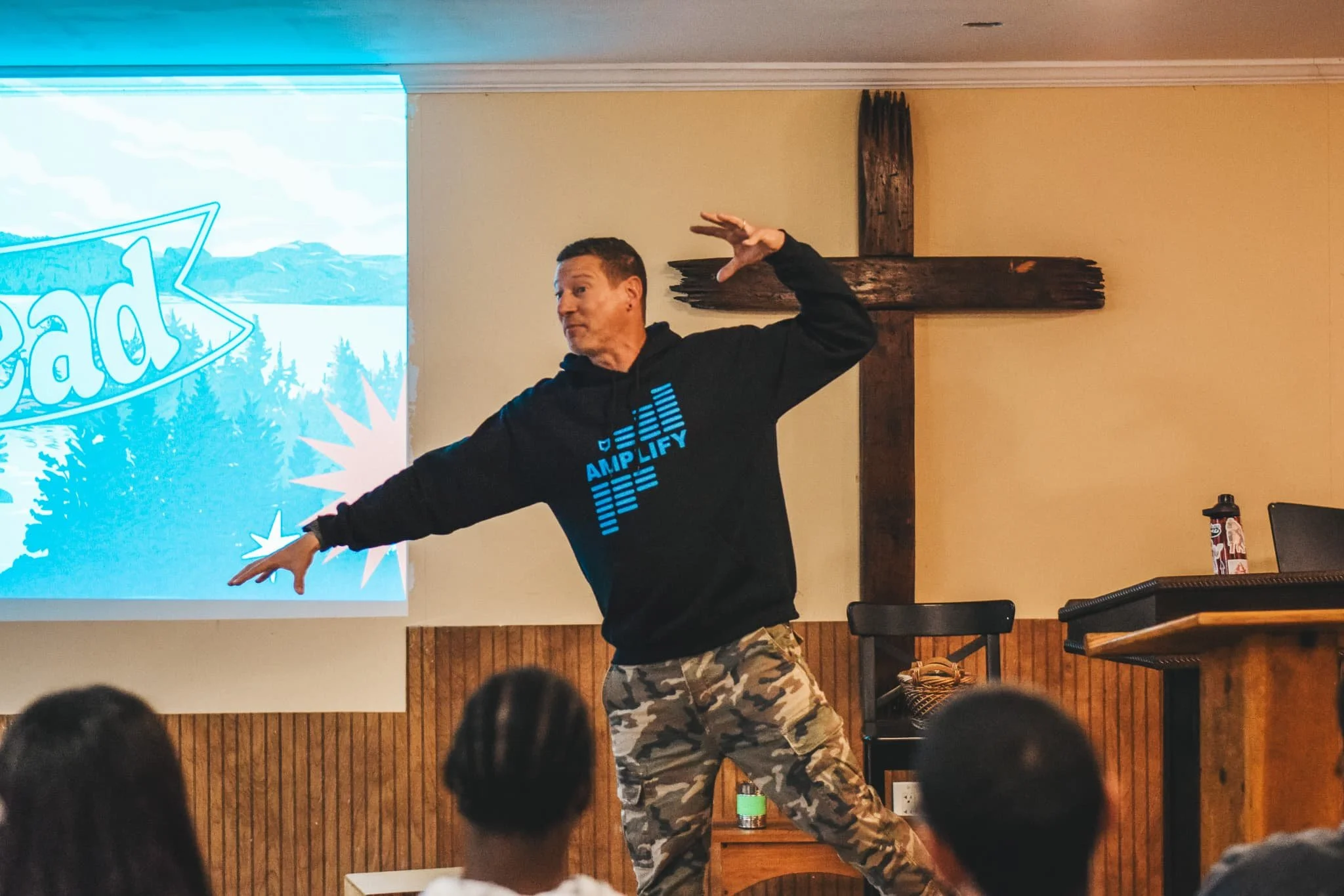
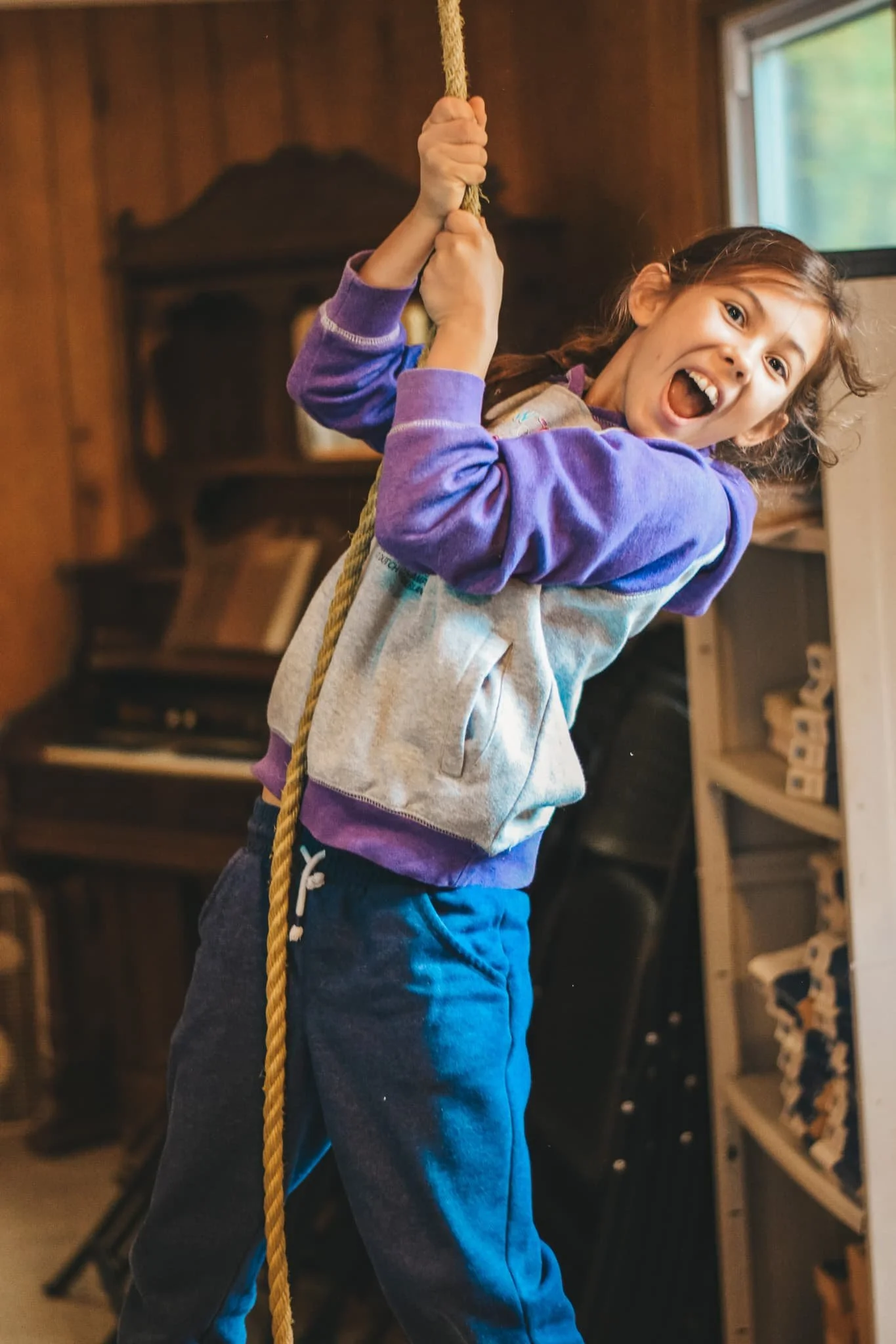
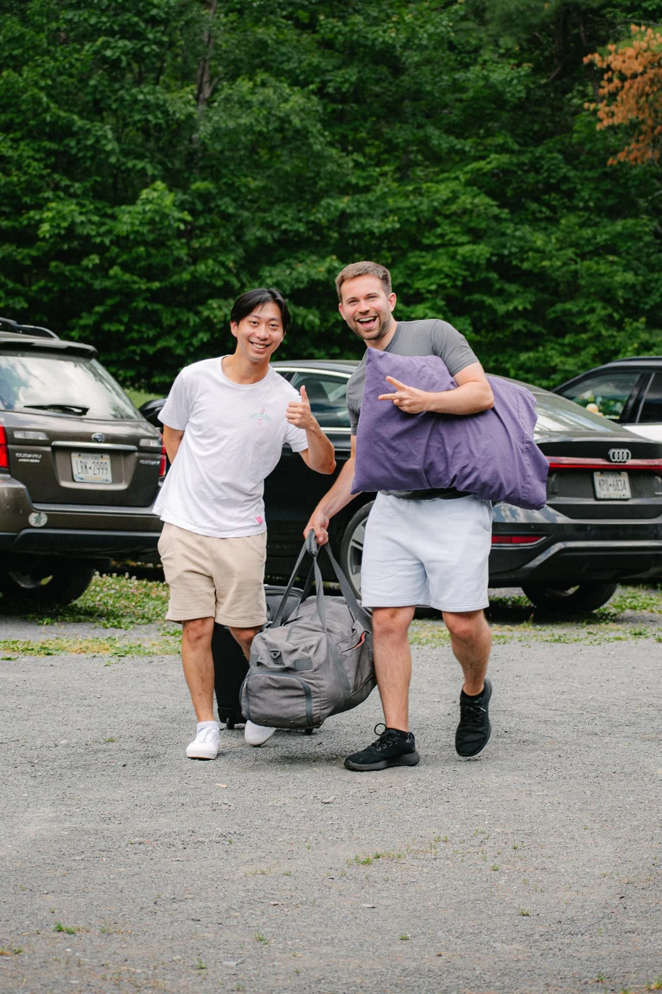
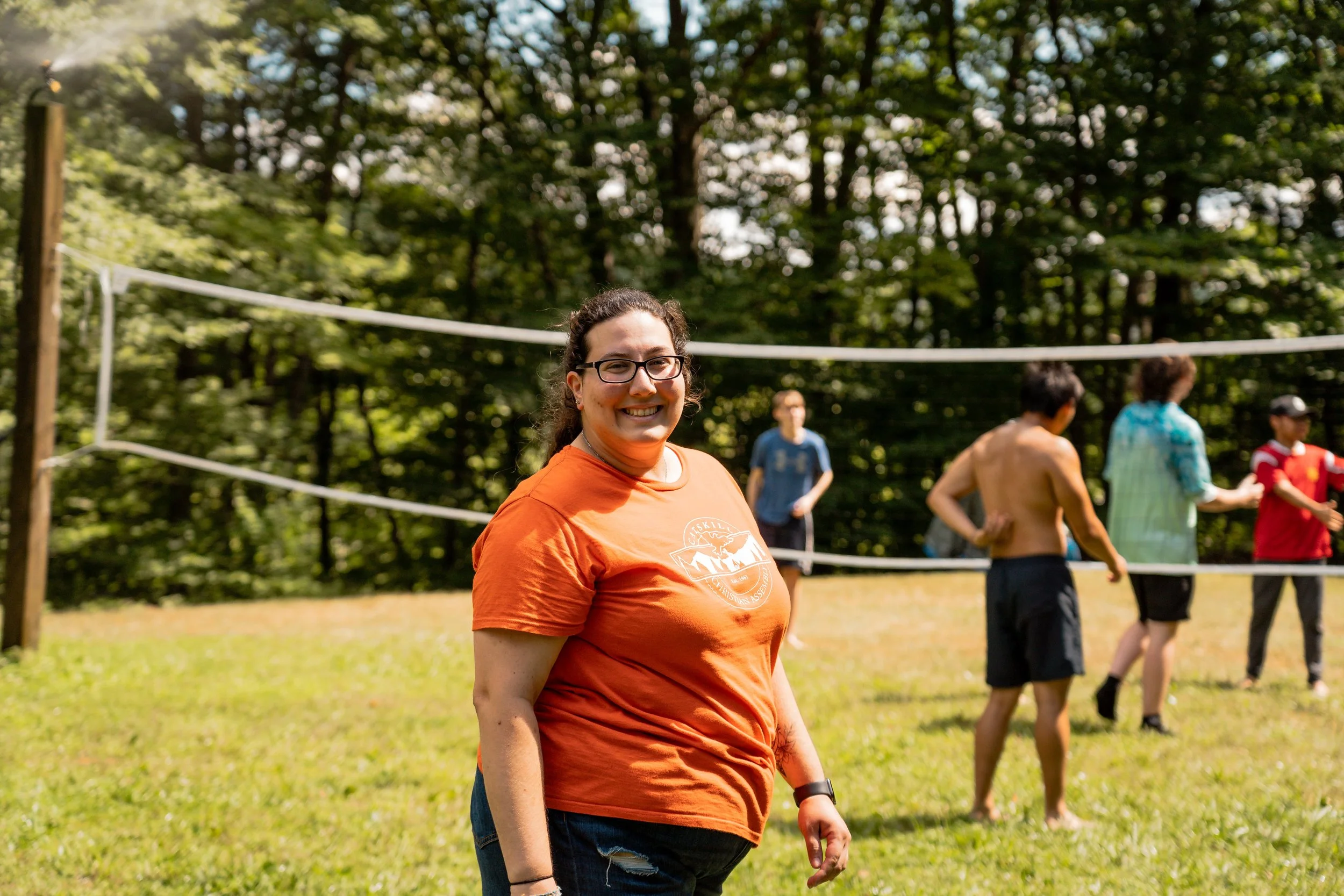
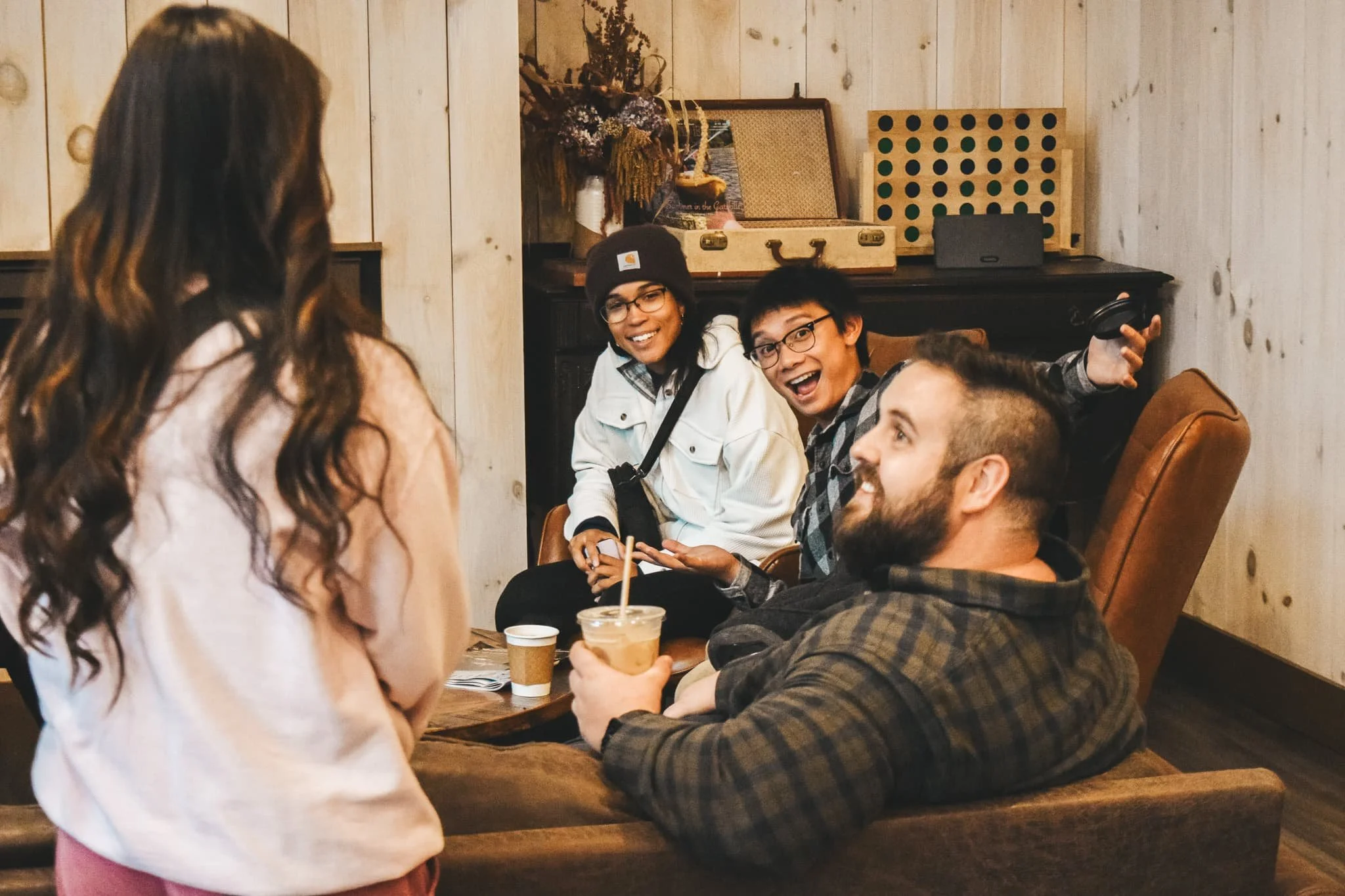
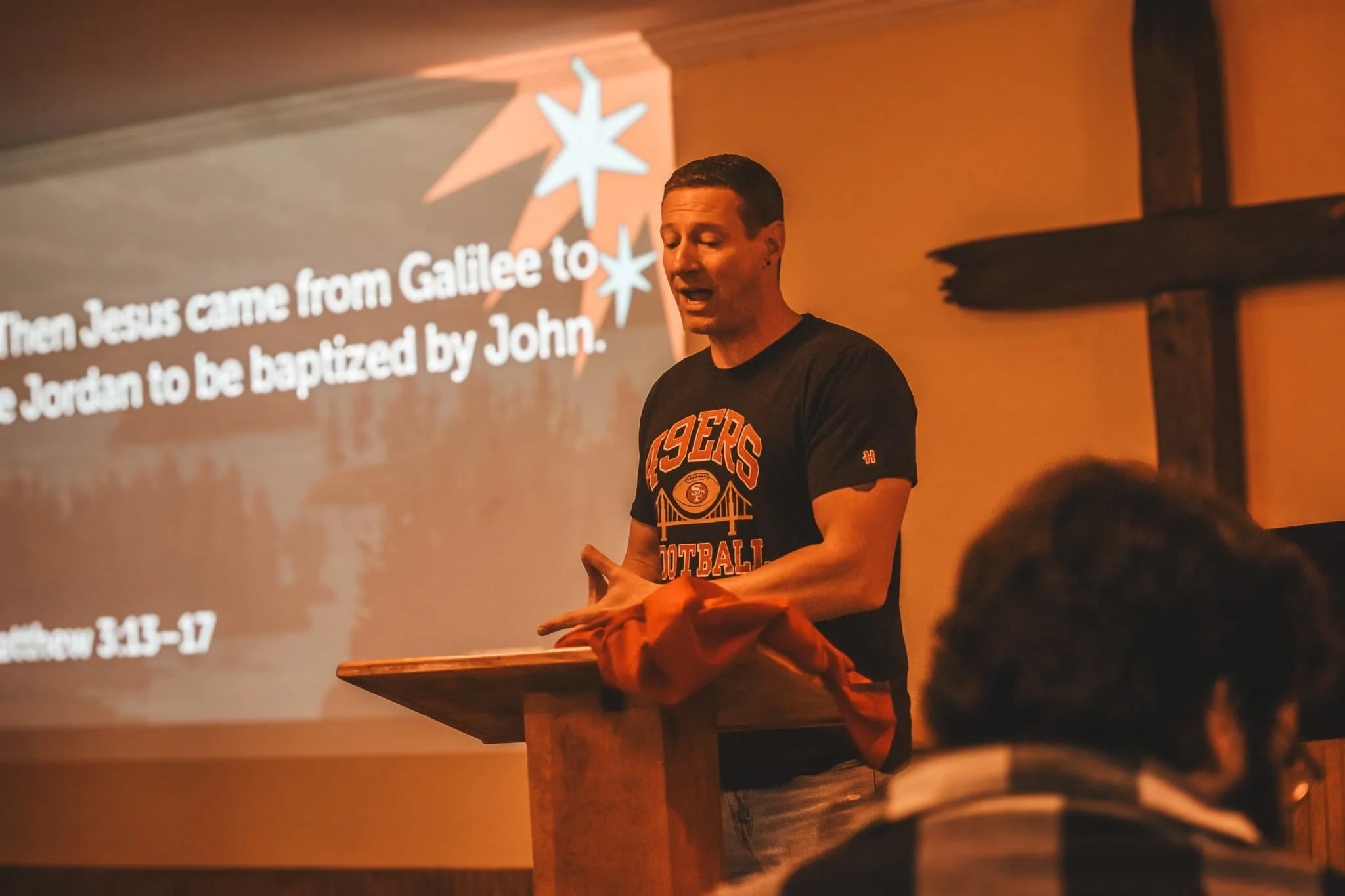
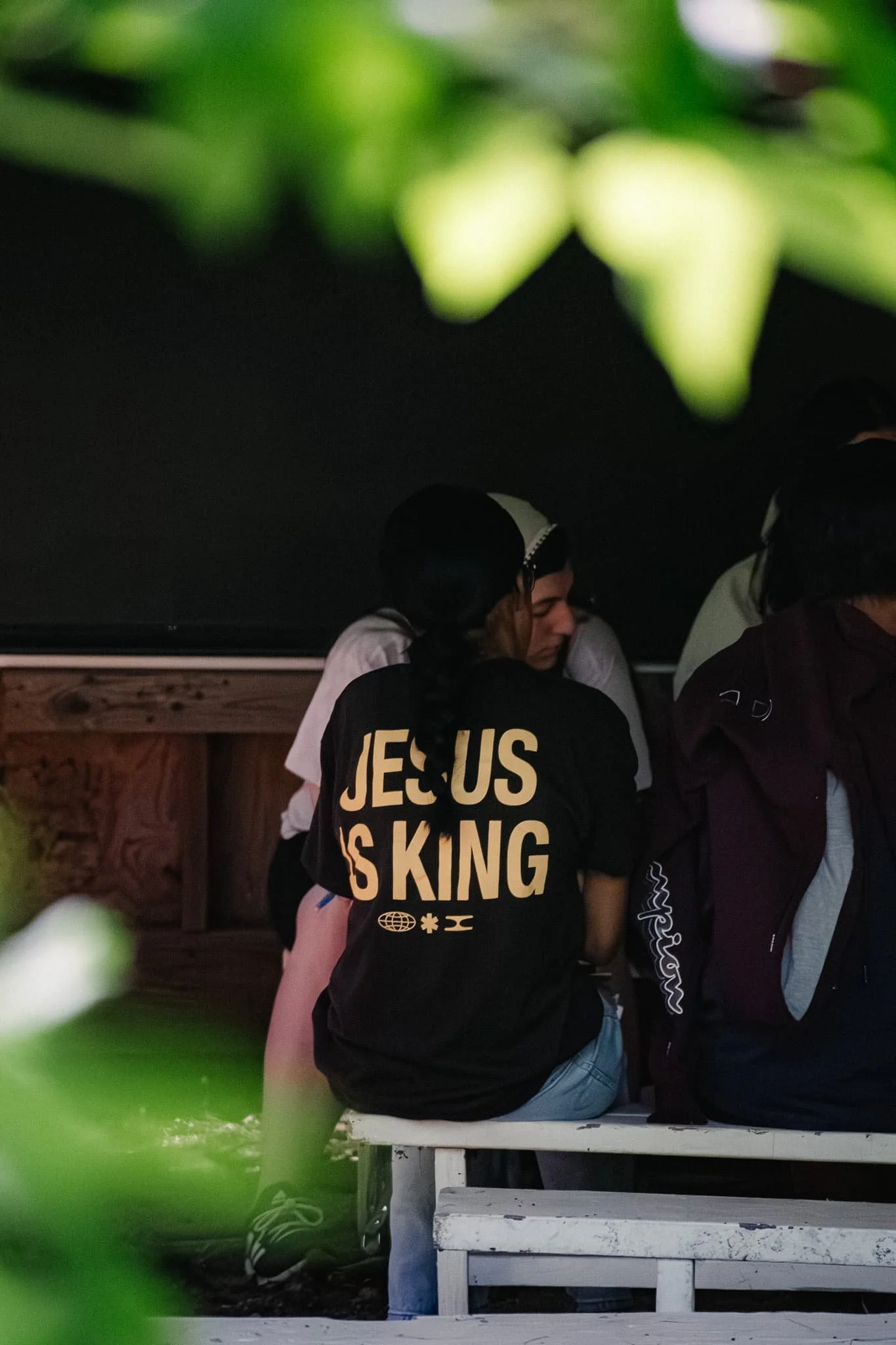
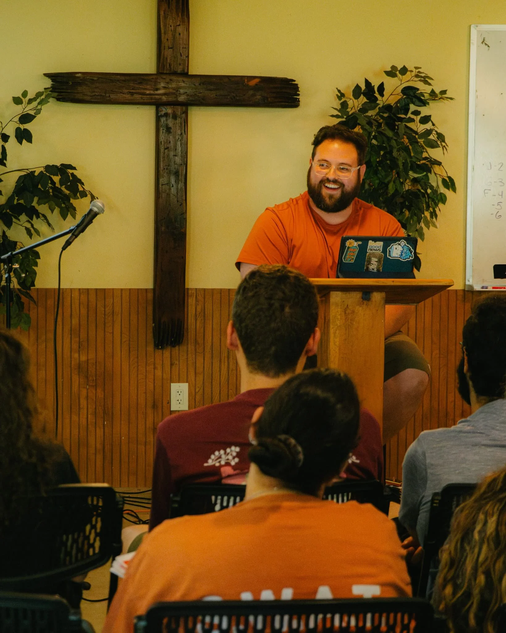
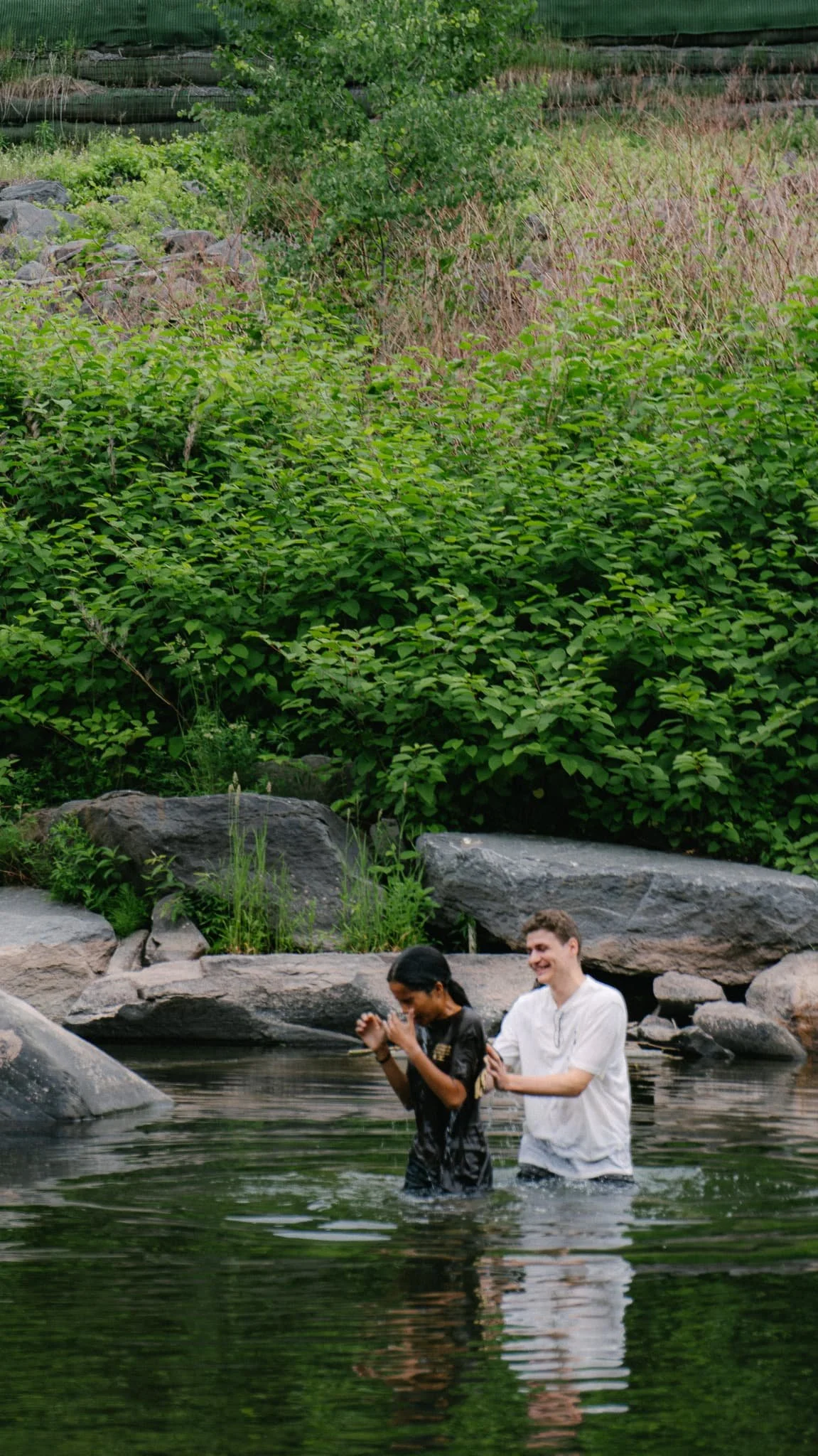
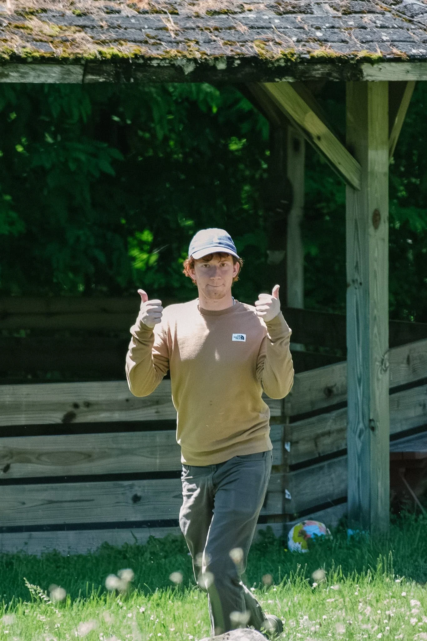
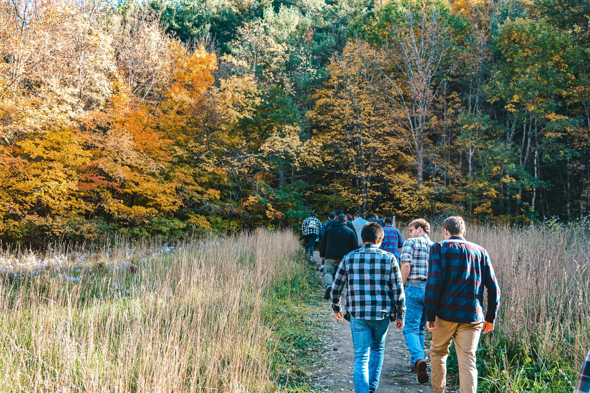
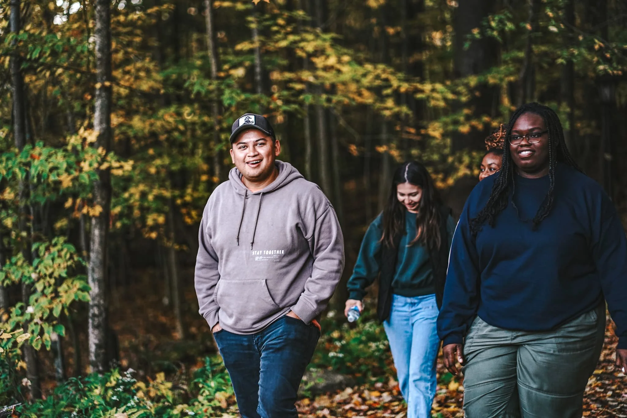
Most of what you see on the CCA website was shot on the mountain by me. The creek, the chapel, the fall foliage, the kids at camp — real moments from a place I know well. Having spent time there as a counselor and returning season after season, I knew what to look for and how to capture the feeling of the place.