
Christmas at NCC
Illustration, Design, Seasonal Branding, Communications, Strategy, Event Marketing, Facebook Ads, Social Media, Event Spatial Design, Copywriting, Photography, Website Design and Development, Leadership, and Print
Client
Nesconset Christian Church
Year
2023
The Design Process:
-
When conceptualizing the Christmas at NCC branding, I brainstormed some keywords that I felt were important to communicate during the Christmas season. These keywords—Family, Nostalgia, Memories, Connection, Multigenerational, Simple, Elegant yet Kid-friendly, and Creative—formed the foundation for my vision.
After coming up with these keywords, I realized that I wanted Christmas at NCC to create memories between generations of people that connected them to the true meaning of Christmas — Jesus.
Nostalgia was key, evoking the warmth of childhood Christmases spent with family around the tree. When I think of nostalgic Christmas, I think of when I was a child around the tree with family. I wanted to bring that nostalgic fun feeling of remembering Christmas as a child without being flashy or over the top.
-
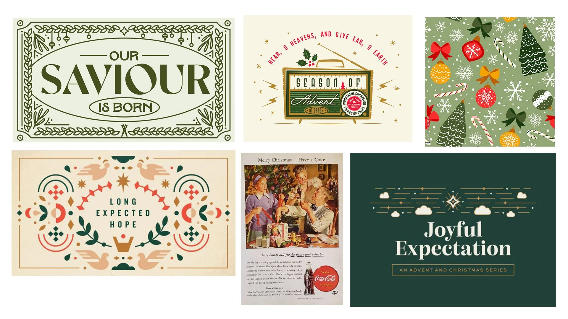
My research began by exploring Google Images, Pinterest, Unsplash, Adobe Stock, Behance, and Dribbble to gather ideas, primarily focusing on vintage Christmas advertisements, movies, and graphics from the 70s, 80s, and 90s for inspiration. Using Coolers.co, I curated a vintage color palette, starting with the first concept's colors and experimenting with our branding blue and subdued greens for a refined look. I further explored a vibrant, playful aesthetic by incorporating light blue and pink tones into the mix to achieve a fun and bright visual vibe.
-
I created three concepts; see more details below on the process of each concept.
-
After presenting the three concepts to the staff team, the team loved elements of all three but settled on the first concept as the winner.
Concept 01 - The Winner
Nostalgia + Warmth + Traditional
For the initial concept of Christmas at NCC, I aimed to capture a distinctive vintage aesthetic infused with illustrations. This design concept sought to evoke nostalgia while maintaining a contemporary appeal. To achieve this, I began by curating a mood board that drew inspiration from a collection of graphics and a color palette gathered during the research phase.
Color Palette & Mood board:
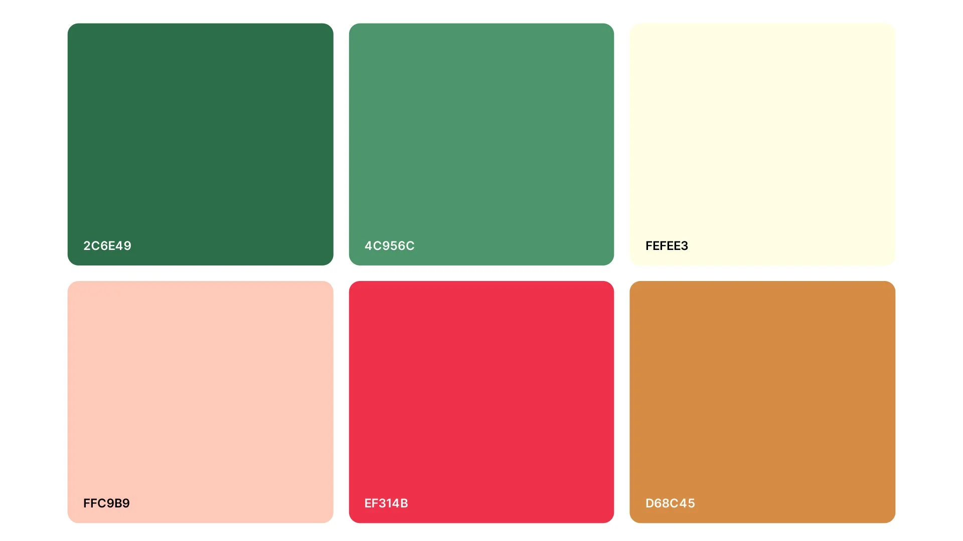
The color palette I meticulously crafted was a fundamental element in creating the desired nostalgic ambiance for the Christmas at NCC design concept. The interplay of these rich, warm tones—vintage red, warm gold, vintage light pink, dull sea green, terrestrial green, and golden cream—within the color palette serves as a powerful vehicle to evoke a sense of nostalgia, warmth, and tradition associated with the holiday season.
Typography:
I opted for the versatility of the serif font family, specifically choosing Kepler Std as the primary typeface. Its varied weights and italics offered flexibility while maintaining consistency across different design elements. The intention behind leveraging different weights was to inject diversity within the seasonal branding while ensuring a cohesive visual identity.
To complement the primary font, I introduced Moodinan as a secondary font choice, aiming to infuse the design with a vintage American essence. The amalgamation of these fonts allowed for a playful yet refined approach, encapsulating the unique vintage vibe sought for Christmas at NCC.
Color Palette:
Mood board:
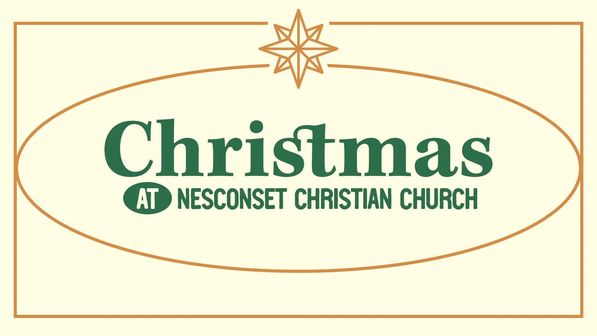
Main Christmas Graphics, Concept 01:


Concept 02
Nostalgia + Simple + Elegant
For the second rendition of Christmas at NCC, my aim was to encapsulate an elegant nostalgic atmosphere, blending simplicity with a distinctive sense of nostalgia. I desired for this design to be simple, not flashy, yet contemporary and fun. To achieve this, I curated a mood board drawing inspiration from various graphics and a refined color palette gathered during the research phase.
Color Palette & Mood board:
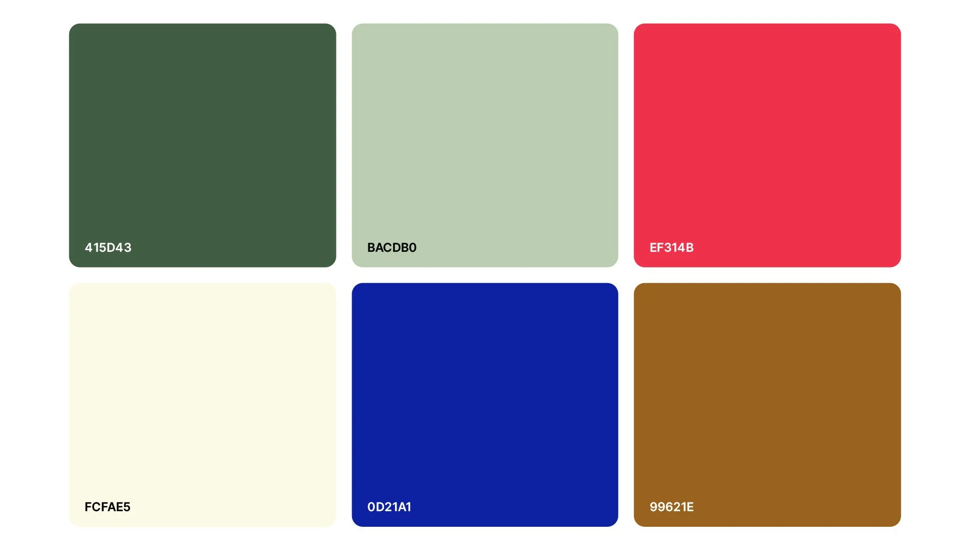
The color palette maintained a similar feel from the first concept while undergoing subtle transformations. Keeping the foundational red hue, I nuanced the other colors, replacing the blush pink with our branding blue to infuse elements of our brand identity. To enhance elegance, I deepened the gold-tone while toning down the greens and gently lightening the cream, fostering a refined and sophisticated visual palette.
Typography:
In exploring typography, I sought inspiration from the nostalgic charm of 'A Christmas Story,' aiming to evoke a vintage Christmas at home with the family aesthetic in the 70-80s era. To achieve this, I opted for the Rafaella font, infusing the design with a blend of playfulness, formality, and liveliness.
Complementing this, the choice of Forma DJR Micro introduced a simple yet contemporary mid-century appearance. These fonts crafted an elegant, simple, and nostalgic ambiance in line with my envisioned design.
Color Palette:
Mood board:
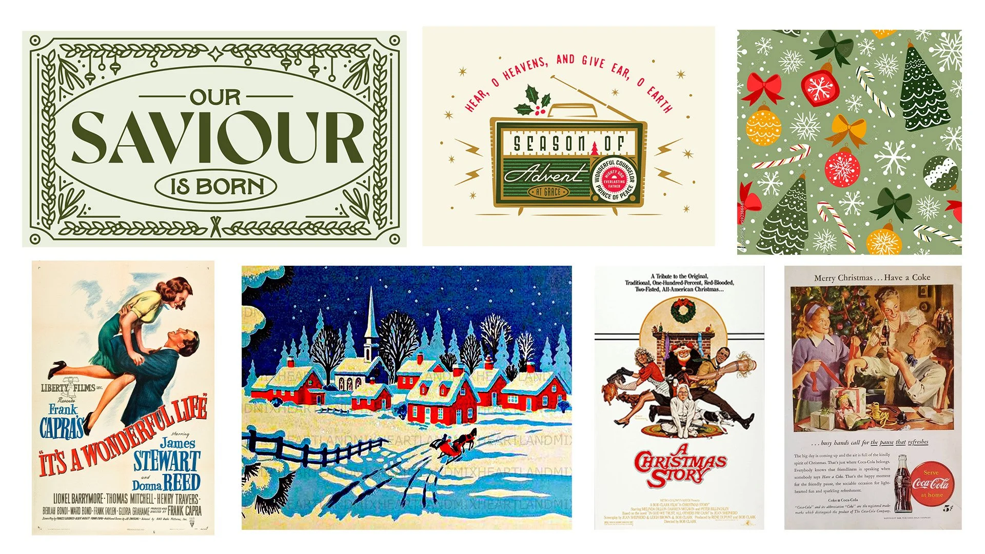


Concept 03
Retro + Whimsical + Fun
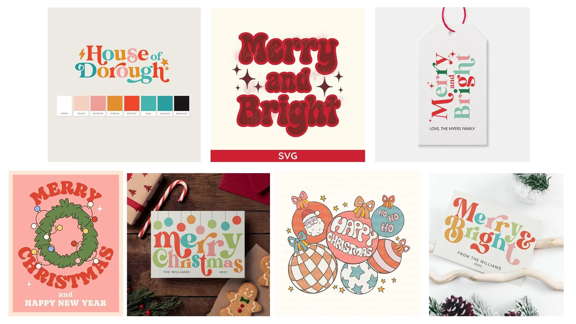
For the third and final rendition of Christmas at NCC, my aim was to curate a playful and nostalgic retro experience, capturing a whimsical essence that resonates with a trendy and kid-friendly atmosphere. The goal was to evoke the cherished Christmas spirit that people fondly remember from their childhood. To achieve this, I curated a mood board drawing inspiration from various graphics and a refined color palette gathered during the research phase.
Color Palette & Mood board:
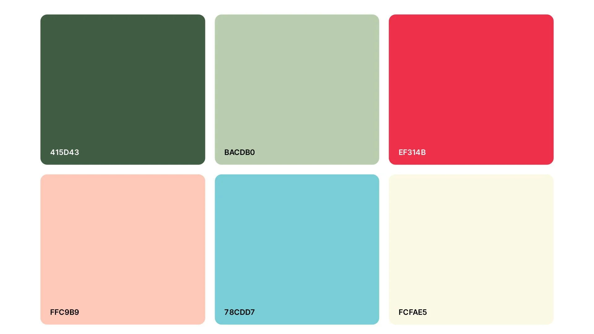
The color palette maintained a similar feel to the first and second concepts while undergoing subtle transformations. While preserving the foundational red hue and incorporating the greens from the second concept, I deviated from the gold, reverting to the initial pink and retaining the light cream. I reintroduced our brand's light blue, infusing elements of our brand identity. This amalgamation of blush pink and light blue infused a delightful retro vibe, lending a unique and cheerful character to the design.
Typography:
In my exploration of typography, I drew inspiration from retro thick serif fonts like Cooper and Soap, intending to incorporate whimsy while seeking versatility in weights for variation. Ultimately, Sirenia stood out as the ideal choice, not only meeting the required criteria but also presenting a friendly, easily readable, and visually engaging font.
Complementing this, the inclusion of Forma DJR Micro provided a simple yet easily legible font, ideal for paragraph text to ensure a seamless reading experience.
Color Palette:
Mood board:

Final Designs
Final Design Process
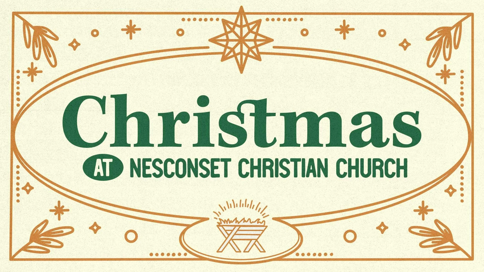
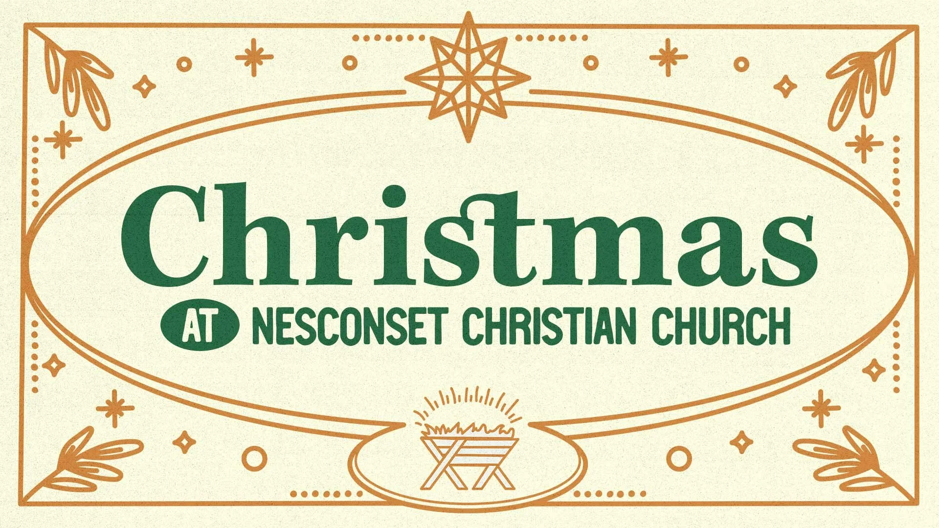
Using Adobe Illustrator, it was exciting to recreate the concept using shapes and the pen tool to start making the first concept come to life. Placing the manager at the heart of the lower thirds was like setting the stage for the focal point, while each star was meticulously drawn, aiming to make the North Star shine brilliantly. The incorporation of leaf branches in the design's corners carried a deeper meaning inspired by Jesus's birthplace in Nazareth. It was fascinating to discover that 'Nazareth' derives from 'netzer,' meaning 'branch.' Integrating these branches added a profound layer of symbolism, infusing the design with a subtle yet profound homage to the etymology.
After all the illustrated elements were completed, I brought the final design into Adobe Photoshop to add some vintage noise textures to finish the design and give it that extra nostalgic feel.
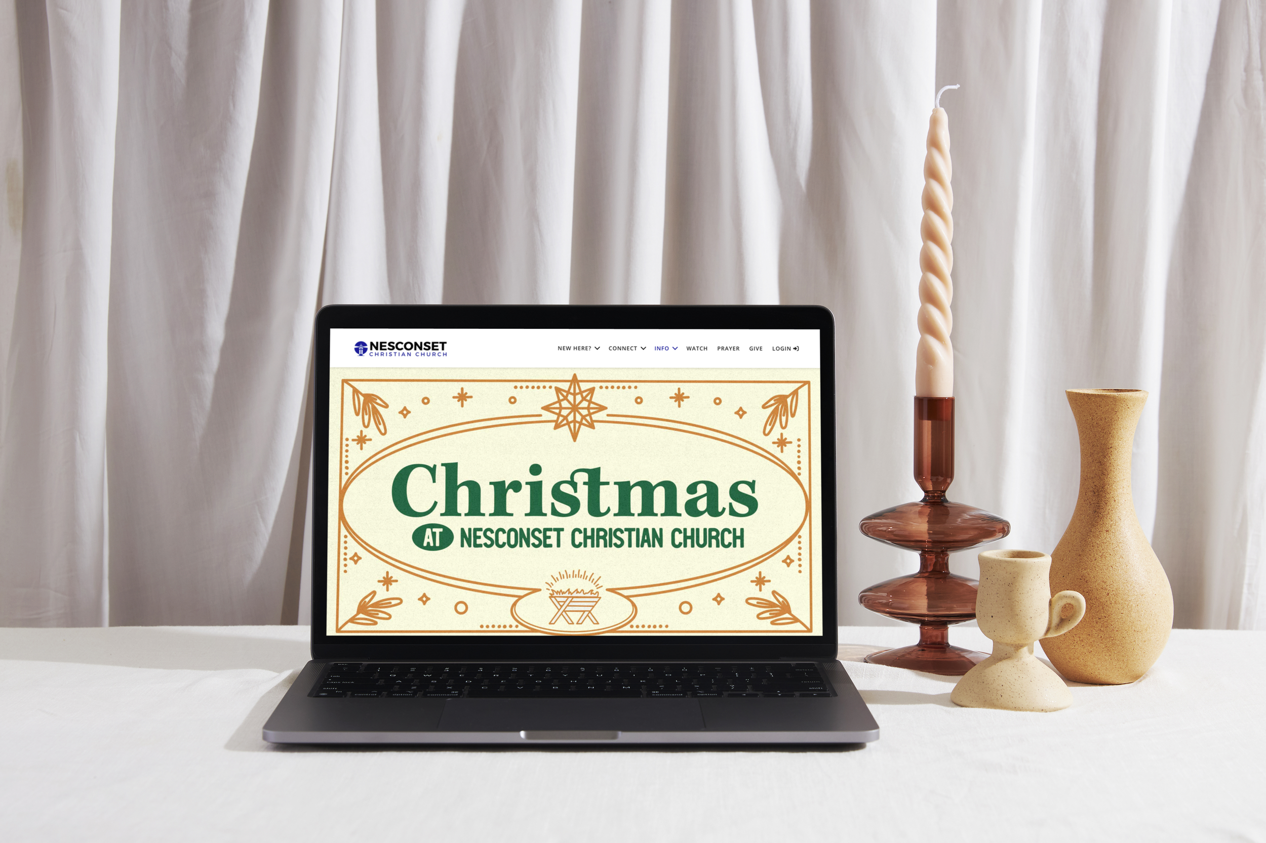
Website Design & Development
-
Summary:
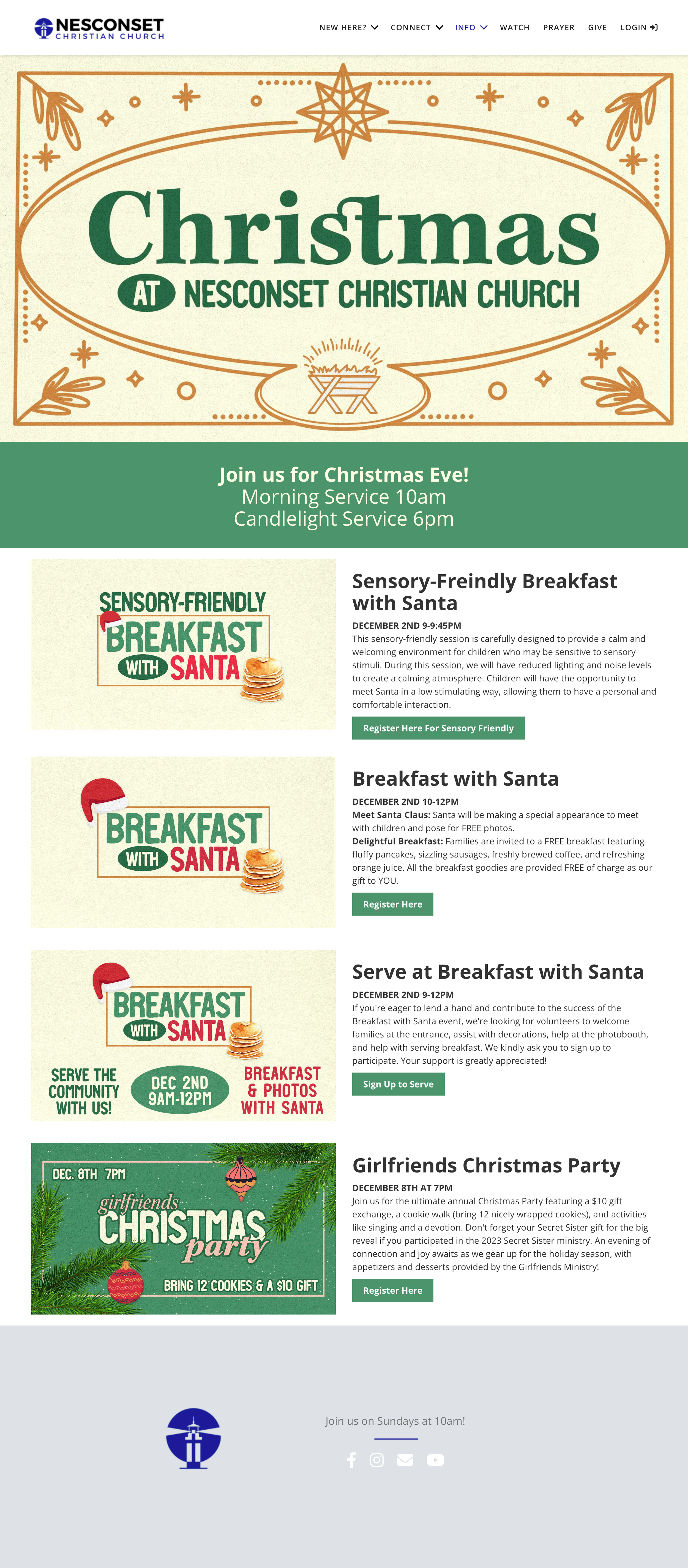
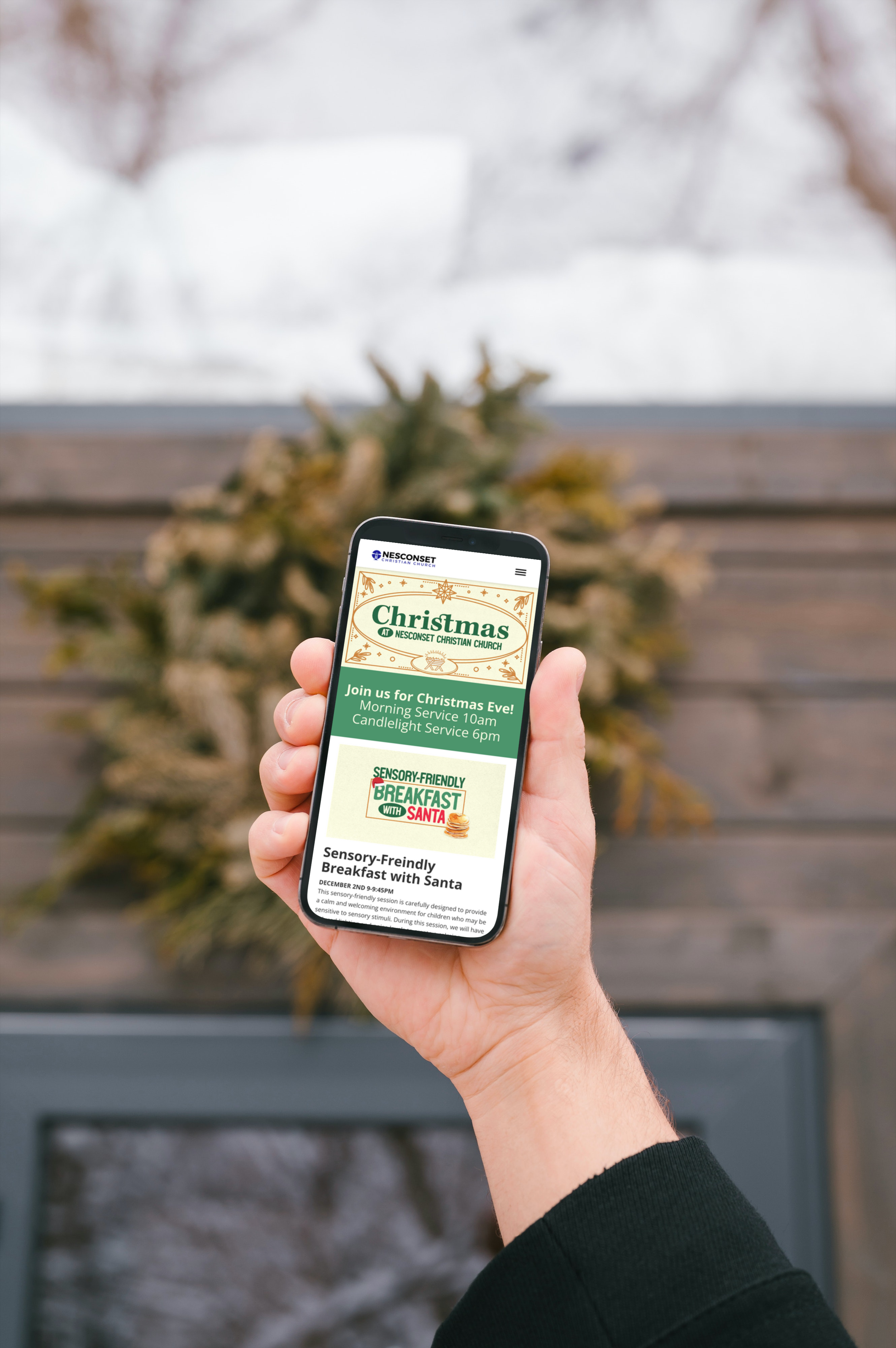
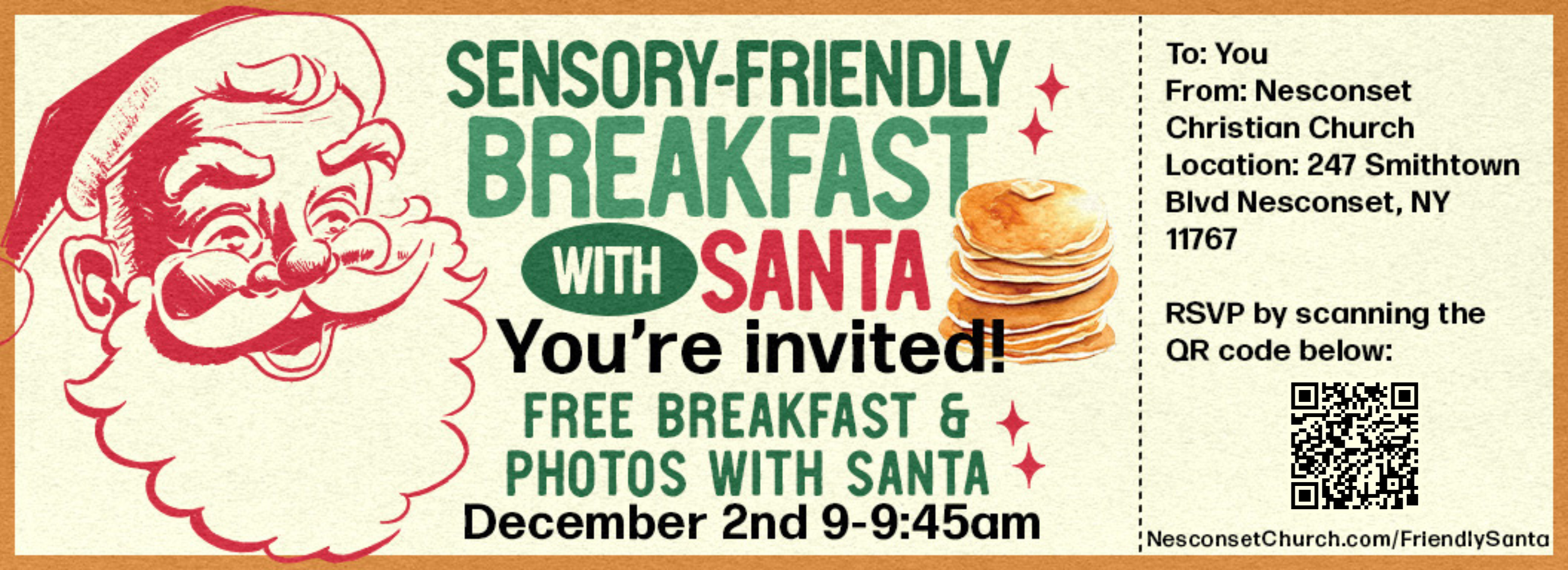
This sensory-friendly session is carefully designed to provide a calm and welcoming environment for children who may be sensitive to sensory stimuli. During this session, we will have reduced lighting and noise levels to create a calming atmosphere. Children will have the opportunity to meet Santa in a low stimulating way, allowing them to have a personal and comfortable interaction.
Description on Event Registration Page:
Our Sensory-Friendly Breakfast with Santa is crafted with care to provide a warm and comfortable experience for children who may have sensory sensitivities. This means a reduced-stimulus environment, making it easier for every child to enjoy the magic of meeting Santa without feeling overwhelmed. We've intentionally limited attendance to no more than 25 registrants.
We will have adjusted the lighting and noise levels to create a calm and soothing atmosphere. Children will have the opportunity to meet Santa in a low stimulating way, ensuring a personal and comfortable experience. We’ll have FREE breakfast, including pancakes, sausage, coffee, and OJ.
This event is open to all families in our community. Whether you have a child with sensory sensitivities or simply want to enjoy a quieter and more intimate Santa experience, we welcome you to join us.
To help us prepare for the event, please RSVP by clicking the register button.
-
Summary:
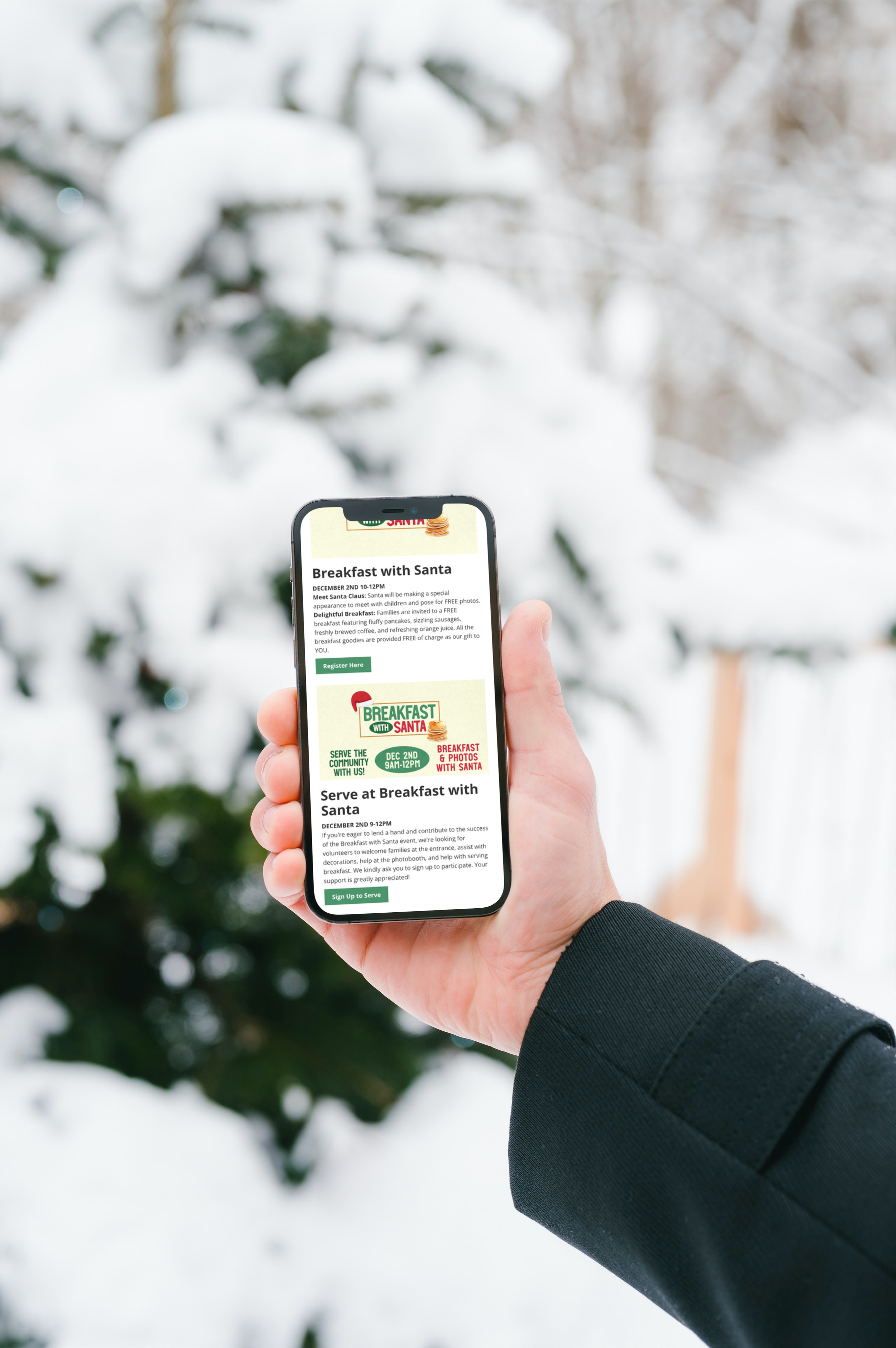
Meet Santa Claus: Santa will be making a special appearance to meet with children and pose for FREE photos.
Delightful Breakfast: Families are invited to a FREE breakfast featuring fluffy pancakes, sizzling sausages, freshly brewed coffee, and refreshing orange juice. All the breakfast goodies are provided FREE of charge as our gift to YOU.
Description on Event Registration:
Celebrate the Joy of the Season at Our Community Breakfast with Santa!
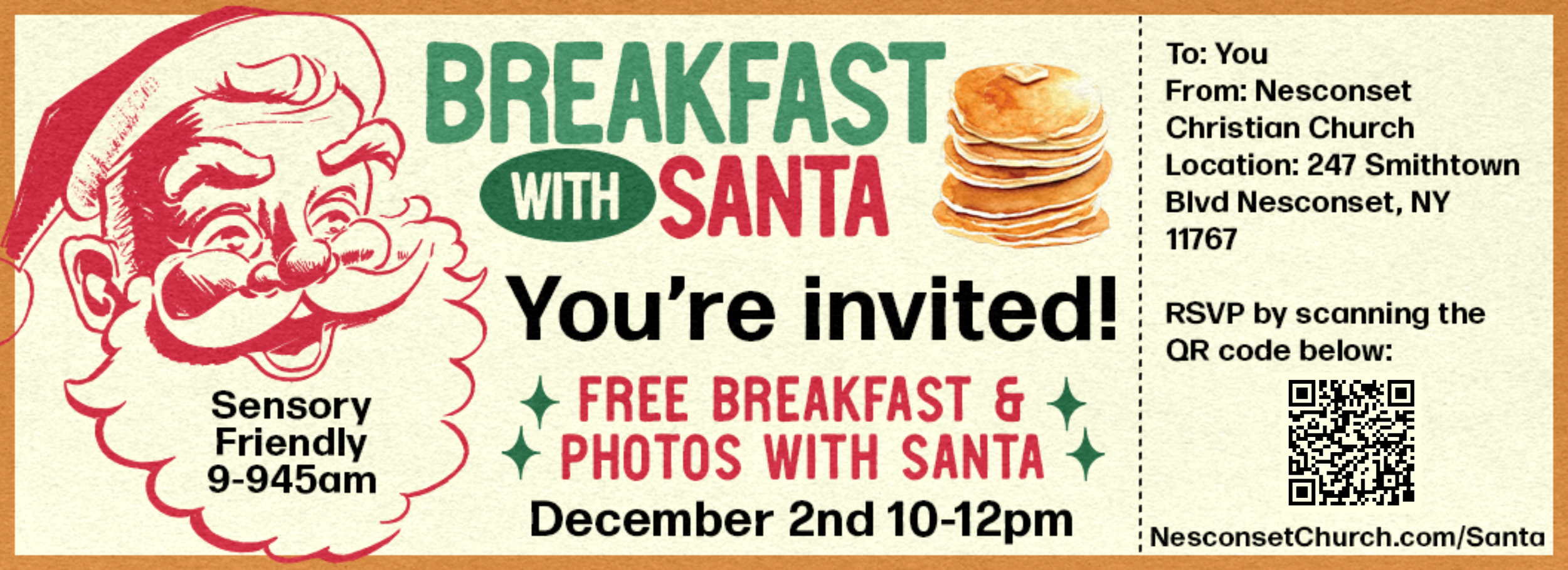
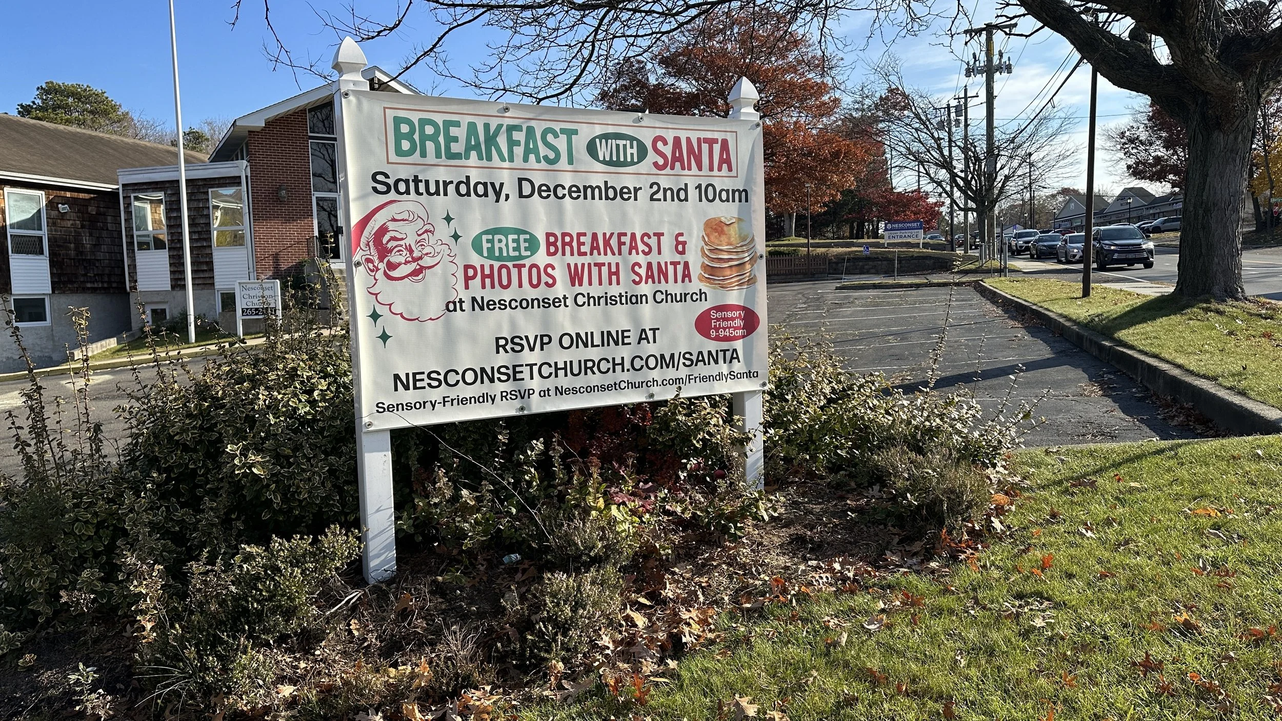
We are thrilled to invite families in the community to a FREE festive and joy-filled event, "Breakfast with Santa," on Saturday, December 2nd, from 10:00 AM to 12:00 PM at our church!
This special event is an opportunity for us to warmly welcome our neighbors and friends in the community, especially those who may not regularly attend our church. It's a time to come together and create cherished memories with families and children.
What to Expect:
Meet Santa Claus: Santa will be making a special appearance to meet with children and pose for FREE photos.
Delightful Breakfast: Families are invited to a FREE breakfast featuring fluffy pancakes, sizzling sausages, freshly brewed coffee, and refreshing orange juice. All the breakfast goodies are provided FREE of charge as our gift to YOU.
Capture the Magic: Attendees can look forward to complimentary photo opportunities with Santa Claus. These pictures will serve as lasting mementos of a morning filled with happiness!
Who's Invited: Everyone! This event is open to all families in the community, whether or not they are part of our church family. It's a time to come together and create cherished memories with families and children.
Why Are We Doing This? Our Breakfast with Santa event is a way for us to give back to the community, share the warmth and joy of the holiday season, and create beautiful memories for families. It's our gift to the community, a gesture of goodwill during this special time of year.
RSVP: If you plan to attend, please register by clicking the button to help us ensure there's enough food and space for everyone.
Save the Date: Mark your calendars for a joyful morning with Santa and your community. We can't wait to see you at Nesconset Christian Church on December 2nd.
Spread the Word: We encourage community members to share this event with their friends, neighbors, and loved ones. Let's make this a wonderful experience for all.
-
Summary:
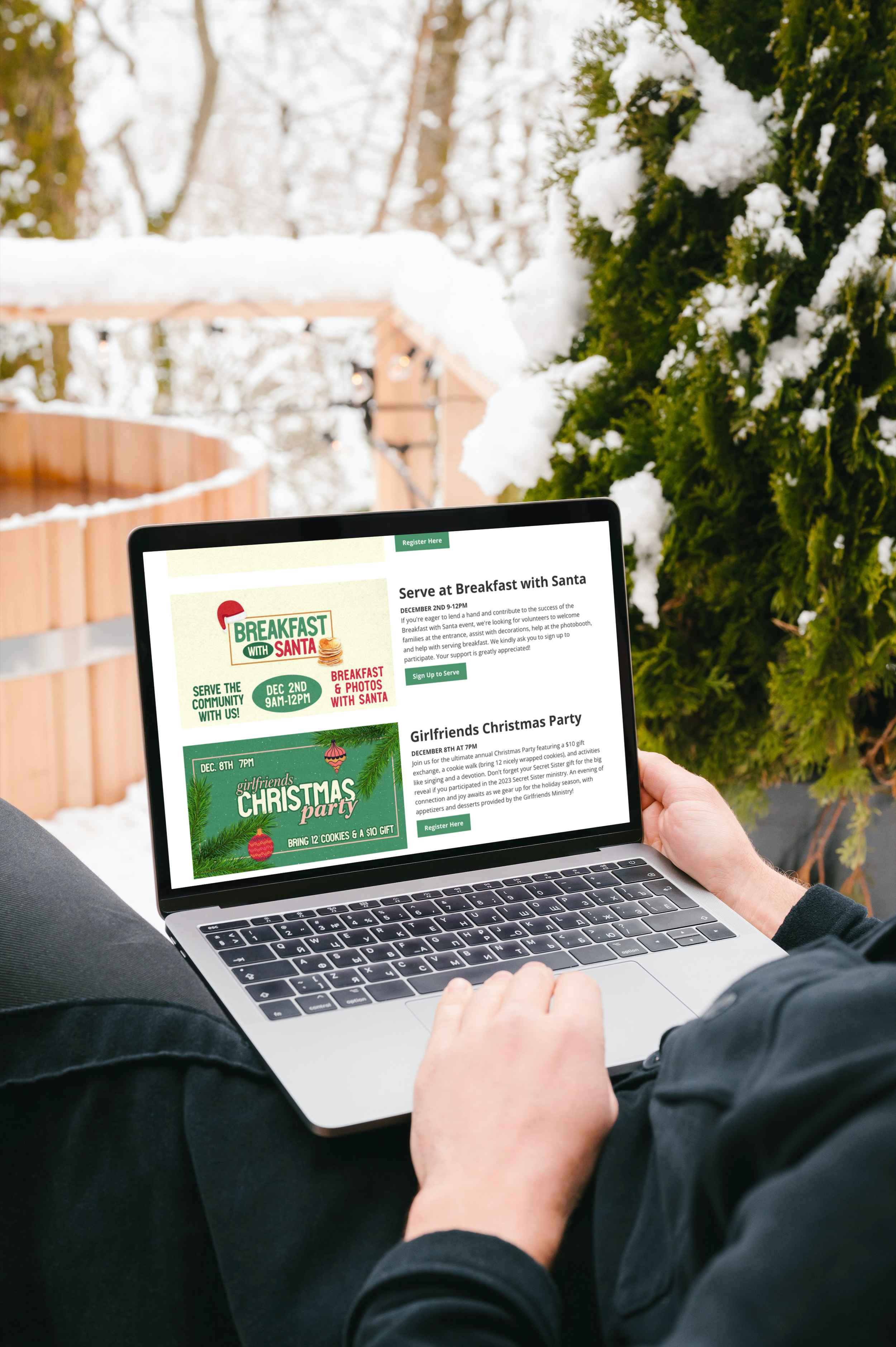
If you're eager to lend a hand and contribute to the success of the Breakfast with Santa event, we're looking for volunteers to welcome families at the entrance, assist with decorations, help at the photobooth, and help with serving breakfast. We kindly ask you to sign up to participate. Your support is greatly appreciated!
-
Summary:
Join us for the ultimate annual Christmas Party featuring a $10 gift exchange, a cookie walk (bring 12 nicely wrapped cookies), and activities like singing and a devotion. Don't forget your Secret Sister gift for the big reveal if you participated in the 2023 Secret Sister ministry. An evening of connection and joy awaits as we gear up for the holiday season, with appetizers and desserts provided by the Girlfriends Ministry!
Description on Event Registration:
You don’t want to miss the best annual event of the year -- The Christmas Party!! We will be having a fun gift exchange game in which you will need to bring a wrapped gift worth at least $10.00. It will be a night of singing, a devotion, and a cookie walk. For this special part of the night, we are asking each of you to bring in at least 12 cookies either homemade or store bought wrapped nicely so they stay fresh. It’s gonna be an amazing evening connecting with all of you wonderful ladies as we prepare for the Christmas Season. Appetizers and desserts will be provided by the Girlfriends Ministry.
If you were a part of the Secret Sister ministry In 2023, we will be revealing Secret Sisters at this event. Make sure to bring an extra gift to give to your secret sister at the reveal.
Let us know you are coming by clicking the “Register Here” button!
Sunday Morning Announcement Slides
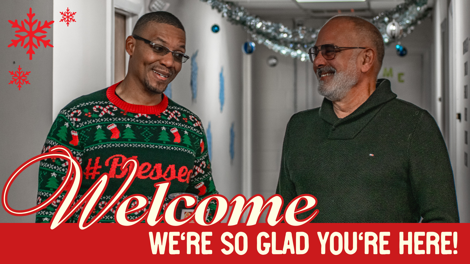
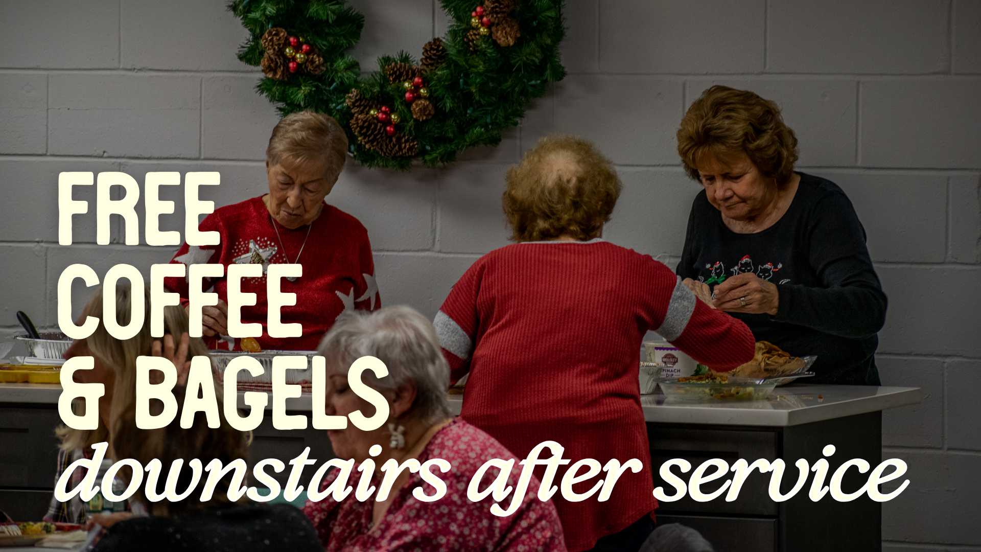
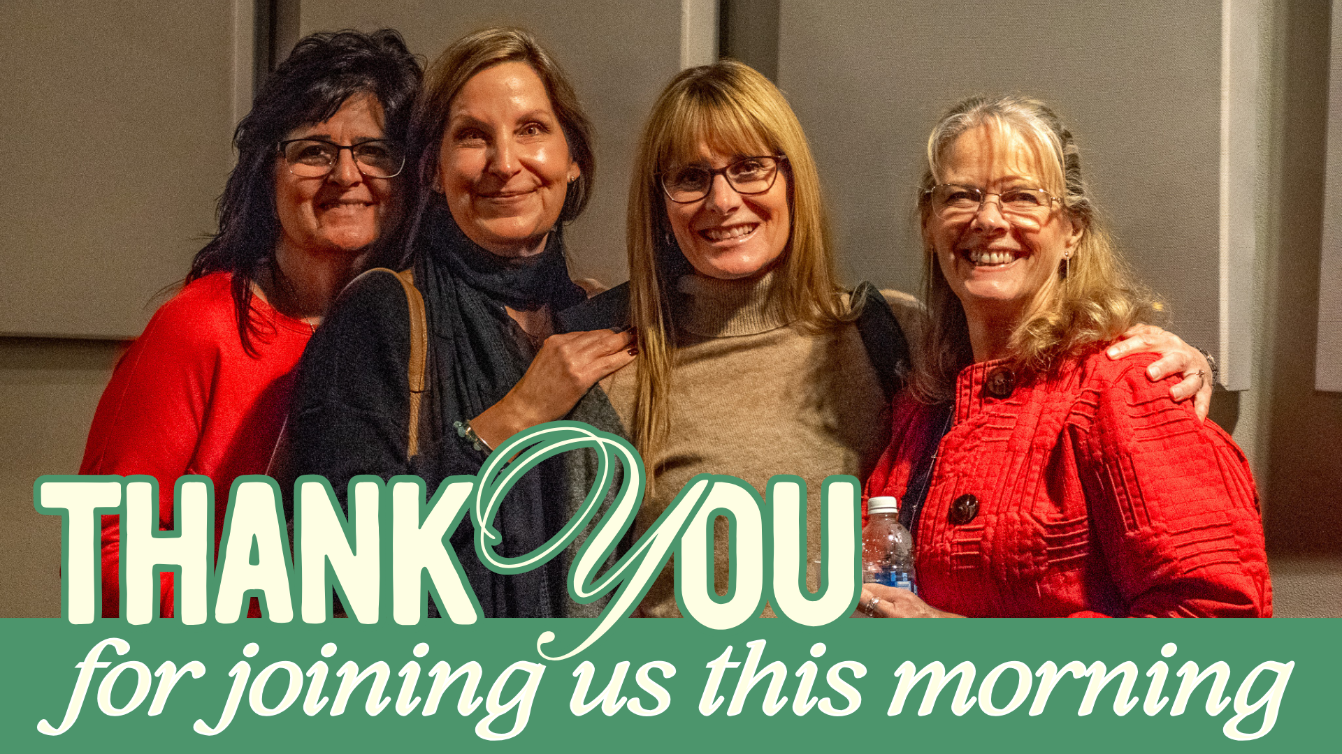
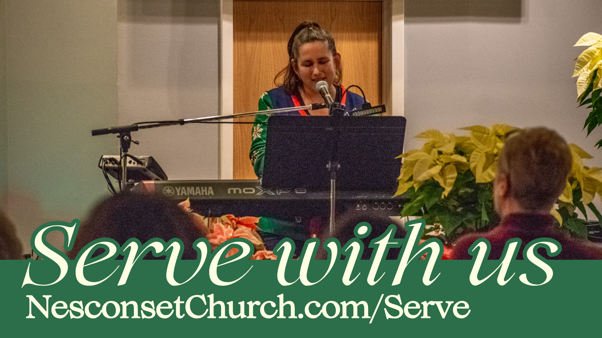
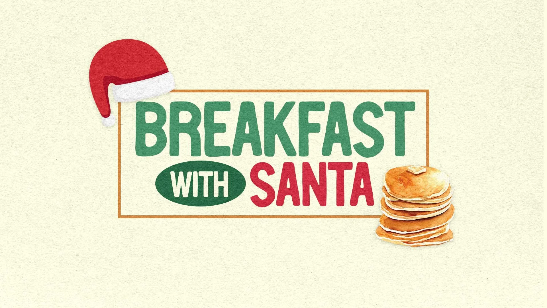
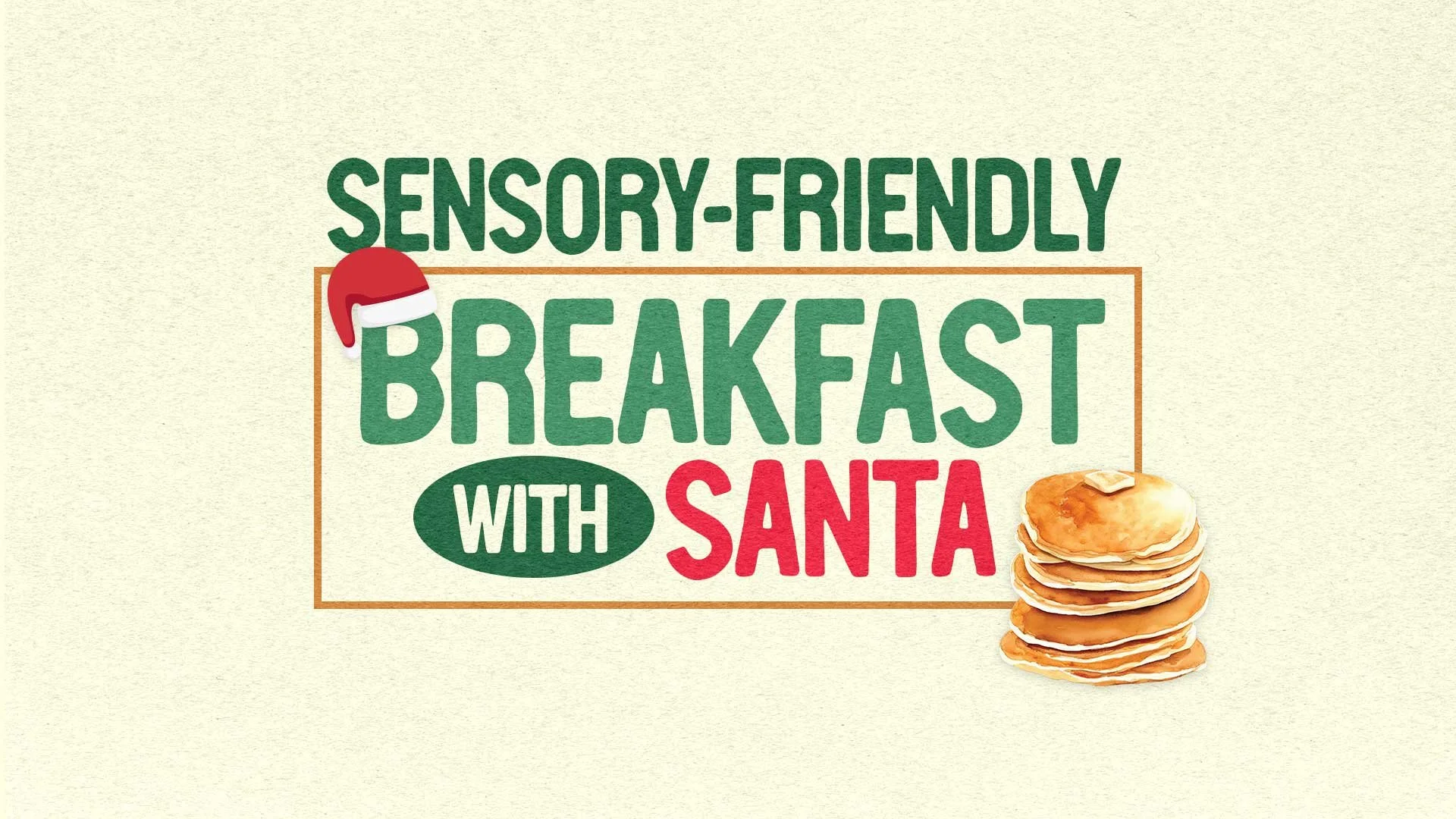
Pastor’s Goal: To host a Breakfast with Santa outreach event exclusively for our local community, offering free breakfast and photos with Santa. We aim to unite a group of enthusiastic volunteers, fostering meaningful connections while wholeheartedly serving the children and families within our community.
This event is not just about Santa; it's our first step in launching a special needs ministry with a pioneering sensory-friendly experience. This unique offering provides parents a precious chance to bypass the bustling mall lines, creating a calm and accommodating environment tailored for their children's needs. Our goal is to cultivate a warm and inviting space, ensuring that everyone—regardless of their abilities—feels welcomed, valued, and celebrated.
Outcome: The response to our events exceeded expectations. The Sensory-Friendly Breakfast with Santa reached maximum registration within just a week and a half, while the regular Breakfast with Santa reached capacity a few days before the event. Initially planning a $100 budget for Facebook Ads over two weeks, we observed a remarkable 42% increase in sign-ups within just four days, achieving this success while spending only $38 on advertising.
Christmas Outreach Event: Breakfast with Santa

-
Subject: You're Invited to Breakfast with Santa!
Email:
Dear [insert their name here],
As the holiday season approaches, we at Nesconset Christian Church are excited to extend a warm invitation to you, your family, and your friends to join us for a heartwarming and joyful event: "Breakfast with Santa!"
Breakfast with SantaDate: Saturday, December 2nd
Time: 10:00 AM - 12:00 PM
Location: 247 Smithtown Blvd Nesconset, NY 11767
We are thrilled to introduce a special addition to our "Breakfast with Santa" event to create a comfortable and inclusive experience for children who may have sensory sensitivities. For Sensory-Friendly Breakfast with Santa, we will have adjusted the lighting and noise levels to create a calm and soothing atmosphere. Children will have the opportunity to meet Santa in a low stimulating way, ensuring a personal and comfortable experience. We'll have FREE breakfast, including pancakes, sausage, coffee, and OJ.
(Insert button to register for event)
Sensory-Friendly Breakfast with Santa
Saturday, December 2nd
9:00 AM – 9:45AM
This special event is all about bringing our community together to celebrate Christmas, create unforgettable memories, and share the spirit of giving. We want to emphasize that you don't need to be a part of our church to be a part of this celebration—everyone is welcome!
(Insert button to register for event)
What to Expect during our 10-12pm Breakfast with Santa:
Free Photos with Santa: Santa himself will be making a special appearance to meet with children and pose for FREE photos. Create lasting memories with complimentary photo opportunities alongside Santa Claus.
Delightful Breakfast: Savor a mouthwatering breakfast featuring fluffy pancakes, sizzling sausages, freshly brewed coffee, and refreshing orange juice, all on the house!
RSVP Today: To help us ensure there's enough food and space for everyone, please RSVP for Breakfast with Santa by clicking here INSERT LINK HERE. RSVP for Sensory-Friendly Breakfast with Santa by clicking here INSERT LINK HERE.
Spread the Joy: We encourage you to share this invitation with your friends, neighbors, and loved ones. Let's make this a memorable gathering for everyone in our community.
We see this event as our way of giving back to the community, spreading holiday cheer, and creating beautiful family moments during this special time of year. It's a gesture of goodwill, and we hope to see you and your family there.
(Insert button to register for event)
Mark your calendars for a joyful morning with Santa and your community. We can't wait to share the magic of the season with you!
If you have any questions or would like to get involved in making this event truly special, please feel free to reach out to us.
In the spirit of the season,
The office
Nesconset Christian Church
P.S. For more information and event updates, please visit our website at Nesconsetchurch.com/calendar.
-
Subject: A Gift to Our Community
Email:We are excited to announce a heartwarming event that will be a gift to our community!
Sensory-Friendly Breakfast with Santa
Saturday, December 2nd
9:00 AM – 9:45AM
We are thrilled to introduce a special addition to our "Breakfast with Santa" event to create a comfortable and inclusive experience for children who may have sensory sensitivities.
Breakfast with Santa
Saturday, December 2nd
10:00 AM - 12:00 PM
This special event is an opportunity for us to warmly welcome our neighbors and friends in the community, especially those who may not regularly attend our church. It's a time to come together and create cherished memories with families and children.
(Insert button to register for event)
What to Expect:
Delicious Breakfast: We will be serving up a delightful breakfast of pancakes, sausages, coffee, and orange juice—all for FREE!
Photos with Santa: Santa Claus will be joining us to meet the children and pose for FREE photos.
Gift of Togetherness: We hope to foster a sense of community and holiday joy, making this event a true gift to our neighbors.
How You Can Help:
Spread the Word: Please share this event with your friends, neighbors, and anyone you think might be interested. Let's make this a memorable gathering for all.
Volunteer: if you’d like to volunteer and help make this event a success, we need people to greet the families coming into the church, people to help decorate, and people to help serve breakfast. If you are interested in serving, please sign up to serve.
(Insert button to sign up to serve)
Let's come together to share the love and joy of the holiday season with our community. Your support and participation are greatly appreciated.
If you have any questions or would like to get involved in making this event truly special, please feel free to reach out to us.
We can't wait to share Breakfast with Santa with our community on December 2nd. Let's create wonderful memories together!
-
We are excited to announce a heartwarming event that will be a gift to our community!
Breakfast with Santa
Saturday, December 2nd
10:00 AM - 12:00 PM
This special event is an opportunity for us to warmly welcome our neighbors and friends in the community, especially those who may not regularly attend our church. It's a time to come together and create cherished memories with families and children.
What to Expect: We will be serving up a delightful breakfast of pancakes, sausages, coffee, and orange juice—all for FREE! Santa Claus will be joining us to meet the children and pose for FREE photos.
Here’s how you can help —
Please share this event with your friends, neighbors, and anyone you think might be interested. Let's make this a memorable gathering for all. We have invite cards for you to share with the community. Give them to your friends and family!
If you'd like to volunteer and help make this event a success, please sign up at nesconsetchurch.com/christmas. We need people to help set up, serve food, clean up, greet, and decorate!
Let's come together to share the love and joy of the holiday season with our community. Your support and participation are greatly appreciated.
We can't wait to share Breakfast with Santa with our community on December 2nd. Let's create wonderful memories together!
-
Celebrate the Joy of the Season at Our Community Breakfast with Santa!
Meet Santa Claus: Bring your little ones to our special event to meet Santa Claus in person. Santa will be here to hear their wishes, take photos, and spread holiday cheer!
Delicious Pancake Breakfast: We're serving up a mouthwatering breakfast of fluffy pancakes and sizzling sausages, all for FREE! Enjoy a warm and delightful meal with your family. We’ll also have coffee and OJ.
Free Photos with Santa: Capture the magic of the moment with a complimentary photo opportunity with Santa Claus. Create cherished memories that you can treasure for years to come.
Who's Invited? Everyone! Our Breakfast with Santa is open to all families in our community, regardless of whether you attend our church. We warmly welcome everyone to join us for this festive occasion.
This event is our way of giving back to the community, spreading holiday joy, and creating beautiful memories for families during this special time of year.
Don't Forget to Invite Your Friends and Neighbors! Share the spirit of the season by inviting your friends, neighbors, and loved ones.
RSVP Today: Help us ensure there's enough food and space for everyone by RSVPing through our website at [WESBITE LINK HERE].
Mark your calendars for a joyful morning with Santa and your community. We can't wait to see you there!
-
FB Ads Copy 1
Join Us for a Magical Morning with Santa!
📆 Date: Saturday, December 2nd
⏰ Time: 10:00 AM - 12:00 PM
📍 Location: 247 Smithtown Blvd Nesconset, NY 11767
Unwrap the joy of the season at our Community Breakfast with Santa! Delicious pancakes, free photos with Santa, and memories that last a lifetime. Everyone is welcome, so invite your friends and neighbors. RSVP today to secure your spot!
FB Ads Copy 2
Family Fun at Breakfast with Santa!
📅 Date: Saturday, December 2nd
⏰ Time: 10:00 AM - 12:00 PM
📍 Location: 247 Smithtown Blvd Nesconset, NY 11767
Start your holiday season with laughter and togetherness. Free breakfast, Santa photos, and a warm community welcome. Your family and friends are all invited! Let's create life-lasting memories. Secure your spot—RSVP now!
FB Ads Copy 3
You’re invited to a FREE Breakfast with Santa!
📅 Date: December 2nd
⏰ Time: 10:00 AM - 12:00 PM
📍 Location: 247 Smithtown Blvd Nesconset, NY 11767
🎄 Join us for a jolly morning filled with FREE pancakes, sausages, coffee, and orange juice! Get your FREE photos with Santa, and let the holiday season begin!
FB Ads Copy 4
Want to take photos with Santa this year but don’t want to wait in the long lines at the mall? Look no further! We invite you to Breakfast with Santa at Nesconset Christian Church.
Santa's coming to town! Enjoy a delicious meal and take photos with Santa, all for FREE.
Your family and friends are all invited! Let's create life-lasting memories. Secure your spot—RSVP now!
📆 Date: December 2nd
🕙 Time: 10:00 AM - 12:00 PM
🏰 Location: 247 Smithtown Blvd Nesconset, NY 11767
Breakfast with Santa Communications
Breakfast with Santa Decorations
The Vision: Imagine a seamless journey from the moment kids step through the door until they leave—a complete immersion into the enchanting Christmas experience. Upon entry, they are greeted by a peppermint forest adorned with bunches of balloons, instantly evoking awe and igniting their excitement. This sets the stage for what's to come.
Moving into our Cafe, where their delightful pancake breakfast awaits, the ambiance is intentionally cozy, exuding the warm and comforting atmosphere of Christmas at home. As they venture down the hall toward the room where Santa awaits, they find themselves in a mesmerizing winter wonderland. It feels as though they've stepped into a snowy scene, heightening the magic of their adventure.
Upon entering Santa's room, it’s like stepping into the heart of Santa's workshop—an abundance of presents fills the space, creating an atmosphere brimming with festive joy and wonder. The entire experience is crafted to create lasting memories and a sense of pure enchantment for every child visiting Santa.
Outcome: I discovered that crafting balloon Christmas trees is more challenging than anticipated, often requiring teamwork for assembly—a lesson learned through hands-on experience. Much of the physical work involved in bringing my vision to fruition was completed with the assistance of our dedicated youth and kids ministry. While we encountered limitations preventing the execution of every planned detail, we focused on essential tasks to actualize the envisioned decorations and create a festive atmosphere.
Check out this video for a walkthrough experience (all filming was done by students in the youth ministry):


Contact Me
Interested in creative communications for your church or organization? Need creative direction? Need help with design, branding, or social media? Let’s work together!