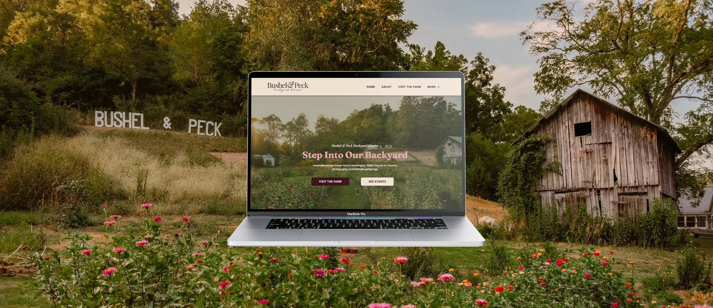
Website Design + Development · Huntington, West VirginiaBushel & Peck Backyard Blooms
A beautiful Appalachian flower farm with a lot to offer needed a website that felt magical and was easy to use.
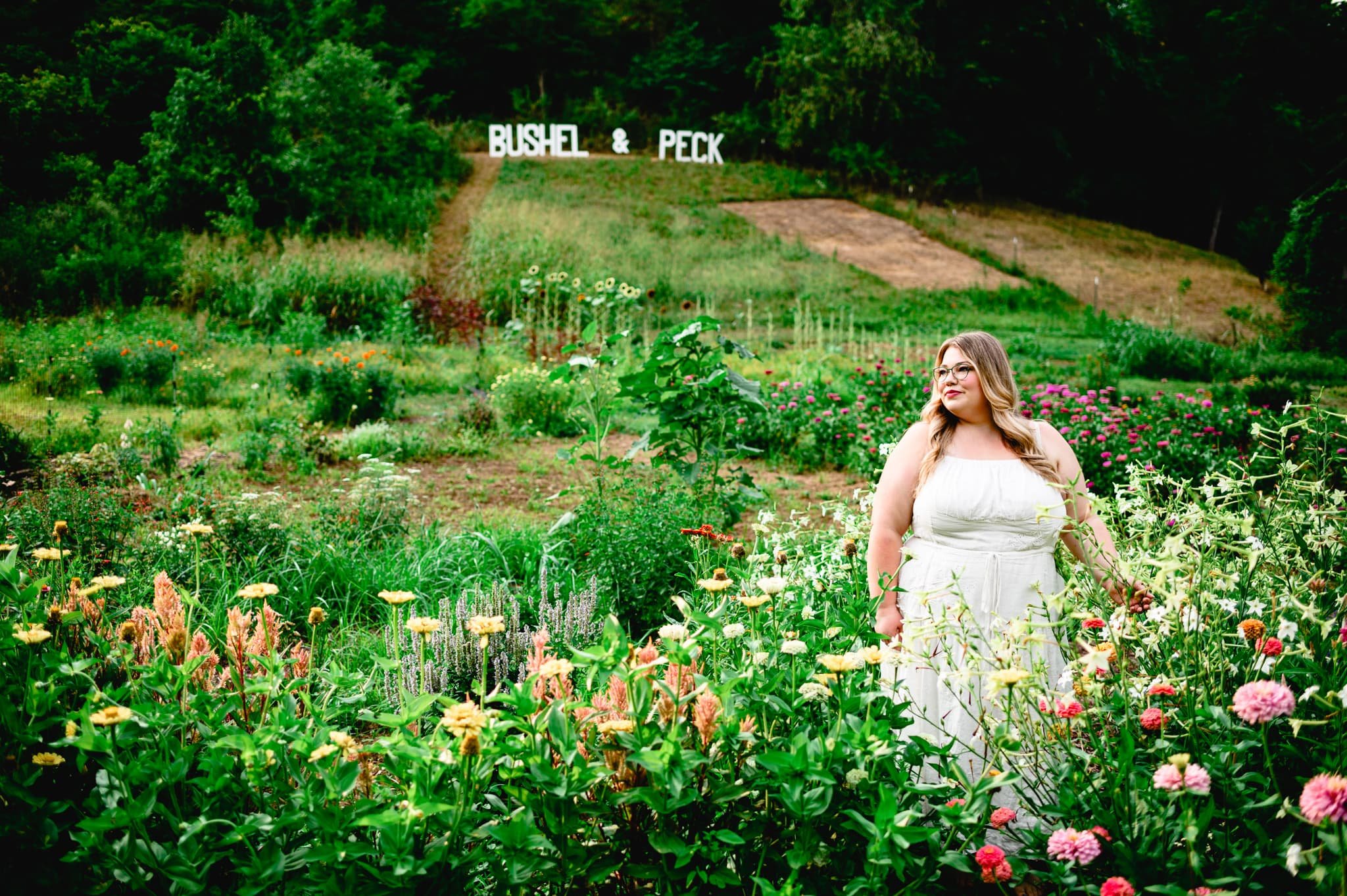
Bushel and Peck Backyard Blooms is a woman-owned flower farm tucked into the Harveytown hills of Huntington, West Virginia.
I built their website from strategy to launch, including a custom WordPress website, a fully configured booking system, and custom illustrations.
The goal was a site that felt as dreamy as the farm and as functional as the business behind it.
The Story
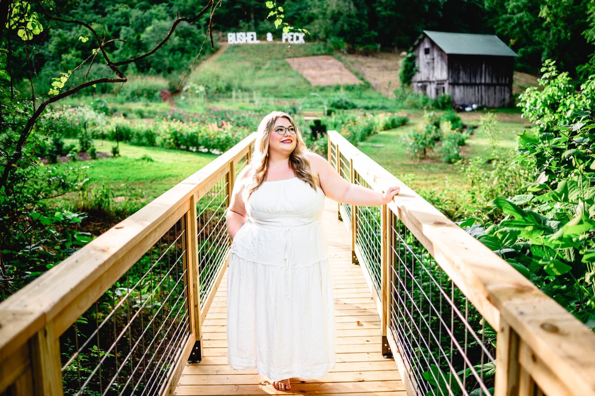
Bushel and Peck Backyard Blooms is a West Virginia flower farm offering you-pick flower fields, floral arrangements, photography sessions, workshops, private farm experiences, micro weddings, and even a boat on the pond. Kathleen Linville started with a backyard garden in 2023 and by 2024 had expanded to nearly 10 acres. She lives on the property with her husband Tyler, their kids, a flock of ducks that patrol the fields for pests, and a yard full of milkweed for the Monarch butterflies.
Kathleen had built a beautiful place that people wanted to experience. The challenge was helping them find it, understand it, and book it.
The Problem
Kathleen had built something really special. The challenge was that her website needed to do a lot of things at once. It needed to:
Welcome people into the feeling of the farm
Clearly explain what was available
Help visitors figure out which experience was right for them
And make it easy to actually book it, without having to call or email to figure out the details.
A flower farm with this many offerings can get confusing fast. The site needed to feel as dreamy as walking through the fields while also being clear enough that nobody got lost along the way.
The Strategy
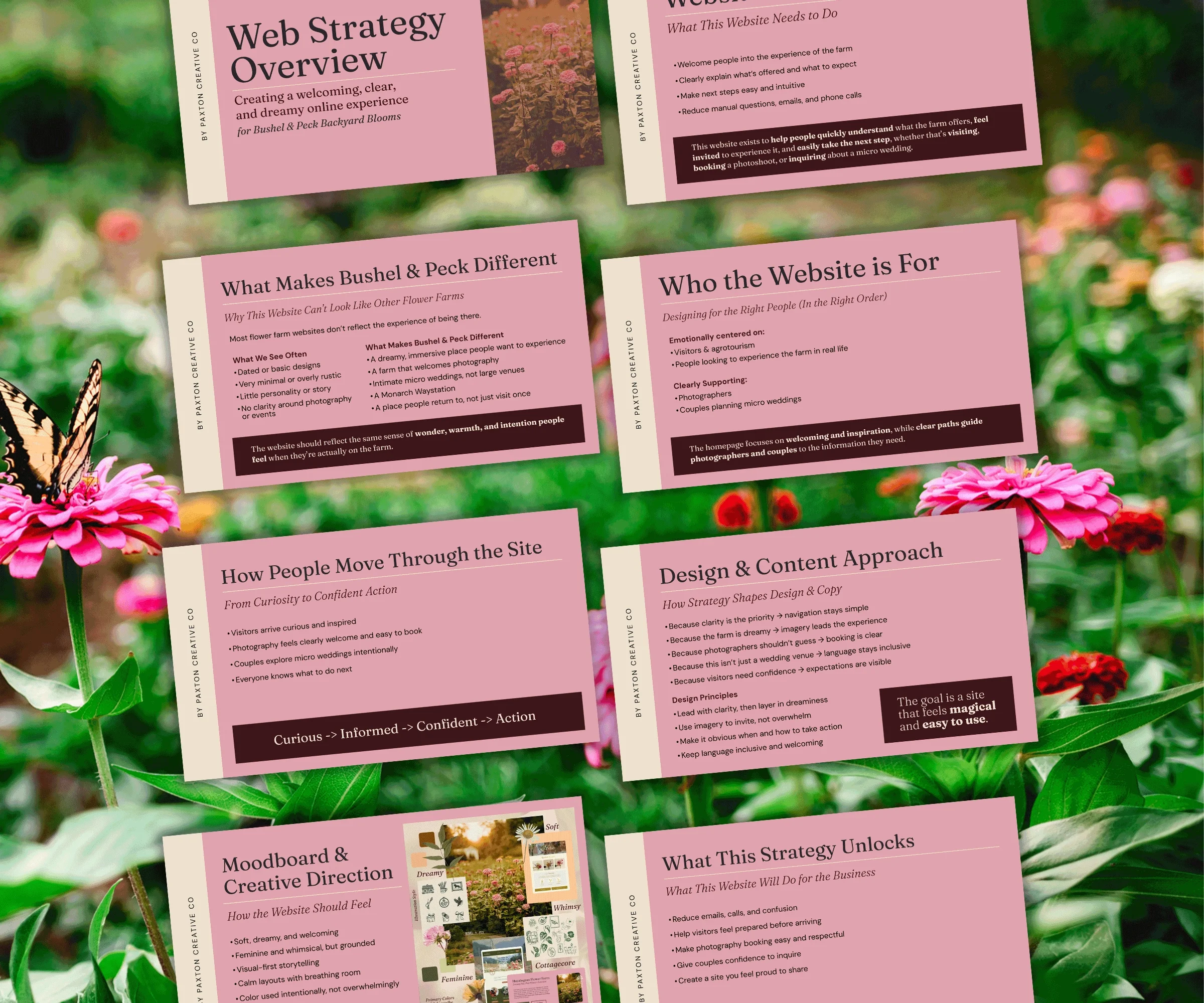
Before a single page was designed, I put together a full web strategy for the project. Audience mapping, homepage philosophy, design principles, copy direction, and a complete creative brief presented to Kathleen before anything was built.
The thinking behind the site was rooted in how a real person discovers a place like this. They find it somewhere online, they get curious, they start looking around. The website's job is to meet them there and walk them through naturally. Help them understand what the farm offers, feel welcome to experience it, and know exactly what to do next. No pressure. No confusion. Just a clear, warm path from first click to booking.
The homepage was designed as an invitation, not a catalog. It sets the feeling of the farm before anything else. Each page from there was built for a specific type of visitor — the person who wants to pick flowers, the photographer looking to book a session, the couple considering a micro wedding. Every one of them guided toward the right experience without having to dig for it.
The design followed the same thinking. Lead with clarity, then layer in the dreaminess. Use imagery to invite, not overwhelm. Make it obvious what to do next. Keep the language warm and welcoming for everyone who lands there.
The goal was a site that felt magical and easy to use.
The Copy Guide
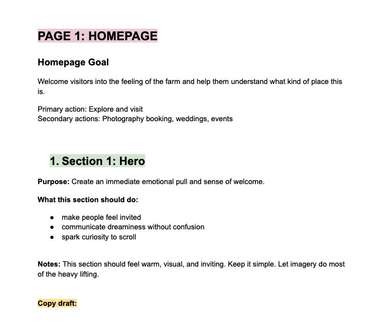
As part of the strategy work, I built out a full sitemap for the site. Every page, every section, every piece of content that needed to exist. From that sitemap I put together a copy guide for Kathleen's marketing team — a page-by-page breakdown of what each section needed to say, what tone it should carry, and how it should guide the visitor toward the next step.
The guide meant that whoever was writing the copy had a clear framework to work from rather than staring at a blank page. It kept the voice consistent across every page and made sure the strategy actually made it into the words, not just the design.
The Creative Direction
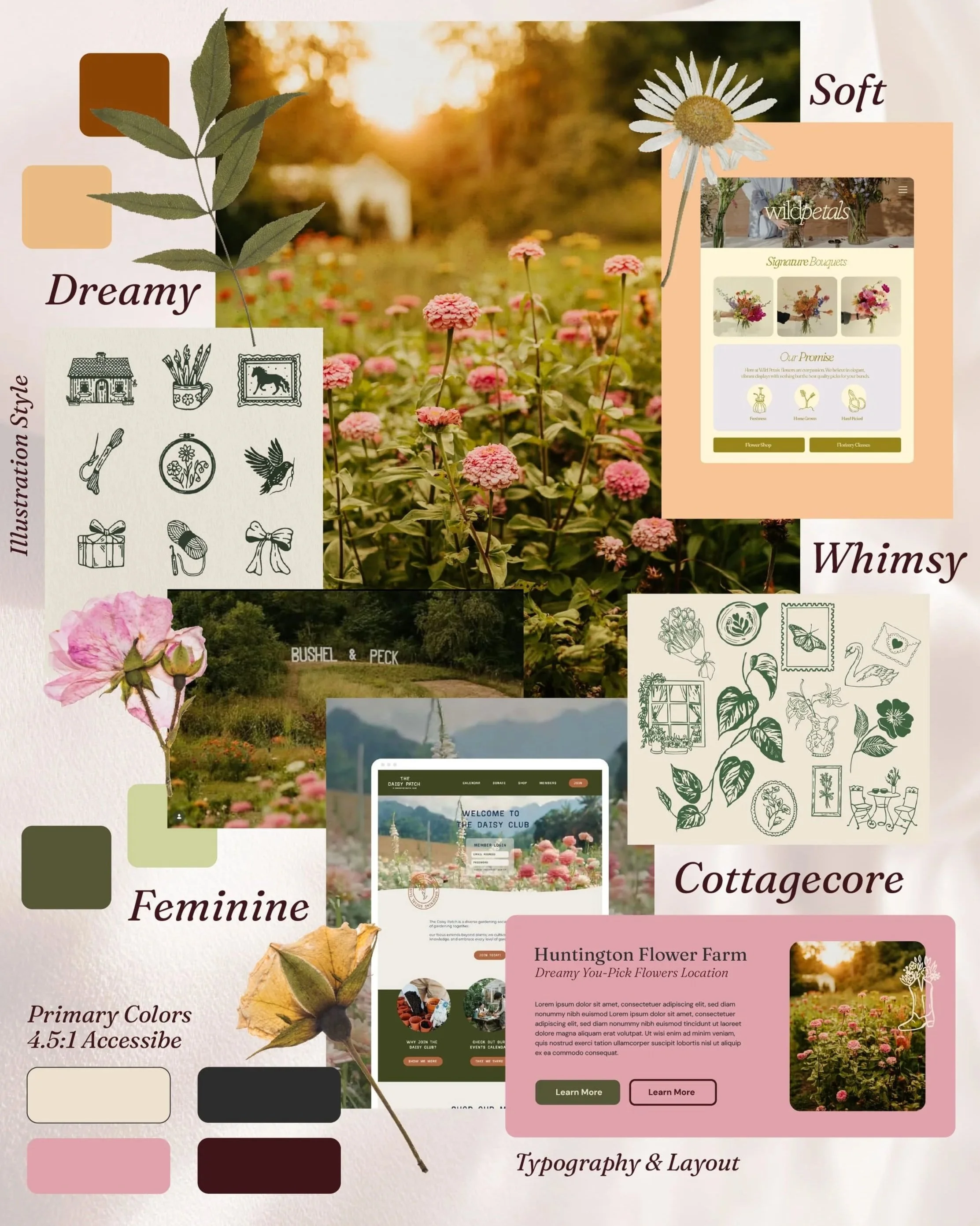
The visual direction needed to feel like the farm itself. Soft, dreamy, and welcoming. Feminine and whimsical but grounded enough to be easy to navigate. The kind of site where imagery leads and every page feels like it was made for this specific place.
The moodboard pulled from cottagecore aesthetics, golden hour farm photography, hand-drawn illustration styles, and warm botanical references. The words that shaped every visual decision were simple: soft, dreamy, whimsical, feminine. Not in a precious way. In a way that felt true to what Bushel and Peck actually is.
Soft pastels can be beautiful but tricky on screen. They can make text hard to read and buttons easy to miss. So rather than changing the brand, I extended the palette with web-specific tones that kept the dreamy feeling while making sure everything was clear and readable across devices.
The illustration style was established in the moodboard before a single drawing was made. Fine line, hand-drawn, botanical and whimsical. The kind of illustrations you'd find in a vintage nature journal or pressed into the pages of an old book. That direction became the foundation for everything drawn specifically for the site.
The Design
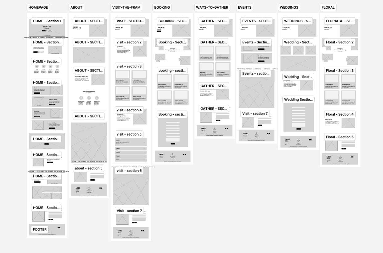
Before a single line of code was written, the site was designed in Figma from the ground up. Wireframes first to establish the structure and layout of each page, then a complete visual design that brought the creative direction to life. Colors, typography, illustrations, imagery, spacing — all of it worked out in Figma and presented to Kathleen for approval before development began.
That approval step matters. It means no surprises during the build and no costly changes after the fact. What gets approved in Figma is what gets built in WordPress.
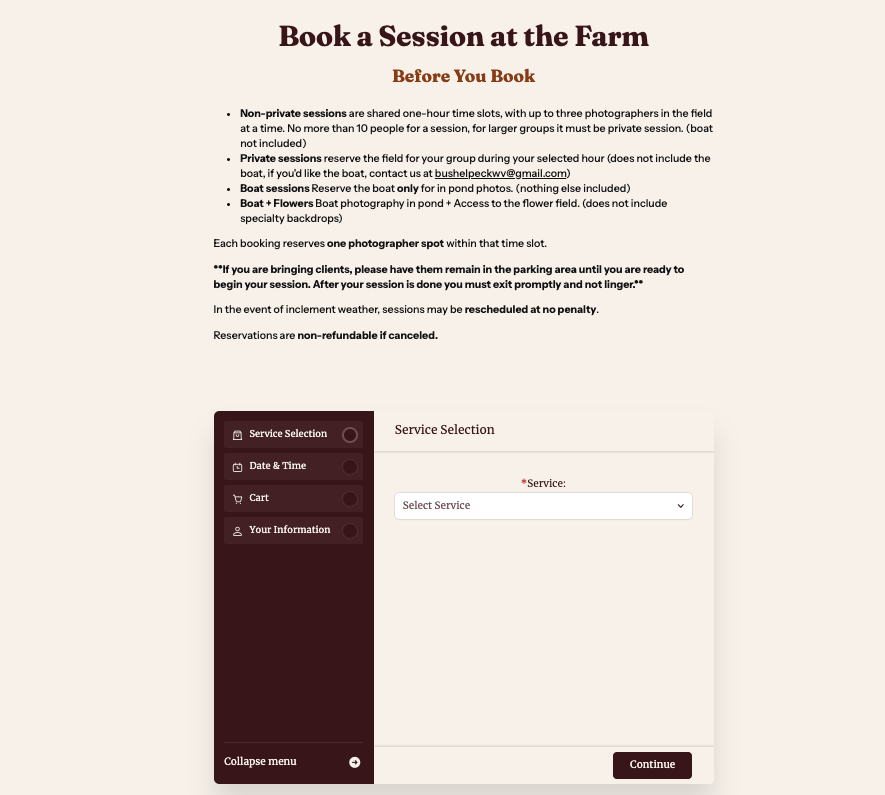
The Booking System
This is where the project went deeper than most website builds.
Bushel and Peck's offerings don't all work the same way. Photography non-private sessions allow multiple photographers to book within the same hour. Private photography access is exclusive — one booking closes the window for everyone else. The boat on the pond can be reserved on its own outside of non-private sessions, combined with flower field access, but needed to be closed for the private photography hour.
All of that logic had to live inside the booking system and behave correctly for every combination a customer might choose. Getting it wrong would mean double bookings, confused customers, and a lot of phone calls Kathleen didn't have time for.
I configured the full booking infrastructure using Amelia inside WordPress, connected to Stripe for payments. That included U.S. tax setup, deposit and cancellation policies, rescheduling rules, seasonal availability for the January through March off-season, events and workshops, and email setup so that customers get emails as soon as they book confirming their session.
The result is a system that reflects how the farm actually operates, not how a generic calendar app assumes it should.

Coming Soon Page
While the site was being built, a coming soon page went live so visitors already finding Bushel and Peck online had something to land on. It wasn't just a blank holding page. It carried the same visual direction as the full site — dreamy, warm, and on brand — so that the first impression matched what was coming. By the time the site launched, people were already excited.
The Illustrations
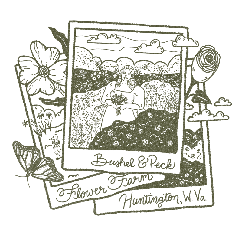
Every illustration was drawn by hand specifically for Bushel and Peck. Not stock art pulled from a library. Not something another flower farm already has. Each one was created to tell a specific part of the farm's story and feel like it could only belong to this place.
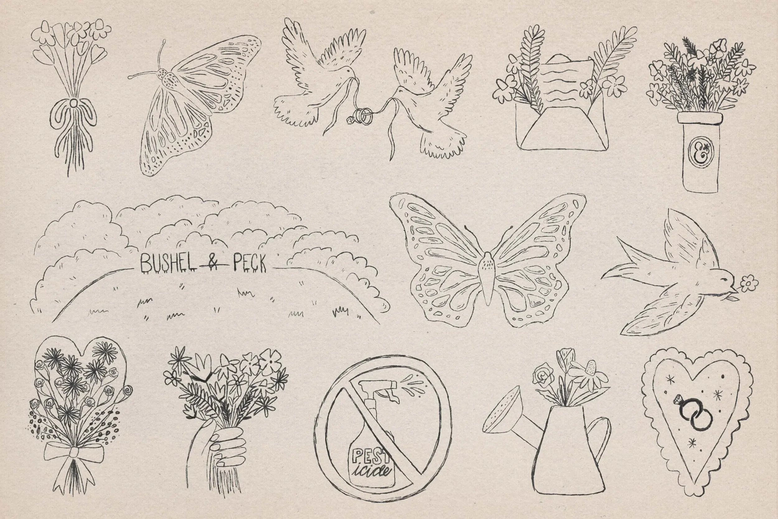
The process started with paper and pencil, sketching loose and working out the ideas by hand before moving into Procreate to refine and finish. That starting point mattered. A perfectly clean illustration would have felt too polished for a farm that's rooted in soil, ducks, and flowers grown from seed. The rougher edges, the textured linework, the hand-drawn details all echo the warmth and authenticity of what Kathleen has built.
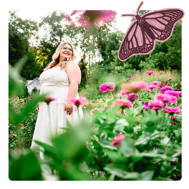
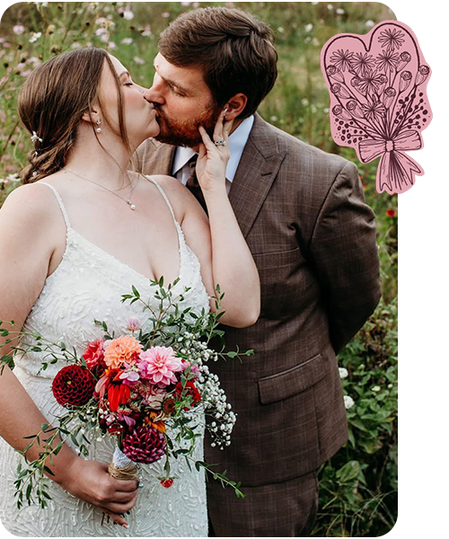
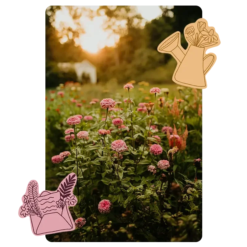
Each illustration was drawn for a specific page and a specific type of visitor.
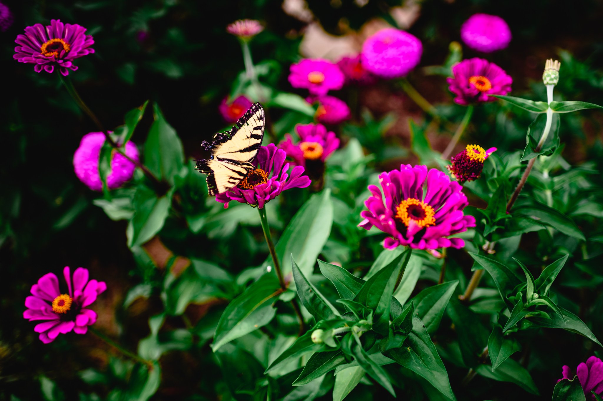
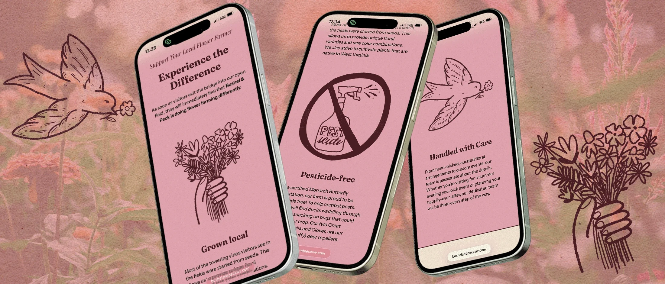
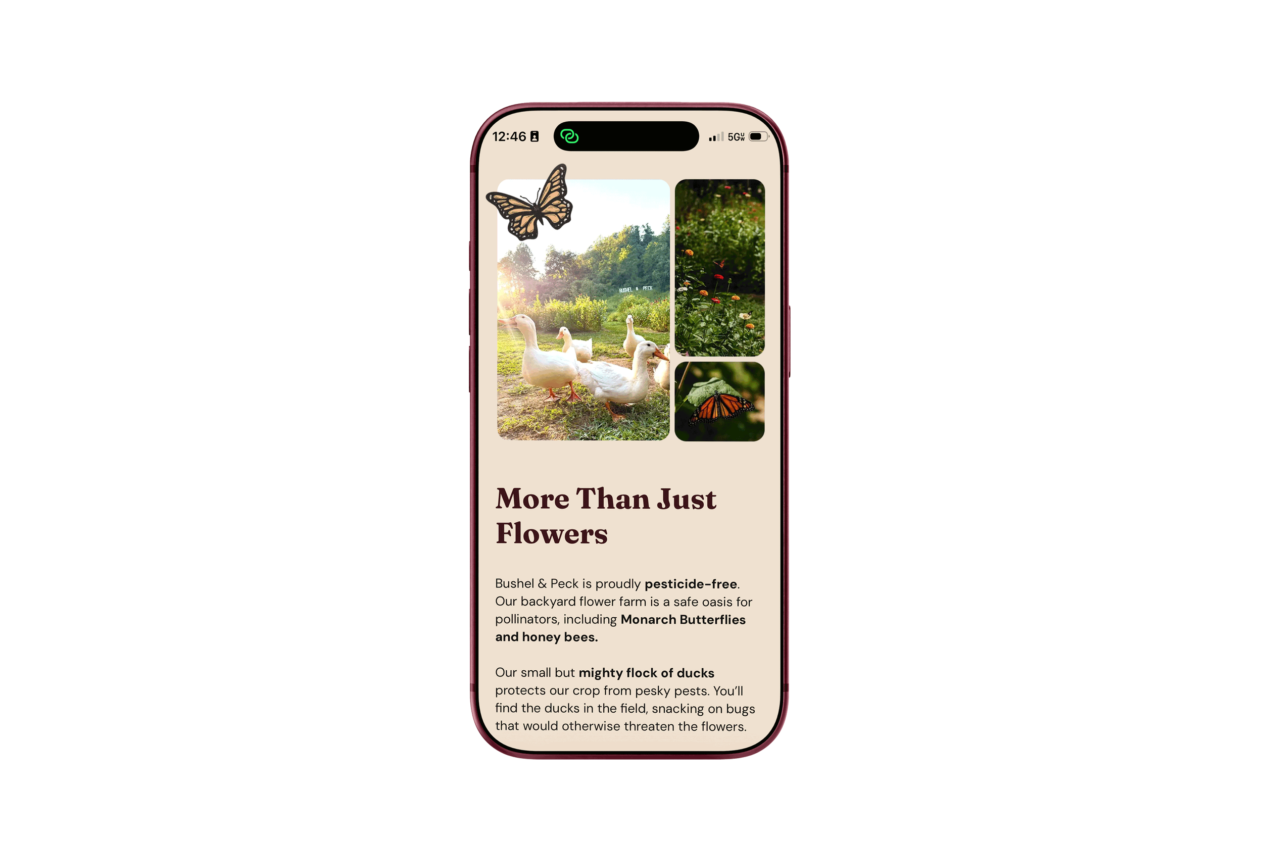
The Monarch butterfly appears throughout because the farm is a certified Monarch Waystation. The pesticide-free icon tells one of Kathleen's most important values without a single word. The hand holding a bouquet greets visitors on the homepage and captures what the whole experience is about before anyone reads a sentence. The doves carrying wedding rings live on the weddings page. All of it drawn to match the feeling of Bushel & Peck for each specific page, offering, and visitor.
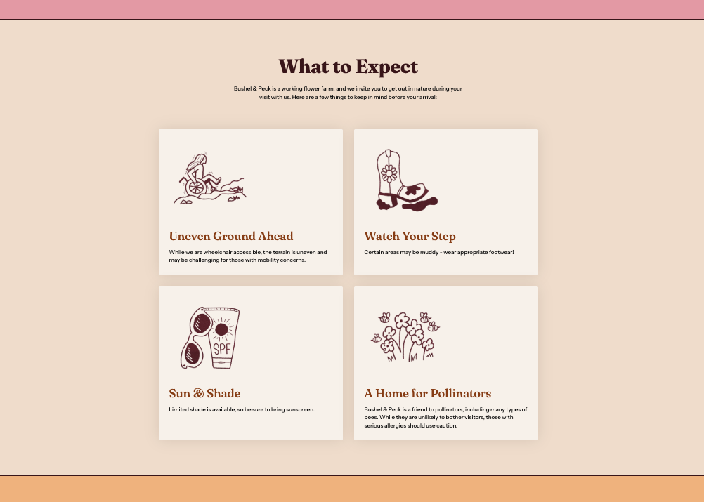
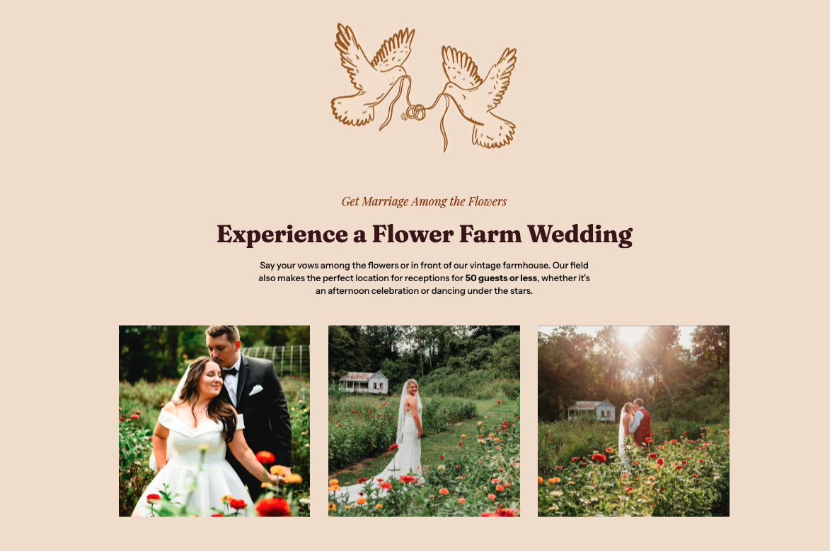
The style is fine line and hand-drawn, the kind that looks like it was pulled from a vintage nature journal. Warm, whimsical, and unmistakably Bushel and Peck. They give the site a handcrafted quality that no template could replicate and remind every visitor that this place was built by hand too.
The Website
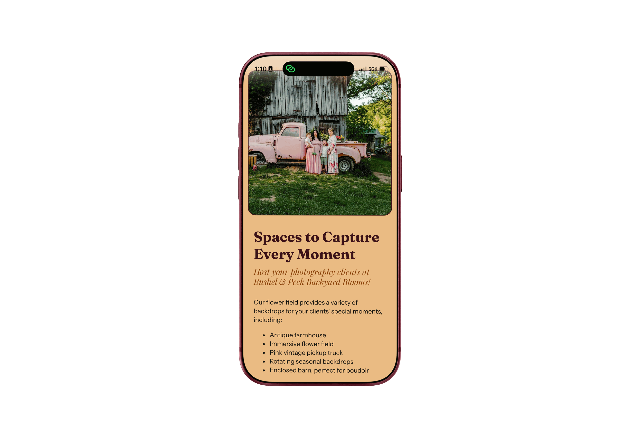
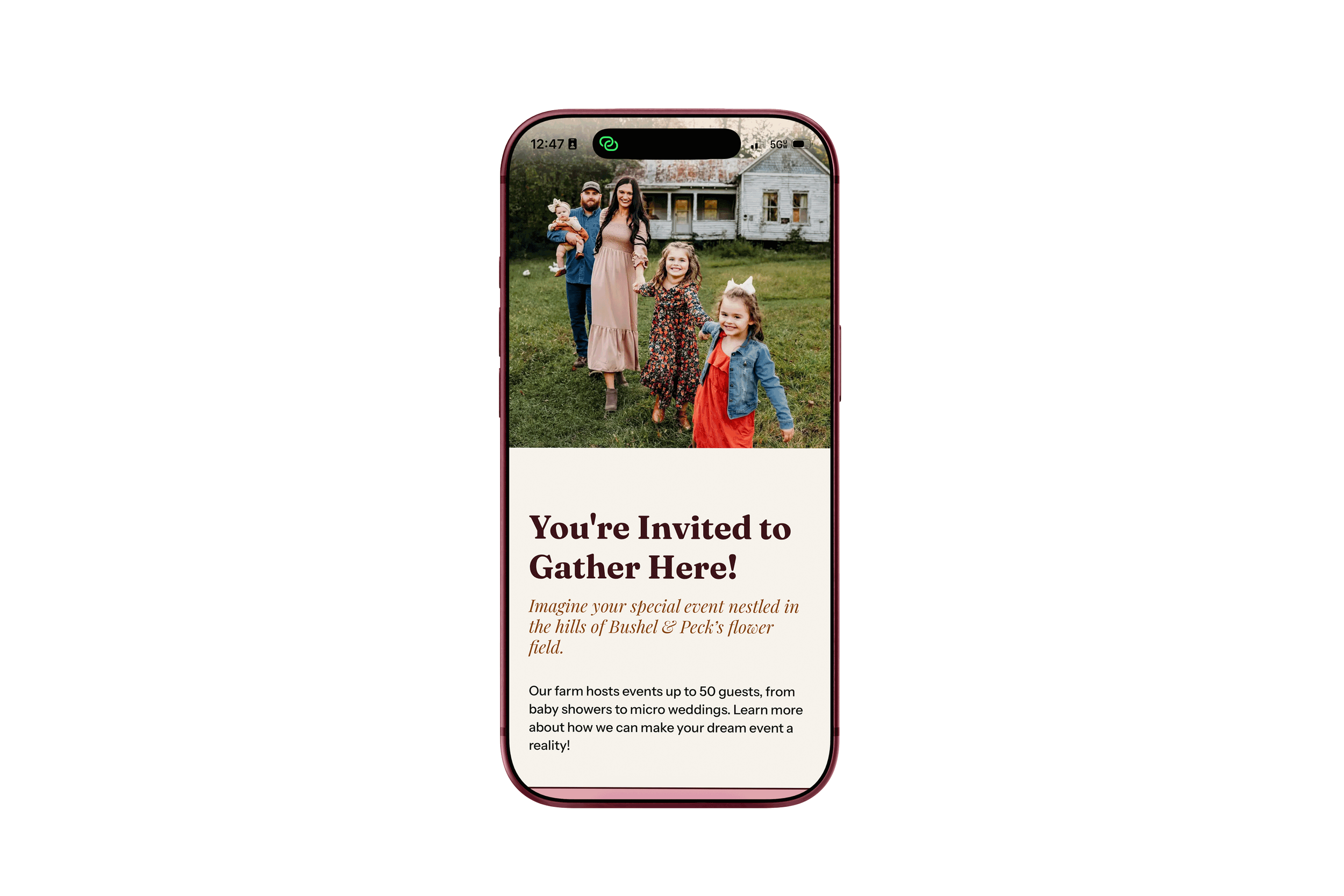
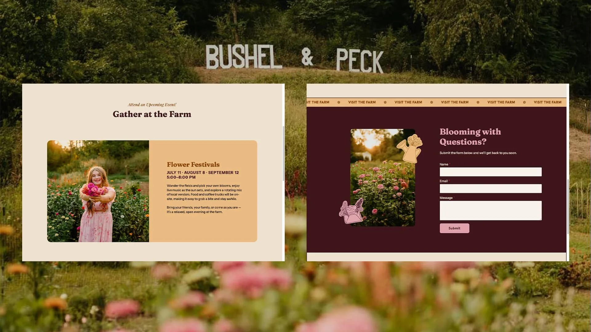
Built on WordPress using Breakdance Builder, every page was designed around the strategy we built at the start of the project. Home, About, Visit the Farm, Events, Photography, Floral Arrangements, Ways to Gather, and Weddings. Eight pages, each one built for a specific type of visitor and a specific next step.
The homepage was designed as an invitation. It sets the feeling of the farm before anything else. Soft, dreamy, welcoming. From there, every page was built to answer the right questions for the right person at the right moment. The you-pick visitor needs different information than the photographer or the couple considering a micro wedding. The site accounts for all of them without making anyone wade through content that isn't for them.
The goal was a site Kathleen felt proud to share and visitors felt confident using.
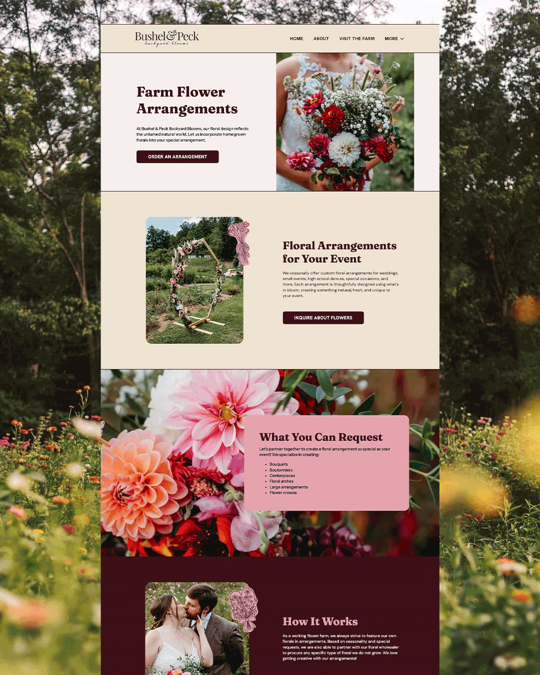
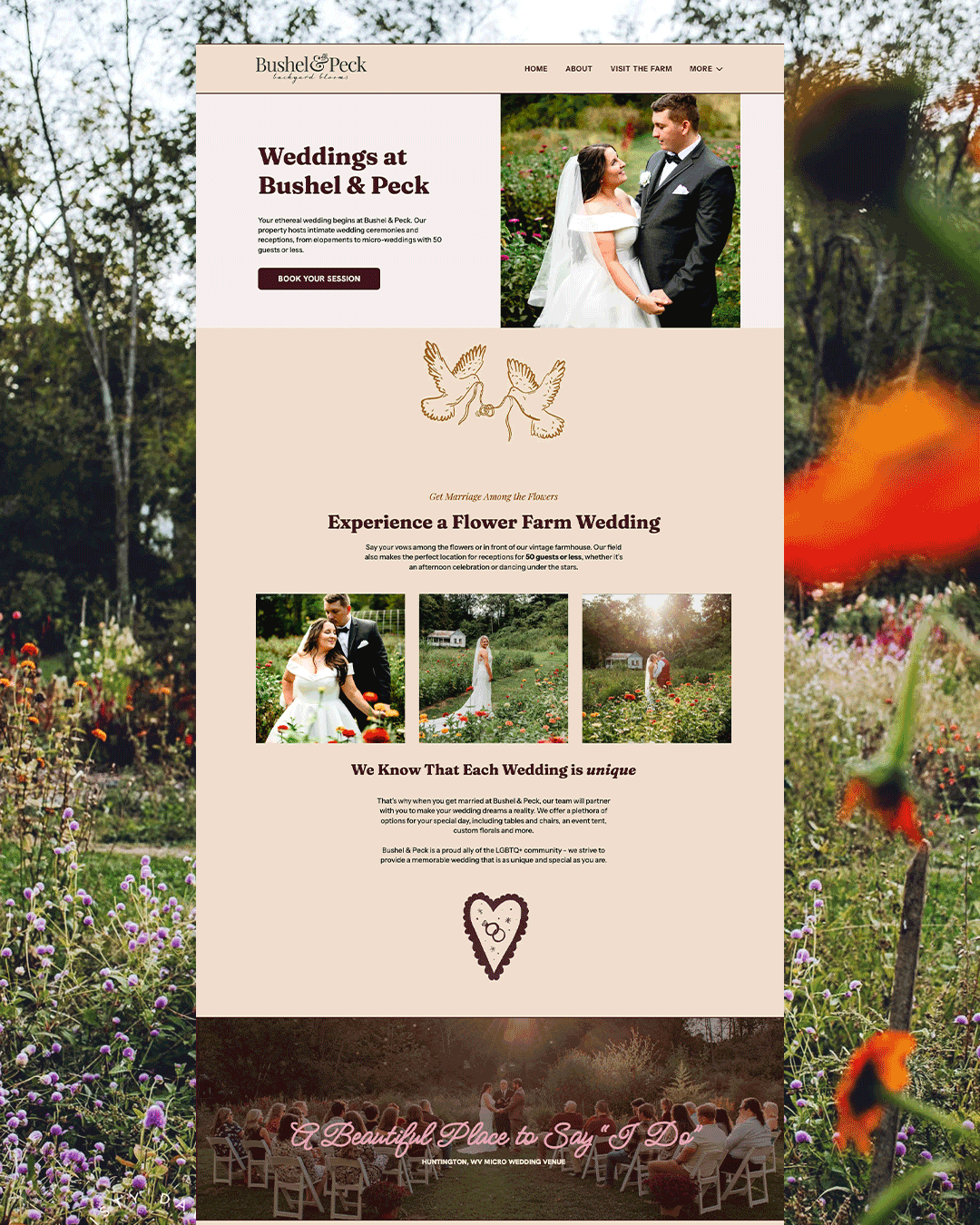
The new Bushel & Peck Website in Kathleen's words.
“Thank you so much! I really appreciate you and everything you have done for me! I'm so excited as I was so overwhelmed before managing all those bookings.”
“The website is going sooooo great! Payments are coming smoothly and everything.”
“I appreciate you so much! Without you i would be LOST!!!”
What changed for Kathleen.
Kathleen used to answer booking questions between rows of flowers. Now photographers reserve their own sessions, workshops sell tickets, couples inquire about weddings, and she can add something new to the farm without calling me first.
You built a place people love, but does your website feel like it?
I build brands and websites for coffee shops, small farms, churches, and camps. Not just something pretty, but something that actually runs your business while you're busy running it.